Discussion
Loading...

#Tag

  • About
  • Code of conduct
  • Privacy
  • Users
  • Instances
  • About Bonfire
Anke boosted
Nicola Rennie
@nrennie@fosstodon.org  ·  activity timestamp 2 weeks ago

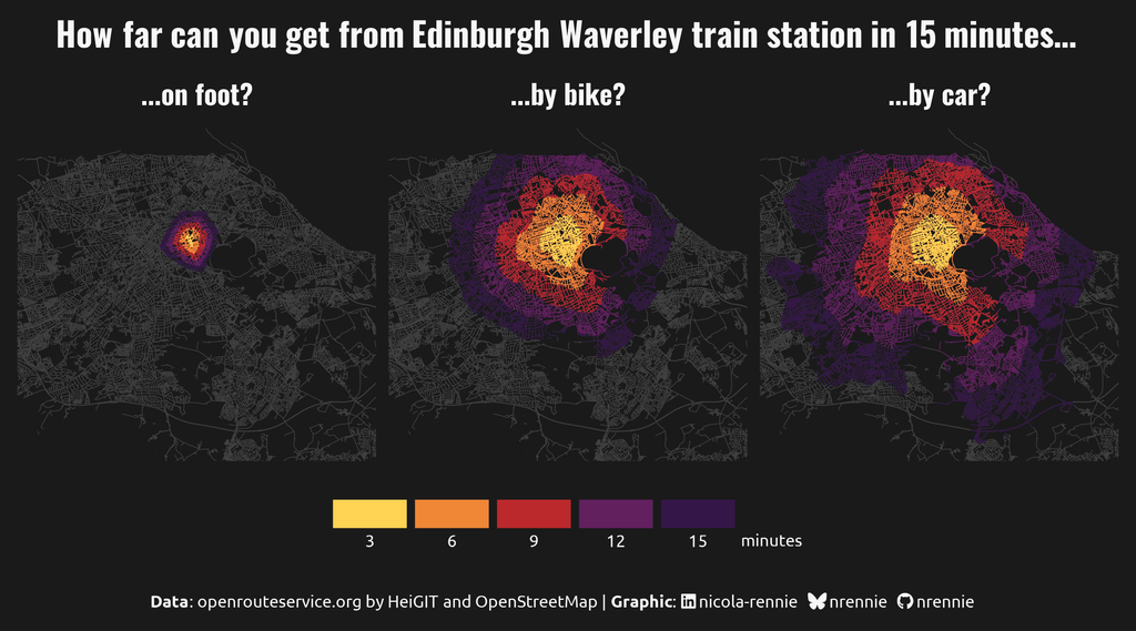
Mapping out how quickly you can get around Edinburgh with different modes of transport for day 26 of the #30DayMapChallenge!

Useful blog post if you want to try this yourself: https://jamiehudson.netlify.app/post/distance_map/

#RStats #DataViz #ggplot2

Three small multiple street maps of Edinburgh showing how far you can travel in 15 minutes on foot, by bike, and by car. Bike and car aren't that different.
  • Copy link
  • Flag this post
  • Block
Jeremy ⁂ and 1 other boosted
terence
@terence@fosstodon.org  ·  activity timestamp 3 weeks ago

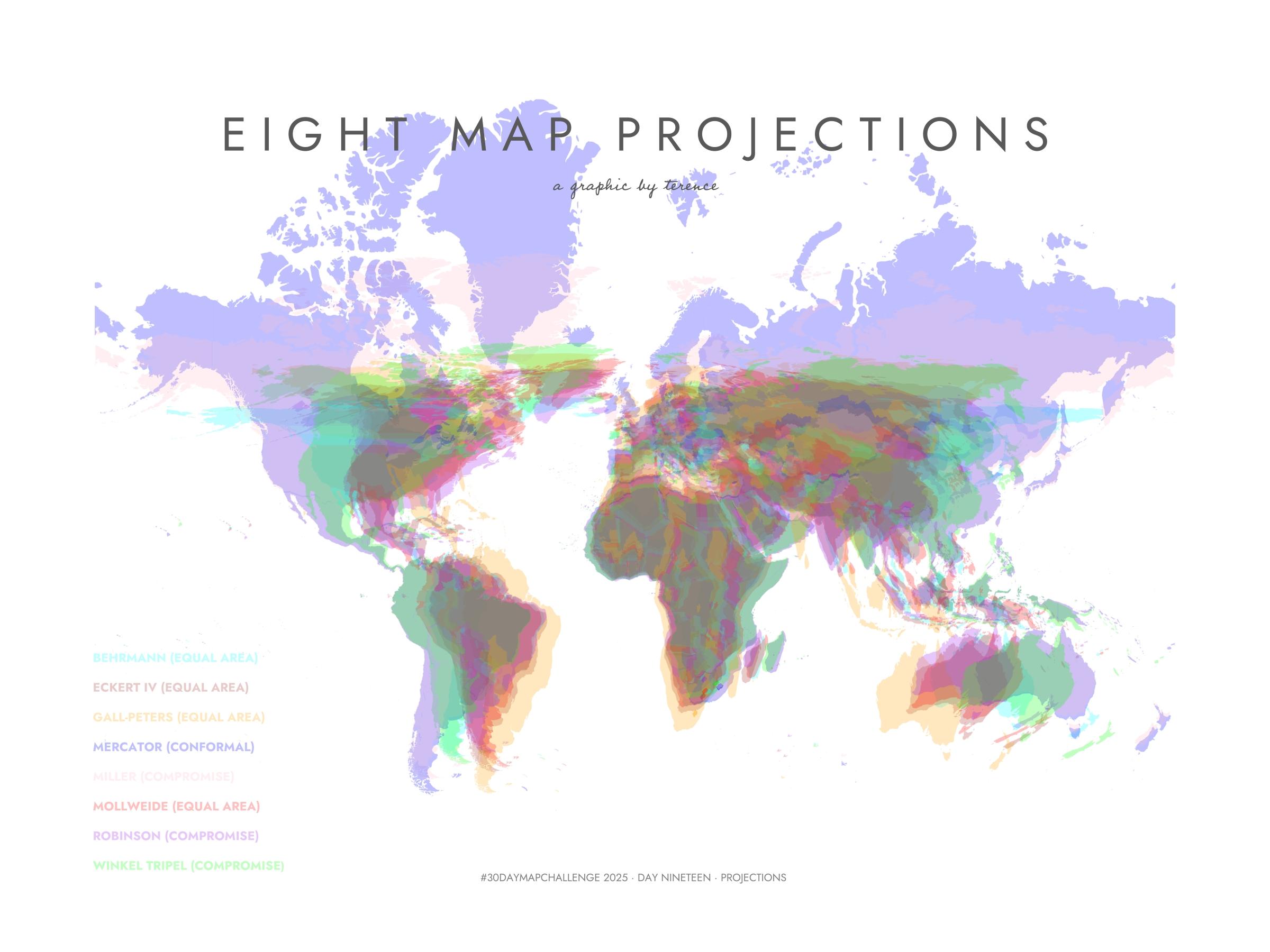
#30DayMapChallenge · Day 19 · Projections. Here's a visualisation of eight map projections.

#ggplot2 adventures, an #rstats tale

A visualisation of eight map projections
  • Copy link
  • Flag this post
  • Block
terence
@terence@fosstodon.org  ·  activity timestamp 3 weeks ago

#30DayMapChallenge · Day 19 · Projections. Here's a visualisation of eight map projections.

#ggplot2 adventures, an #rstats tale

A visualisation of eight map projections
  • Copy link
  • Flag this post
  • Block
Mince Pie Butty boosted
Nicola Rennie
@nrennie@fosstodon.org  ·  activity timestamp last month

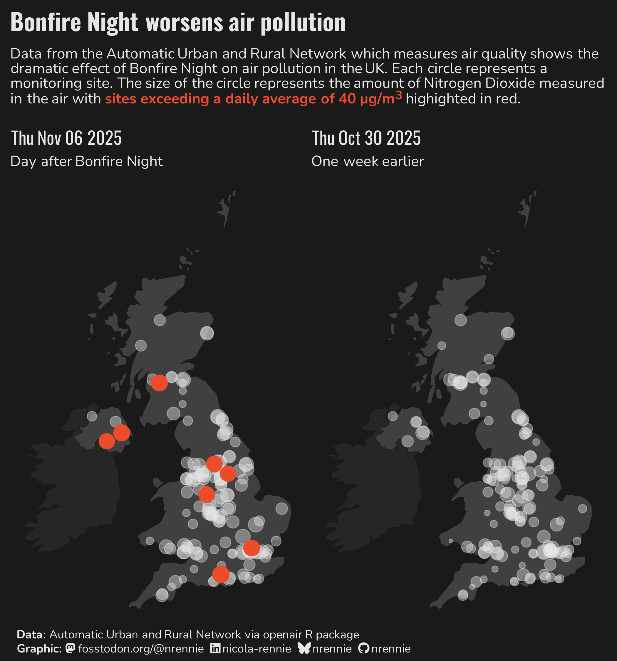
It's Day 10 of the #30DayMapChallenge and for the "air" prompt, I decided to look at air quality data before and after Bonfire Night in the UK 🎇

#RStats #ggplot2 #DataViz

Side by side maps of the UK showing air quality before and after Bonfire night. The day after Bonfire night shows many more sites marked as exceeding a threshold of 40 micrograms/m3.
  • Copy link
  • Flag this post
  • Block
Matthieu Viry boosted
Nicola Rennie
@nrennie@fosstodon.org  ·  activity timestamp last month

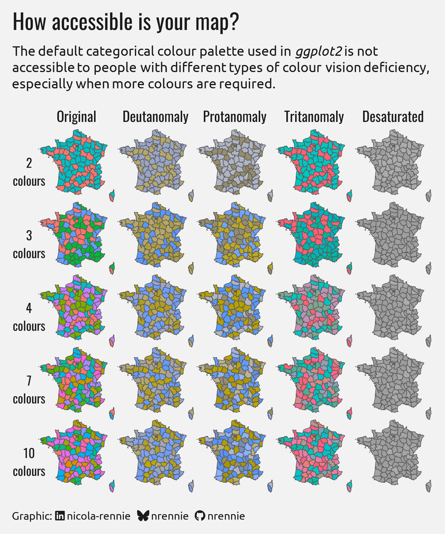
For the "accessibility" prompt on day 7 of the #30DayMapChallenge, I decided to investigate how accessible the default #ggplot2 colours are to people with different types of colour vision deficiency (and for different numbers of colours used). 🎨

TLDR: please choose a different, accessible palette

#RStats #DataViz

A 5x5 grid of maps of France. Each row contains areas shaded with a different number of colours, and each column shows how it looks with different types of colour vision deficiency. None are accessible, except when using only two colours.
  • Copy link
  • Flag this post
  • Block
devSJR :python: :rstats: boosted
Sascha Wolfer
@sascha_wolfer@fediscience.org  ·  activity timestamp last month

#Rstats problems: Did you ever think that the dots for dotted lines are a bit too far apart per default? TIL that it's super easy to change this.

In #ggplot2, simply try something like:

scale_linetype_manual(
values = c(a = "dotted", b = "11")
)

The '11' means: 1 point for a dot, 1 point for a gap. Find out more here: https://stackoverflow.com/questions/25788945/how-to-define-more-line-types-for-graphs-in-r-custom-linetype

Stack Overflow

How to define more line types for graphs in R (custom linetype)?

There are 6 line types defined for plots in R defined as "dashed", "longdash" ... Link How can I define more types if I have more that 6 series to plot ? The graph lines can be
A graph with two dotted lines. The dots for one of the lines are much closer together.
  • Copy link
  • Flag this post
  • Block
Simon Tournier
@zimoun@social.sciences.re  ·  activity timestamp last month

Today, @edumerco motivated me to give a deeper look to #Org mode and #Emacs #Lisp for processing data as a reproducible computational notebook. It reminds me this great MOOC [1]. 🤩

And today I learn more about #Sociocracy thanks @edumerco! Well, the concept of #Guix teams needs more love. 😍

Bah the kind of day when you feel part of something. 🥳

Thanks @bzg for the connection. 😁

1: https://www.fun-mooc.fr/en/courses/reproducible-research-methodological-principles-transparent-scie

Eduardo Mercovich (él)
@edumerco@social.coop replied  ·  activity timestamp last month

Dear @zimoun , thank you for such a rich meeting and sharing your experience with #ReproducibleResearch and #guix for this #tem25 thesis . :)

#orgmode Babel (blocks of code calling anything integrated with the text and images) are great for #LiteraryProgramming and reprod. research.

Also, thank you for your mention of #ggplot2 that @ansate nailed too a little later. :)

Thanks also to @bzg too. 🙏

Re #PeerGovernance, I'd be delighted to share my experience with the guix community anytime.

  • Copy link
  • Flag this comment
  • Block
Sharon Machlis
@smach@masto.machlis.com  ·  activity timestamp 2 months ago

The {ggbot2} #RStats 📦 launches a chatbot you can speak to in plain language, and it can write ggplot2 R code and display the dataviz.
Plus: The {shinyrealtime} #RStats 📦 has a demo voice app that generates #dataviz code in both R and #Python
https://www.infoworld.com/article/4072500/how-to-run-an-r-data-visualization-chatbot-you-can-talk-to.html
#GenerativeAI #ggplot2

InfoWorld

How to run an R data visualization chatbot you can talk to

Posit’s ggbot2 is a voice assistant for ggplot2. Tell it what you want in a spoken conversation, and it will generate plots and ggplot2 R code from your data.
  • Copy link
  • Flag this post
  • Block
Unnamed TNG skant beefcake boosted
James Hawley, PhD
@jrhawley@scholar.social  ·  activity timestamp 3 months ago

Wow, setting default labels for your data in #rstats using "label" attributes is a good idea. I'd never heard of this before, but I'm glad that #ggplot2 is now supporting it. Manually specifying axis labels was a bit tedious.

I do like that if you transform the data, the default label is not applied (see the sqrt(body_mass) variable in the first figure here).

https://www.tidyverse.org/blog/2025/09/ggplot2-4-0-0/#labels

  • Copy link
  • Flag this post
  • Block
Nicola Rennie
@nrennie@fosstodon.org  ·  activity timestamp 4 months ago

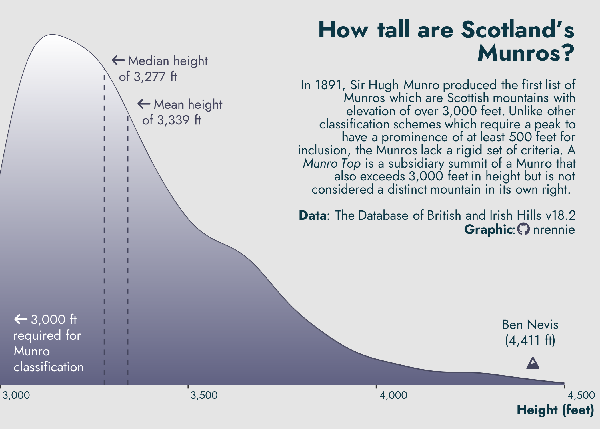
I had the pleasure of curating this week's #TidyTuesday data about Scottish Munros ⛰️ So the chart just had to be an annotated, snow-capped, density mountain! 📊

Code: https://github.com/nrennie/tidytuesday/tree/main/2025/2025-08-19

#RStats #ggplot2 #DataViz

Density plot showing height of Munros in Scotland with a peak about 3100 ft, going up to 4411 ft of Ben Nevis
  • Copy link
  • Flag this post
  • Block
Sharon Machlis
@smach@masto.machlis.com  ·  activity timestamp 4 months ago

New presentation just posted at today's @useR_conf virtual conference: Plot Twist: Adding Interactivity to the Elegance of ggplot2 with ggiraph

By @tanya_shapiro & @CedScherer

Video https://www.youtube.com/watch?v=GnDjRxyO-7A

#RStats#DataViz #ggplot2 #user2025

  • Copy link
  • Flag this post
  • Block
Log in

bonfire.cafe

A space for Bonfire maintainers and contributors to communicate

bonfire.cafe: About · Code of conduct · Privacy · Users · Instances
Bonfire social · 1.0.1-alpha.8 no JS en
Automatic federation enabled
  • Explore
  • About
  • Members
  • Code of Conduct
Home
Login