Esther Payne :bisexual_flag:
boosted

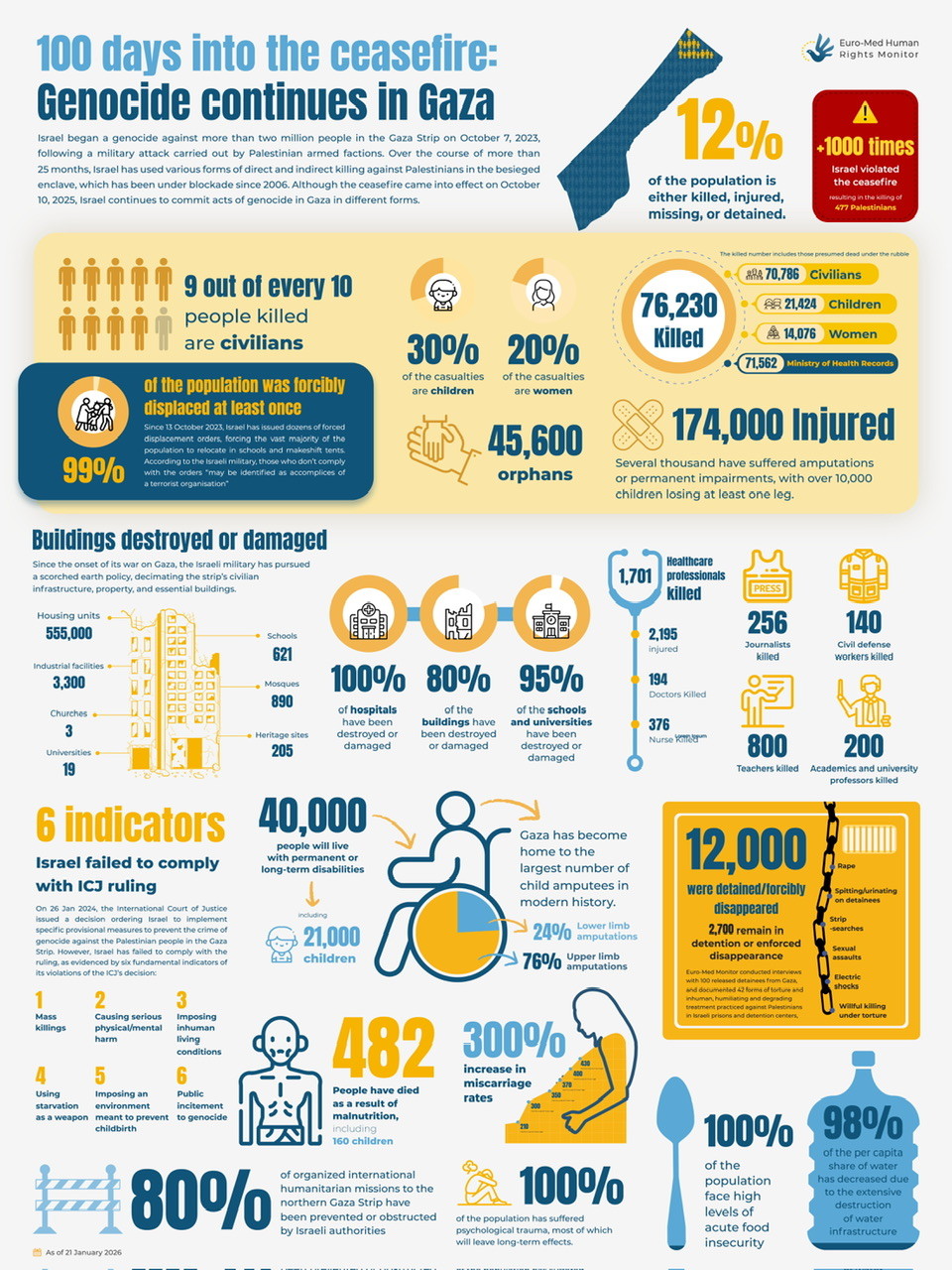
[ #Infographics] 100 days into the ceasefire: Genocide continues in Gaza (Euro-Med Human Rights Monitor, 2026-01-22)
https://euromedmonitor.org/a/6970
------
>> ... Over the course of more than 25 months, Israel has used various forms of direct and indirect killing against Palestinians in the besieged enclave, which has been under blockade since 2006. Although the ceasefire came into effect on October 10, 2025, Israel continues to commit acts of genocide in Gaza in different forms...
#ThisIsNoCeasefire #Gaza #StopGenocide #StopIsrael #palestine
@palestine@lemmy.ml @palestine@fedibird.com