
MacOS Tahoe got rid of the full screen launchpad. LaunchBack is a free and open-source re-implementation of the "classic" macOS Launchpad.
https://github.com/trey-a-12/LaunchBack
Konstantin 🔭
boosted

Anyway, been using NSTableView for my #SwiftUI version of #PDXTransit since it is far more customizable and powerful than `Table`.


While crusty given how old it is, NSTableView is pretty fucking badass with how much it can do and how much you can customize it.
The only problem is that sometimes finding examples of how to do something can be difficult or some configurations aren't really supported.
Anyway, still far better than SwiftUI's Table API. It's so limited and sometimes it just falls flat on its face.
Anyway, been using NSTableView for my #SwiftUI version of #PDXTransit since it is far more customizable and powerful than `Table`.

In this particularly ranty episode of Chit Chat Across the Pond, @adamengst TidBITS joins me to talk about how Apple put icons next to virtually every menu item in macOS Tahoe, and what a hot mess they are.

RE: https://wien.rocks/@noheger/115877698373215218
ugh this is one of the things that drives me most insane in #macOSTahoe. Basic desktop-isms are just so broken. I fear that more and more folks who don't understand the history of the desktop are running the show at Apple. I hope I am wrong but then what explains this mess?

Struggling to resize windows on macOS Tahoe? Here’s why.
https://noheger.at/blog/2026/01/11/the-struggle-of-resizing-windows-on-macos-tahoe/
Konstantin 🔭
boosted
Look how beautifully this plus button gets centered…
#macOSTahoe #LiquidGlass
Look how beautifully this plus button gets centered…
#macOSTahoe #LiquidGlass
John Siracusa
boosted
I'm sorry, but this is the sorta crap behavior I'd expect from cross-platform web based shit apps -- not "native" Apple apps... ugh.
This is Messages on #macOSTahoe.
I'm sorry, but this is the sorta crap behavior I'd expect from cross-platform web based shit apps -- not "native" Apple apps... ugh.
This is Messages on #macOSTahoe.
Konstantin 🔭
boosted
Bjørnar (he/him)
boosted

Gone are the days where you could easily distinguish file types by icons. Why have them anymore?
Tip: Squint and lean in and you might see the difference!
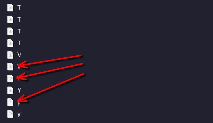
Gone are the days where you could easily distinguish file types by icons. Why have them anymore?
Tip: Squint and lean in and you might see the difference!
what even is this shadow? #macOSTahoe
2 media


It's like #macOSTahoe is just trolling me at this point lol


#LiquidGlass ...😒 The contrast of notifications is now so low that I can hardly distinguish them from the apps underneath. When I first saw this, I thought my #VSCode had gotten a new #Fantastical integration.

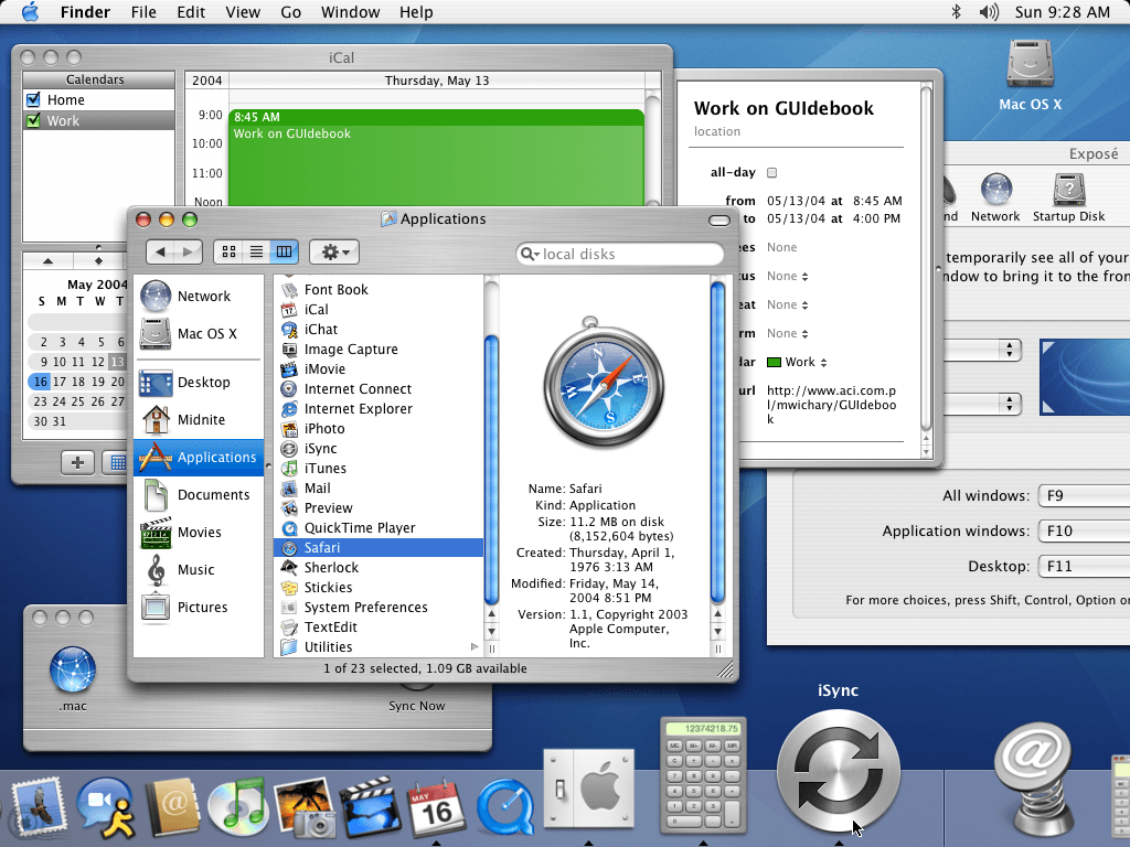
This is #Mac OS Panther, released in 2004. Its UI has many things wrong with it (and is not pretty). But what it does well is a strong and obvious distinction between controls and data. Buttons and borders are clearly defined. Icons are immediately recognizable, even zoomed out and tiny like in this picture. No transparency or blending. Scroll state always obvious through visible bars.
What this adds up to is reduced cognitive load when using the interface. Everything is plain, you can find a thing immediately. This is a stark contrast to #macOSTahoe and the many poor decisions in that UI.
I know how @siracusa loves how Apple found ways to minimize the color differences so we can't see buttons and such, so I made this wee video just for him (but you can watch it too if you like.)
Ben Ramsey
boosted

Now that #macOSTahoe has been out for a while (I'm mostly fine with it), have people played with https://github.com/apple/container? It has 21k stars and has apparently seen steady development, yet nobody seems to be talking about it.
Is it… viable as a replacement for #Docker or #Orbstack? Has someone made a simple Mac GUI app to manage containers with it? (Or maybe I can use Orbstack for that?)
How about performance?