Discussion
Loading...

Post

Log in
  • About
  • Code of conduct
  • Privacy
  • Users
  • Instances
  • About Bonfire
Abhishek Kumar
Abhishek Kumar
@akumar@ecoevo.social  ·  activity timestamp 3 months ago

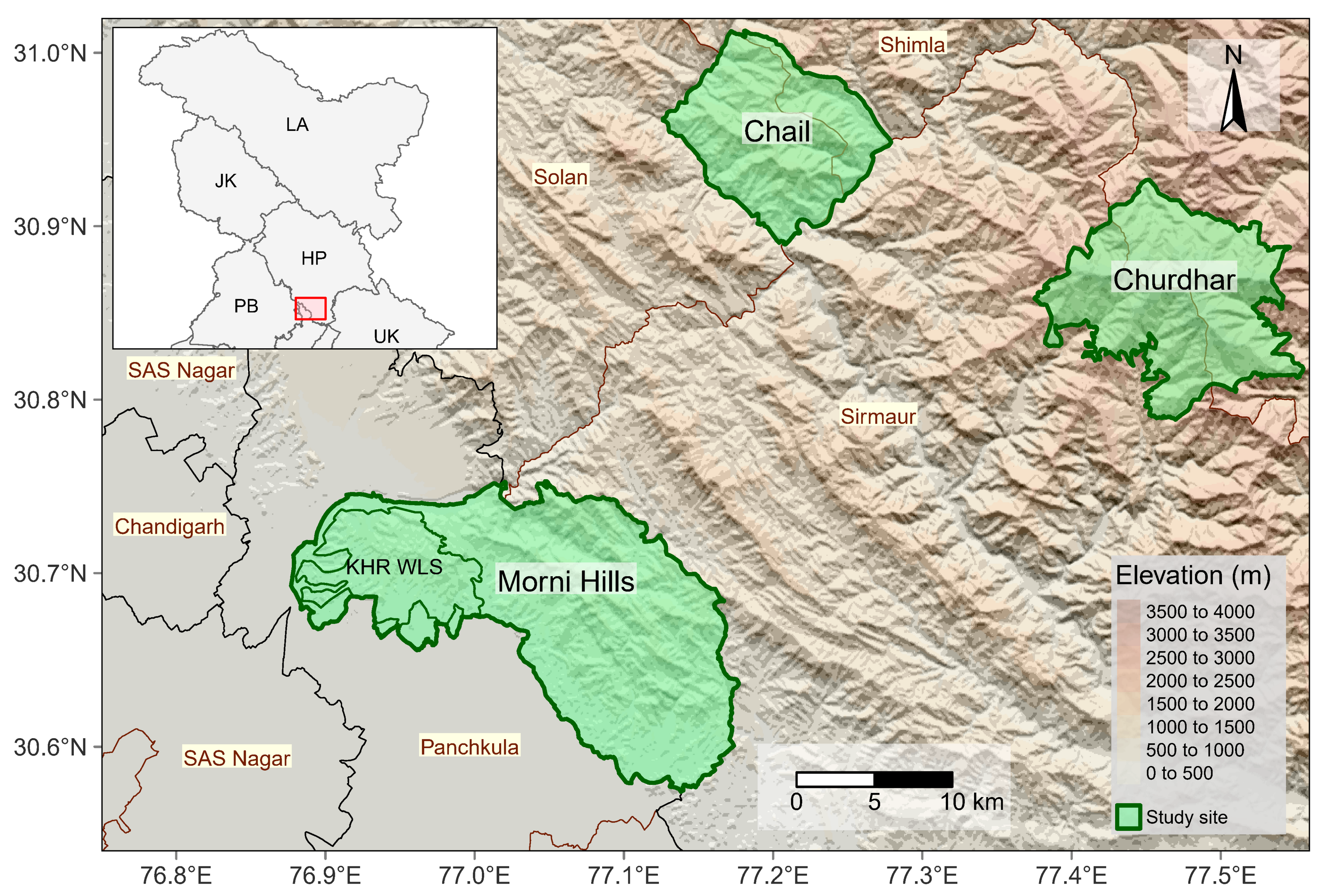
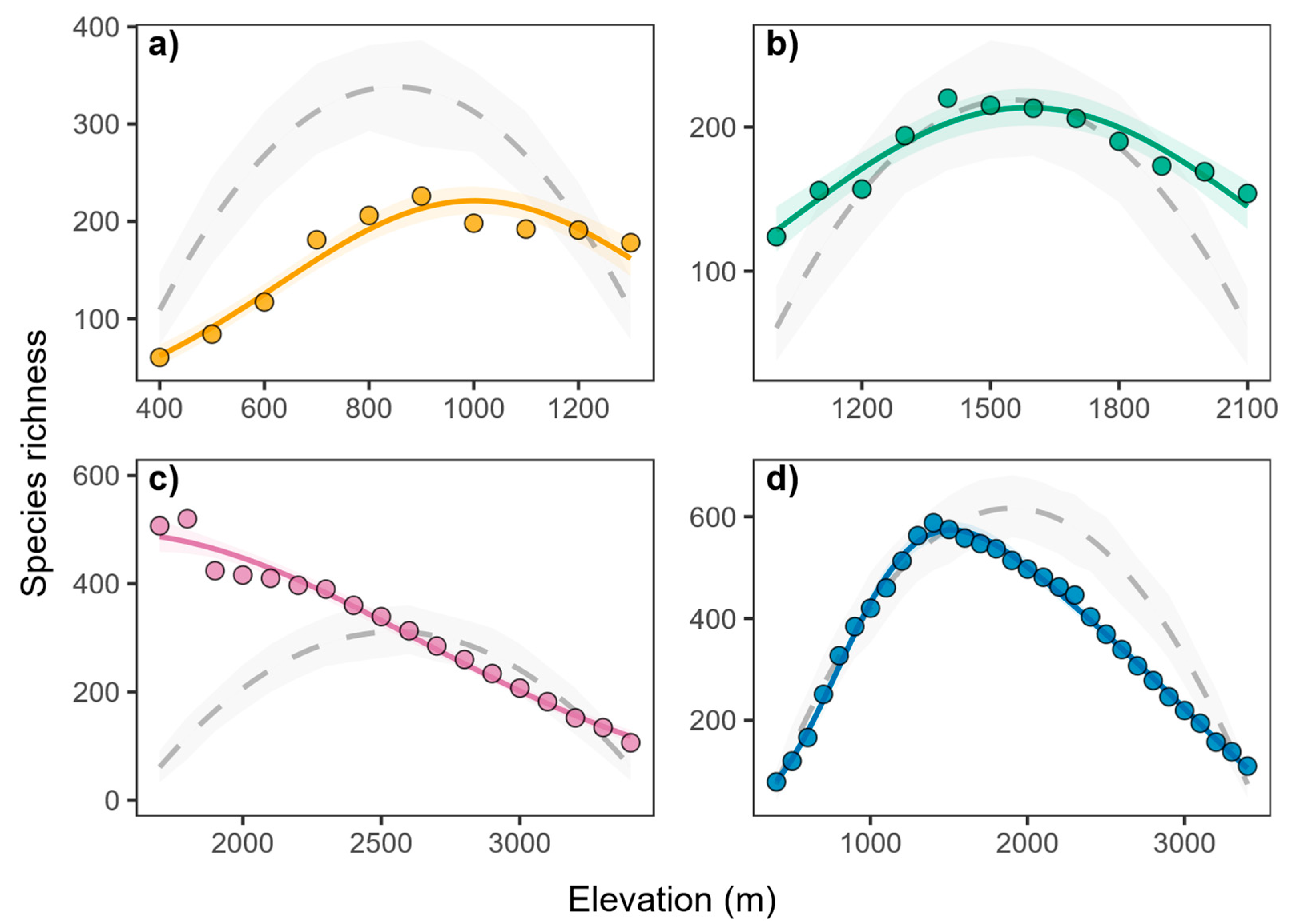
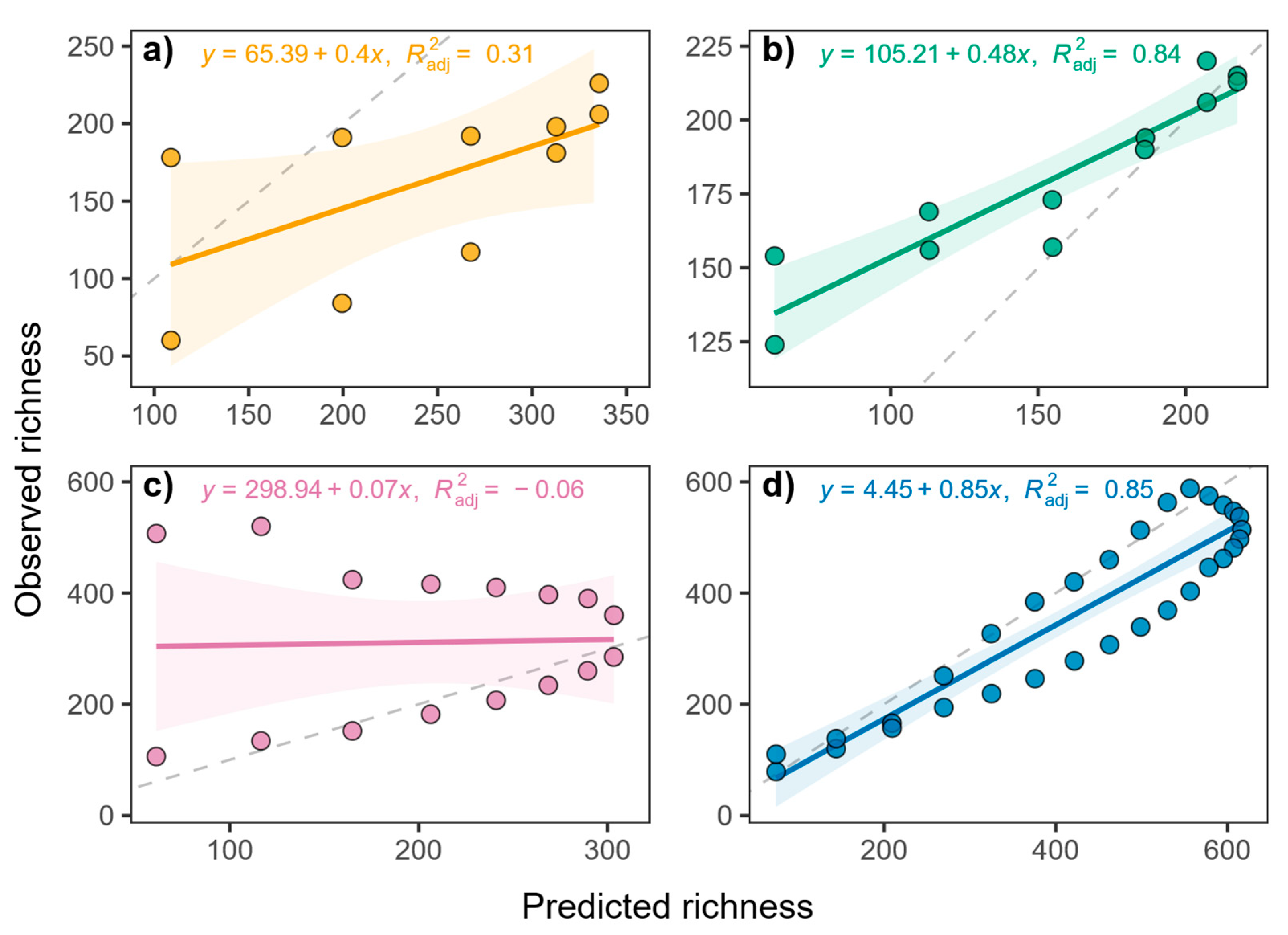
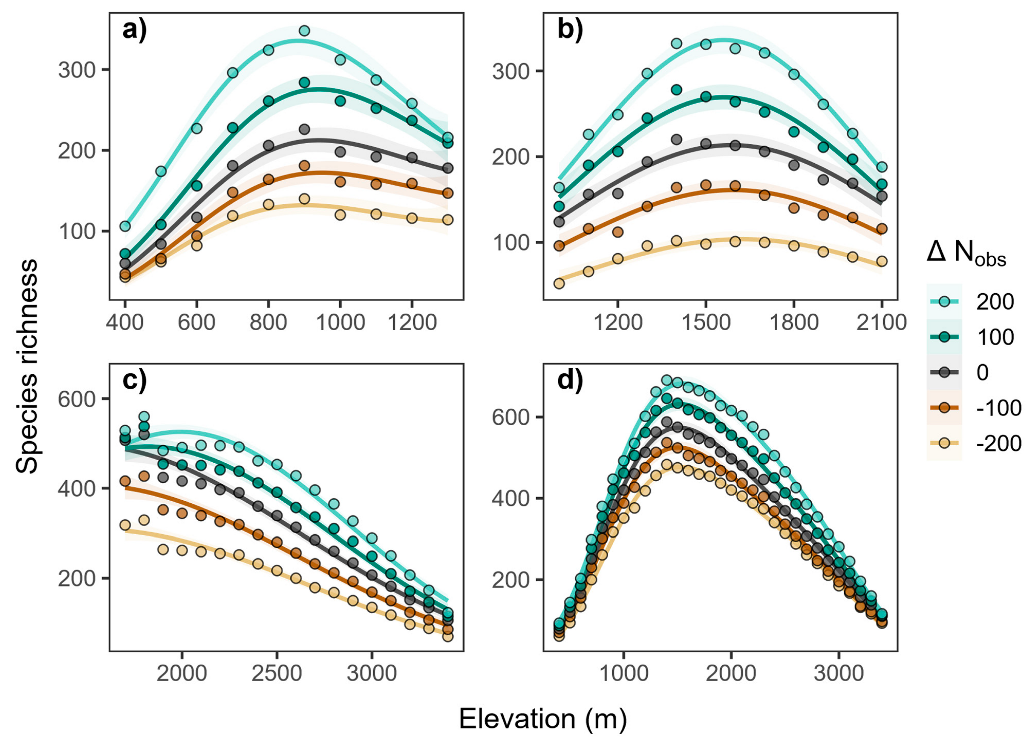
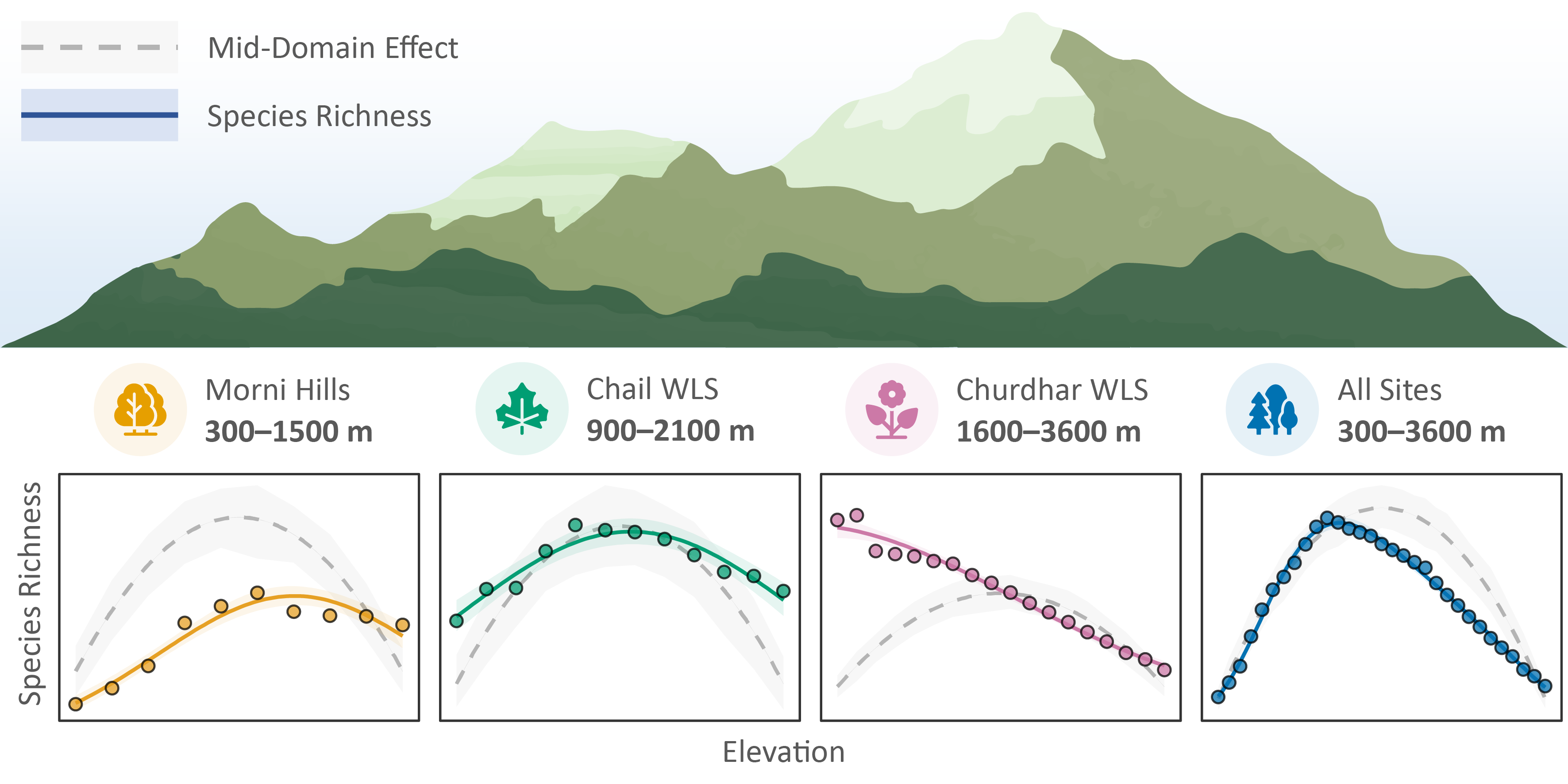
1/7 🌿 Where are greatest number of #PlantSpecies in #Mountains? 🏔️

Our recent study in #Forests explored elevational patterns of plant #SpeciesRichness in Western Himalayas.

🔗 https://doi.org/10.3390/f16101591

#Biodiversity #Biogeography #Ecology #ElevationalGradients #Himalayas #ProtectedAreas

Illustration showing the relationship between plant species richness and elevation across three Himalayan sites and their combined pattern. The top panel depicts a stylized mountain range labeled with a legend for “Mid-Domain Effect” (gray dashed line) and “Species Richness” (solid blue line). Below, four small plots display species richness versus elevation for: (1) Morni Hills (300–1500 m, yellow), showing a unimodal increase and decline in richness; (2) Chail Wildlife Sanctuary (900–2100 m, green), showing a similar mid-elevation peak; (3) Churdhar Wildlife Sanctuary (1600–3600 m, pink), showing a gradual decline with elevation; and (4) all sites combined (300–3600 m, blue), showing a pronounced hump-shaped richness pattern centered at mid-elevations. The gray dashed curves represent predicted richness from the mid-domain effect, with shaded confidence bands.

Elevational Patterns of Plant Species Richness: Insights from Western Himalayas

  • Copy link
  • Flag this post
  • Block
Abhishek Kumar
Abhishek Kumar
@akumar@ecoevo.social replied  ·  activity timestamp 3 months ago

2️⃣ We compiled the elevational ranges of >1100 vascular plant species from three #ProtectedAreas — Morni Hills, Chail WLS, and Churdhar WLS. This contributes to knowledge gap for the #WesternHimalayas.

Map showing the locations of three study sites—Morni Hills, Chail Wildlife Sanctuary, and Churdhar Wildlife Sanctuary—across the northwestern Himalayas. The main map depicts topography with shaded elevation ranging from 0 to 4000 meters, where darker shades represent higher elevations. The study sites are outlined in green, with Morni Hills located in Haryana, and Chail and Churdhar in Himachal Pradesh. Surrounding districts, including Panchkula, Sirmaur, Solan, Shimla, and SAS Nagar, are labeled. An inset map in the upper left corner shows the broader regional context within northern India, highlighting the states and union territories of Punjab (PB), Haryana (HR), Himachal Pradesh (HP), Uttarakhand (UK), Jammu and Kashmir (JK), and Ladakh (LA), with a red box indicating the study area’s location. A north arrow and scale bar (0–10 km) are included for orientation.
  • Copy link
  • Flag this comment
  • Block
Abhishek Kumar
Abhishek Kumar
@akumar@ecoevo.social replied  ·  activity timestamp 3 months ago

3️⃣ What did we find?

While species richness often showed complex non-linear unimodal (hump-shaped) patterns, simple linear decreasing pattern was also observed.

Patterns vary with extent and position of #ElevationalGradients !

Four-panel figure showing relationships between plant species richness and elevation across three Himalayan sites and their combined dataset. Each panel displays observed species richness (colored circles with solid fitted lines) compared with predicted values from the mid-domain effect (gray dashed lines with shaded confidence bands).
(a) Morni Hills (yellow): species richness increases with elevation and peaks near mid-elevations (~900 m) before declining.
(b) Chail Wildlife Sanctuary (green): species richness peaks around 1500 m with a hump-shaped pattern.
(c) Churdhar Wildlife Sanctuary (pink): species richness declines steadily with elevation from ~1600 m to 3500 m.
(d) All sites combined (blue): a pronounced unimodal, mid-elevation peak in richness around 1200–1500 m.
Gray dashed lines represent mid-domain effect predictions, and shaded regions indicate uncertainty.
Four-panel figure showing relationships between plant species richness and elevation across three Himalayan sites and their combined dataset. Each panel displays observed species richness (colored circles with solid fitted lines) compared with predicted values from the mid-domain effect (gray dashed lines with shaded confidence bands). (a) Morni Hills (yellow): species richness increases with elevation and peaks near mid-elevations (~900 m) before declining. (b) Chail Wildlife Sanctuary (green): species richness peaks around 1500 m with a hump-shaped pattern. (c) Churdhar Wildlife Sanctuary (pink): species richness declines steadily with elevation from ~1600 m to 3500 m. (d) All sites combined (blue): a pronounced unimodal, mid-elevation peak in richness around 1200–1500 m. Gray dashed lines represent mid-domain effect predictions, and shaded regions indicate uncertainty.
  • Copy link
  • Flag this comment
  • Block
Abhishek Kumar
Abhishek Kumar
@akumar@ecoevo.social replied  ·  activity timestamp 3 months ago

4️⃣ Is this just a random geometric effect?

We tested the Mid-Domain Effect (MDE) null model and found substantial deviations from its predictions.

This means plant distribution in the Himalayas is NOT a simple game of chance!

Four scatter plots (a-d) comparing Observed richness (y-axis) against Predicted richness (x-axis) from the Mid-Domain Effect Null Model. Each plot includes a linear regression line, its equation, and adjusted R-squared ($R^2_{adj}$). A dashed gray line represents the 1:1 ratio for reference.Plot a) shows a moderate positive linear relationship: $y = 65.39 + 0.4x$, $R^2_{adj}=0.31$.Plot b) shows a strong positive linear relationship: $y = 105.21 + 0.48x$, $R^2_{adj}=0.84$.Plot c) shows virtually no linear relationship: $y = 298.94 + 0.07x$, $R^2_{adj}=-0.06$.Plot d) shows a strong positive linear relationship: $y = 4.45 + 0.85x$, $R^2_{adj}=0.85$, with data points suggesting saturation at the highest predicted richness values.
  • Copy link
  • Flag this comment
  • Block
Abhishek Kumar
Abhishek Kumar
@akumar@ecoevo.social replied  ·  activity timestamp 3 months ago

5️⃣ Influence of observed species?

As more species were added, elevational richness became more distinctly unimodal, converging toward the MDE predictions.

This effect also varies with extent and position of elevational gradients.

Four graphs (a-d) showing the relationship between Species richness (y-axis) and Elevation (m) (x-axis), with curves representing different total numbers of observed species ($\Delta N_{obs}$) relative to the mean across the study sites.The legend indicates five levels of $\Delta N_{obs}$: 200 (light teal), 100 (dark teal), 0 (dark gray), -100 (brown), and -200 (light orange).Plots a, b, and d show a hump-shaped relationship between richness and elevation, where richness peaks at intermediate elevations and decreases at lower and higher elevations.Plot c shows a decreasing relationship between richness and elevation.In all plots (a-d), a higher total number of observed species (positive $\Delta N_{obs}$) corresponds to a higher overall species richness at any given elevation.
  • Copy link
  • Flag this comment
  • Block
Abhishek Kumar
Abhishek Kumar
@akumar@ecoevo.social replied  ·  activity timestamp 3 months ago

6️⃣ Conservation Takeaway

🔑 Mid-elevational zones for conservation priorities, where #SpeciesRichness is greatest.

🧭 Read the full #OpenAccess article for the detailed analyses:
🔗 https://www.mdpi.com/1999-4907/16/10/1591

  • Copy link
  • Flag this comment
  • Block

bonfire.cafe

A space for Bonfire maintainers and contributors to communicate

bonfire.cafe: About · Code of conduct · Privacy · Users · Instances
Bonfire social · 1.0.1-beta.35 no JS en
Automatic federation enabled
Log in
  • Explore
  • About
  • Members
  • Code of Conduct