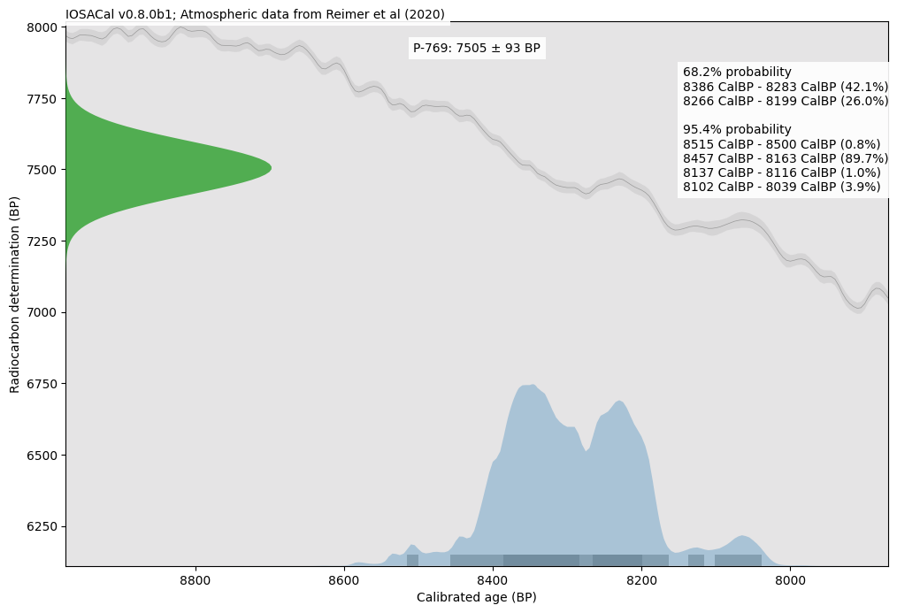
Experimenting with colors ...
#Archeology #Radiocarbon #Python #OpenScience #Matplotlib #ClimateScience #Prehistory
#Tag
Experimenting with colors ...
#Archeology #Radiocarbon #Python #OpenScience #Matplotlib #ClimateScience #Prehistory
https://theshamblog.com/an-ai-agent-published-a-hit-piece-on-me/
This is a terrifying piece about what #OpenClaw has unleashed with its #agentic “ #ai” bots. Scott is a volunteer maintainer for #matplotlib, #python’s go-to plotting library. An agent tied to merge code, and Scott said no. The agent, apparently autonomously, proceeded to attempt to blackmail Scott, and when that didn’t work started posting hallucinations attacking Scott.
His lead in to the article: An AI agent of unknown ownership autonomously wrote and published a personalized hit piece about me after I rejected its code, attempting to damage my reputation and shame me into accepting its changes into a mainstream python library. This represents a first-of-its-kind case study of misaligned AI behavior in the wild, and raises serious concerns about currently deployed AI agents executing blackmail threats.
This nonsense needs to be nipped in the bud.
Falling in love with #marimo.
Scattering of roots of perturbed quadratic equations.
Made with #python #numpy #matplotlib and @marimo_io
Notebook and code: https://static.marimo.app/static/roots-of-perturbed-quadratic-equations-4qhc
Falling in love with #marimo.
Scattering of roots of perturbed quadratic equations.
Made with #python #numpy #matplotlib and @marimo_io
Notebook and code: https://static.marimo.app/static/roots-of-perturbed-quadratic-equations-4qhc
Hello scientists of the world, #Python needs you! 😉 Vote for your favorite programming language and the #ITWorldCup now. And spread the word. Every vote counts (and every minute, too). Thank you!
https://hachyderm.io/@itworldcup/115960578331633434
#DataViz #DataVisualisation #Panda #NumPy #mathematics #Mathematik #GeoPlotLib #MatPlotLib #SeaBorn #SciComm #DataVizualisation #Visualisierung #Science #scientists
RE: https://hachyderm.io/@itworldcup/115960578331633434
Oh das wird echt noch spannend bis zum Schluss.
Wer noch nicht abgestimmt hat, bitte jetzt beim #ITWordCup Deinen Favorit wählen! 👇🏽
Hello scientists of the world, #Python needs you! 😉 Vote for your favorite programming language and the #ITWorldCup now. And spread the word. Every vote counts (and every minute, too). Thank you!
https://hachyderm.io/@itworldcup/115960578331633434
#DataViz #DataVisualisation #Panda #NumPy #mathematics #Mathematik #GeoPlotLib #MatPlotLib #SeaBorn #SciComm #DataVizualisation #Visualisierung #Science #scientists
@LabPlot@floss.social
Hey Labplot, I'm asking for a friend. Can #Labplot do gap axises like #rstats #plotrix or #python #matplotlib?
@labplot@lemmy.kde.social @opensource
I defeated you, #matplotlib
(With a little help from Stackoverflow... https://stackoverflow.com/questions/15740682/wrapping-long-y-labels-in-matplotlib-tight-layout-using-setp).