Discussion
Loading...

#Tag

Log in
  • About
  • Code of conduct
  • Privacy
  • Users
  • Instances
  • About Bonfire
Hacker News
Hacker News
@h4ckernews@mastodon.social  ·  activity timestamp 2 weeks ago

Venezuela explained in 10 maps and charts

https://www.aljazeera.com/news/2025/11/28/venezuela-explained-in-10-maps-and-charts

#HackerNews #Venezuela #Maps #Charts #DataVisualisation #Geography #News

Al Jazeera

Venezuela explained in 10 maps and charts

Al Jazeera visualises Venezuela’s political and economic landscape, oil riches, migration crisis and tensions with US.
  • Copy link
  • Flag this post
  • Block
kpfssport
kpfssport
@kpfssport@mastodonapp.uk  ·  activity timestamp 5 months ago
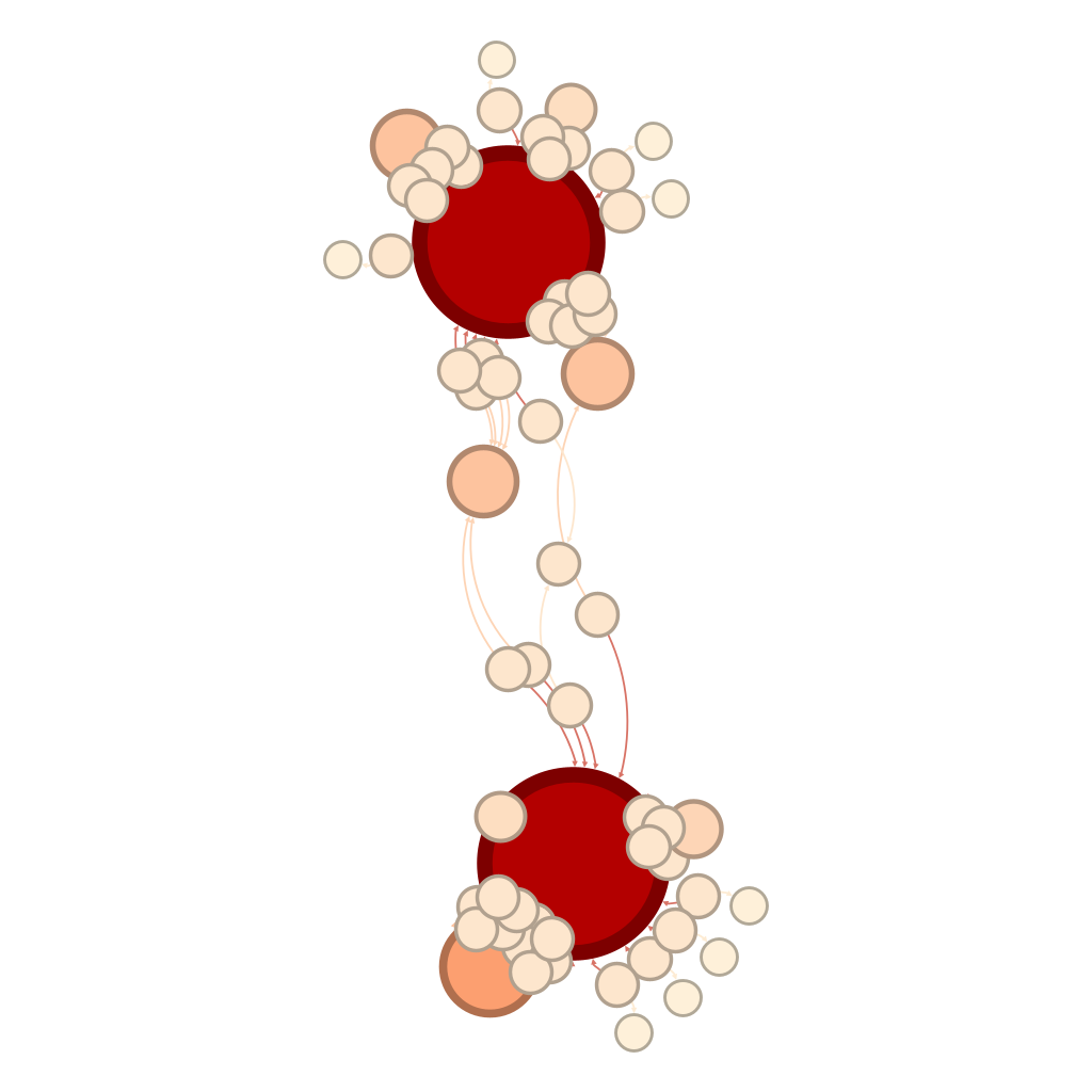
#Euro2025 network graph for the teams in the final - https://fulltimesportsfan.wordpress.com/2025/07/26/euro-2025-network-graph-for-the-final/

#DataVisualisation#Gephi

Network graph of the two teams in the final.  There are two large red circles representing England and Spain.  Of the smaller paler circles, there is one very large one next to the bottom of the two large red circles.  There are two more smaller, paler circles closer to the top of the two large red circles.
Network graph of the two teams in the final. There are two large red circles representing England and Spain. Of the smaller paler circles, there is one very large one next to the bottom of the two large red circles. There are two more smaller, paler circles closer to the top of the two large red circles.
  • Copy link
  • Flag this post
  • Block
Laetitia Bracco
Laetitia Bracco
@BraccoLaetitia@social.sciences.re  ·  activity timestamp 11 months ago

🎥 Le webinaire sur la datavisualisation, organisé par le GTSO #Données de Couperin, est désormais disponible en replay !

📅 Tenu le 17 décembre 2024, ce webinaire explore l’art de transformer des données complexes en récits visuels clairs, fonctionnels et esthétiques. Mais attention : une belle image ne suffit pas, elle doit aussi rendre les informations compréhensibles et pertinentes.

Ce webinaire propose :
✨ Des concepts et outils issus de différents univers disciplinaires.
✨ Des exemples concrets de projets et solutions pratiques.
✨ Une réflexion sur la place de l’image comme vecteur d’information.

👩‍🏫 Intervenants :
Jean-Daniel Fekete (Inria Paris-Saclay)
Étienne Côme (Université Gustave Eiffel)

🎥 Découvrez le replay et les supports sur notre nouvelle chaîne CanalU :https://www.canal-u.tv/chaines/couperin/derriere-la-beaute-des-images-des-donnees

#scienceouverte #datavisualisation #dataviz

  • Copy link
  • Flag this post
  • Block

bonfire.cafe

A space for Bonfire maintainers and contributors to communicate

bonfire.cafe: About · Code of conduct · Privacy · Users · Instances
Bonfire social · 1.0.1-alpha.41 no JS en
Automatic federation enabled
Log in
  • Explore
  • About
  • Members
  • Code of Conduct