

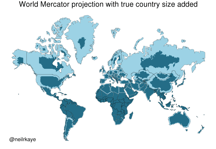
Yet another reason to tut at the Mercator map projection
https://brilliantmaps.com/mercator-vs-true-size/
Discussion
Loading...


Can someone get this to POTUS?
#uspol


@infobeautiful This book is a great discussion of examples like this(the title is relevant to the current commentary) :


@infobeautiful slightly odd. i admit i don't understand, but why is, say, australia not as shrunk as canada? surely it's as far south of the equator as canada is north?


@infobeautiful Exquisite sub-toot.
 👤")

@infobeautiful
Which is which? Where's the key on this visualization?


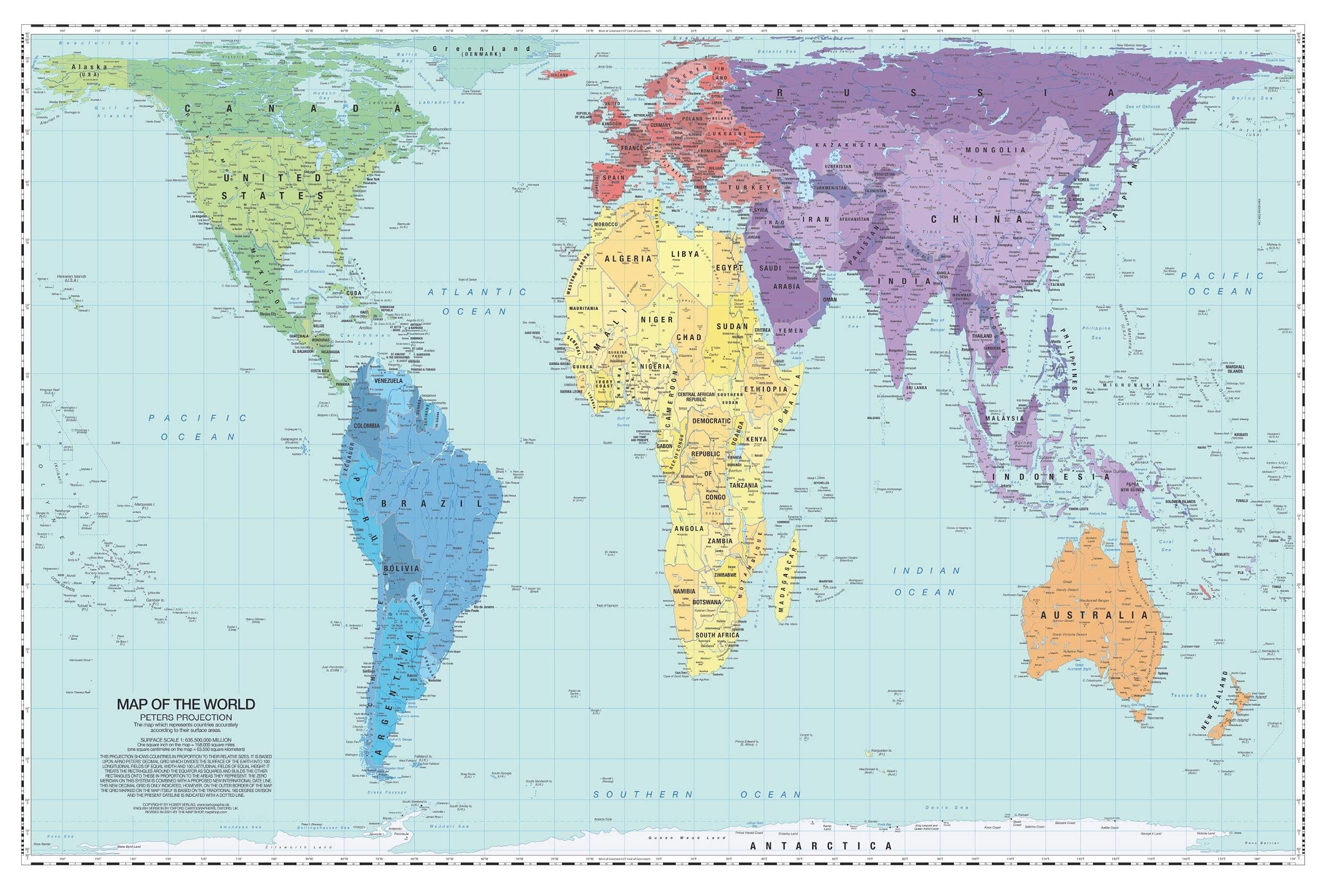
@infobeautiful i’m definitely a fan of the Peters Projection.
I clearly remember a 🤯 moment from first or second grade when I saw it for the first time!


@infobeautiful "Yet another"? Isn't that the one reason why people keep tutting at it all the time?
(And, sadly, many probably think that Mercator is the only projection with this particular distortion or that there are ideal projections that don't distort anything.)

@infobeautiful Someone please fwd this to trump


@infobeautiful oh look how tiny #murica really is... just like his hands 


What this map shows is that America's penis (Florida) is much smaller than Americans think.


A very bad graphic. The point is taken but that map is very inaccurate. Eg the Canadian southern border should fit perfectly with the USA but it is shrink way too much. There are much better maps which account for there projection errors.

@infobeautiful it all depends on what the purpose of the map is.


@infobeautiful Very useful to see. Done by a professional, so I must be wrong, but where I am (north New Zealand) is at about the same latitude as San Francisco, but we seem to be less shrunk?
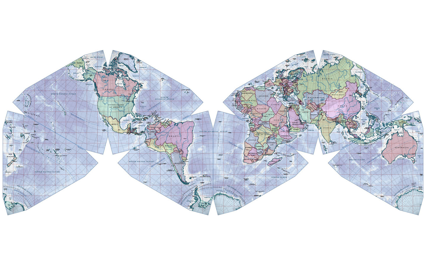
Re discussion about more realistic projections, my favourite is Cahill-Keyes. http://www.genekeyes.com/world_map_poster.html


@infobeautiful Equadorians have no issue with this projection tho


@infobeautiful What would the "True Country Size Map" be called? I'm ready to orient myself toward something else than the Mercator map projection.


Kazakhstan is huge, but it's not that huge.
Maybe I'm confused about what this is showing.


@infobeautiful
Well Austrailia is wrong for a start since about 70% is desert / uninhabited


Fascinating, thanks!
Here's obligatory link to great bit from TV's "The West Wing." Where cartographers compare Mercator versus Peters projections for stunned C.J. and Josh.
The head map guy is played with perfect drollery by the invaluable John Billingsley (Star Trek: Enterprise; The Man from Earth, etc.).
Cartographer: "Nothing's where you think it is."
C.J: "Where is it?"
Cartographer: "I'm glad you asked…"


@infobeautiful It’s like stepping out of a cold shower!

They gave some Eastern Canada provinces to the US. Don't comply in advance!


@infobeautiful MAGAmoron must use Mercator Projection when boasting to underage girls about his dick.
")

@infobeautiful
Just learned something.
On the typical Map, that I had in school, the size of nealry every country was wrong.
Thx for this.
Now I have a new rabit-hole...

@infobeautiful always interesting to see how different maps tell different stories


The USA isn't that big, let's invade it!

Author of this map:
https://www.metoffice.gov.uk/research/people/neil-kaye


@infobeautiful ah sure Greenland is TINY.
Denmark should just hand it over and quit this dog in the manger stuff.
/s
@infobeautiful Abolish this colonial remnant already!!


Can we see a map where it's flipped? I mean where the south is made bigger just as now the north is. Just to have a comparison of what we have been looking at all the time.