

@suihkulokki I enabled quick boost as soon as the dialog became the default. I agree, there are too many dialogs and toggles everywhere, and it seems more are on the way. @MastodonEngineering
Discussion
Loading...
Discussion
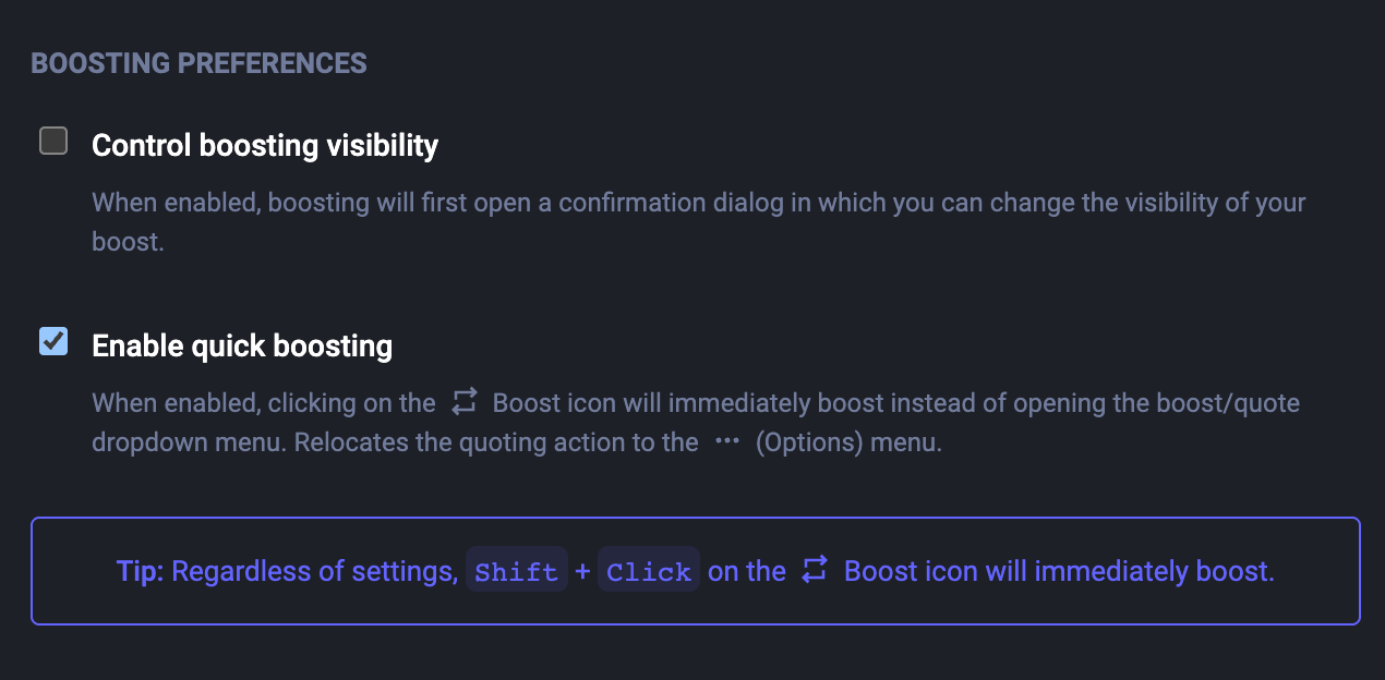


@rolle It really seems like the UX is going the wrong direction, added friction in several places.I think I can observe clear trend of less boosts ever since they made boosting a two-click action. @MastodonEngineering
@suihkulokki I enabled quick boost as soon as the dialog became the default. I agree, there are too many dialogs and toggles everywhere, and it seems more are on the way. @MastodonEngineering


@rolle @suihkulokki @MastodonEngineering Could we have this in @pachli as well, quick boosts? I hardly ever use quote posts.
@kallekn Shouldn't it already exist as a pretty basic feature in your preferences since 4.5+? If you have quote posts, you should have this already.
EDIT: Oh, somehow misread Pachli Android app... yeah, it's not implemented in all of the apps.
What I mean specifically are these endless toggles everywhere. Click-click-click-click. Before it was just a click.
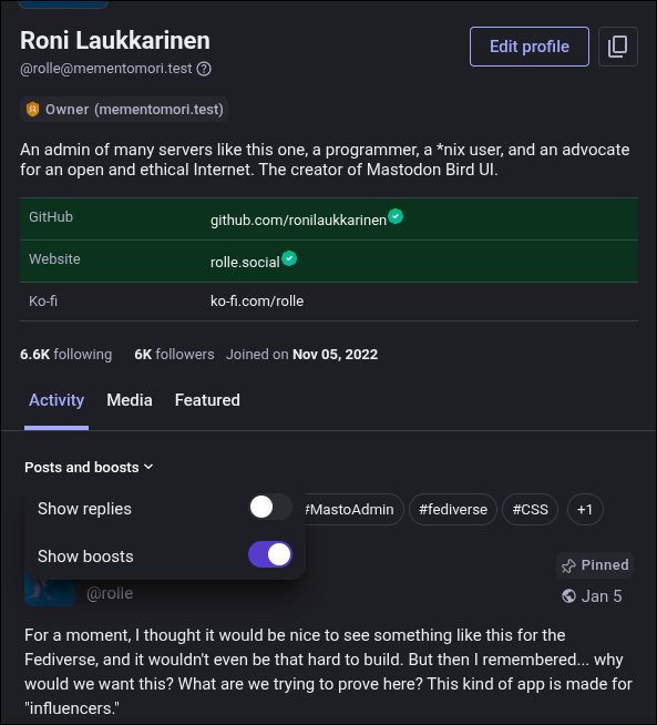
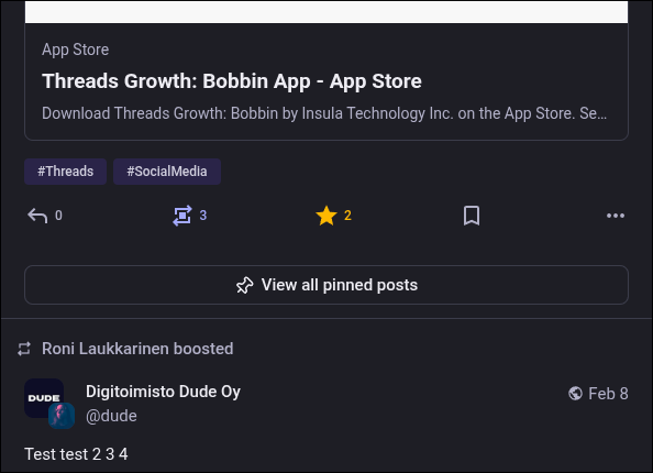
Also, why change the most used hashtags into a horizontal list? And what's with that huge button to show more pinned items? What was wrong with the old setup? The carousel wasn't great either, but I liked the version that showed them one below the other.
What problems are we actually trying to solve here?
I know these aren't shipped yet, but does anyone actually use Figma and discuss UX?
2 media


@rolle I appreciate the feedback and the concerns here, but I want to point our that those changes are not for the sake of changing.
Our designer (and the various platform developers) are trying to solve many of the problems existing with those interface, while making space for some new features. All of this is deeply thought and discussed (internally, not sure how we could be more public on this) and designed in Figma (for all platforms) before implementation. Then changed if wrong.
I feel like my Mastodon fork will eventually go completely off-branch since I've been cherry-picking features anyway after 4.5. Some of the core ones just don't make sense to me.


@rolle I'd love to see a genuine fork that has the UI sensibility of your Bird UI…
@trbutler My fork has included Mastodon Bird UI from the beginning, but it's just a modified Mastodon and nothing "official" like glitch-ui https://github.com/mementomori-social/mastodon
We do have more and more "features" though: https://help.mementomori.social/mementomori.social/instance-features
We'll see what happens in the future.

1 more replies (not shown)