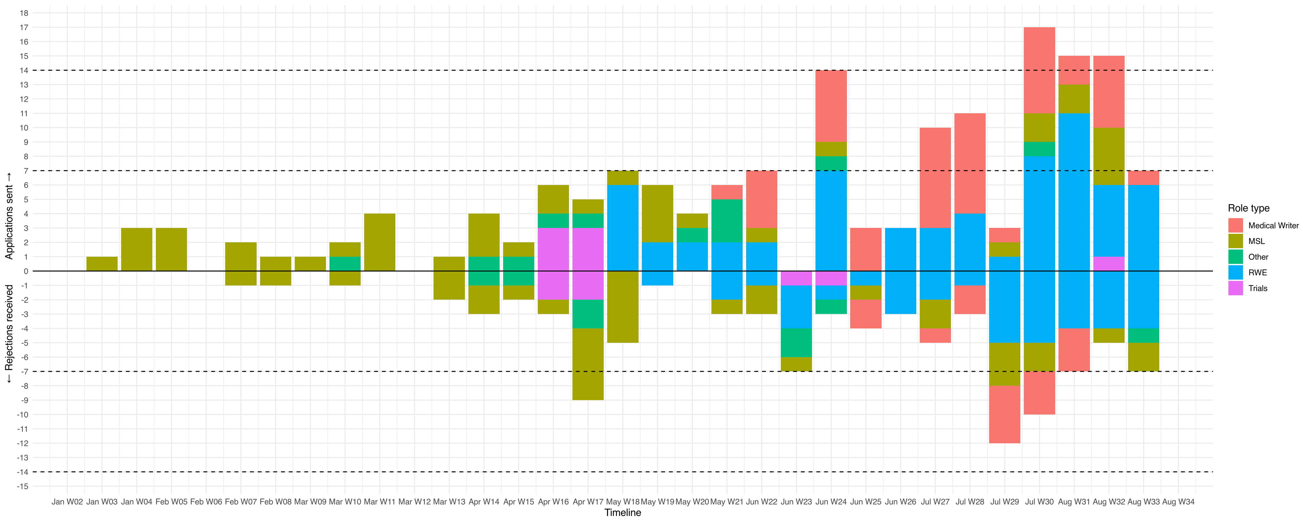
A stacked bar chart showing the applications I've sent out, by week (x-axis) where the colour (Medical Writer = red, MSL = yellow, Other = green, RWE = blue, trials = purple) represent different job categories. There's a big uptick in the number of jobs applied to per week starting in June (week 24) with peaks of 14, 16, 17, 16 sent out per week recently.
Below the 0 line, I've also plotted rejections per week with the same colour scheme; the rejections mirror the applications pretty well, with a little delay.
I've also put dashed lines at +/- 7 and +/- 14, to indicate weeks where I got out as many as one or in some cases, two applications per day (and weeks where I got as many as one rejection per day)
In the last week, I sent out 6 applications for RWE jobs and 1 for a Medical Writer job and got 7 rejections (4 RWE, 2 MSL and 1 Other)