
RE: https://mas.to/@grassrootsforeurope/116964168760008487
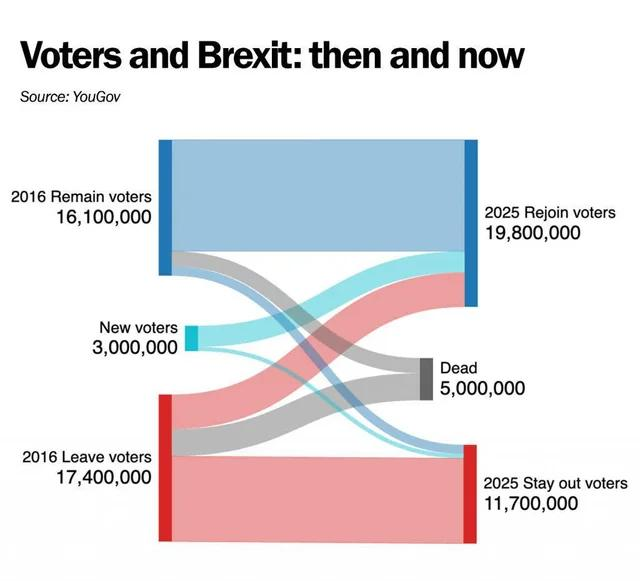
Example of a graphic that is almost indecipherable.
Discussion
RE: https://mas.to/@grassrootsforeurope/116964168760008487
Example of a graphic that is almost indecipherable.
@dangillmor Perfectly clear to me.
(And I am not in the "Dead" segment)
@dangillmor Seems clear enough: the implication is people who have died were wiser than the 11,000,000 dupes and rubes who want to continue smacking themselves in the face.
@count_01 I think it shows the opposite of that...
@dangillmor Thought you said it was unclear what, if anything, it showed. Now it shows the Leave faction were wise?
⬆️ @dangillmor
>> Example of a graphic that is almost indecipherable.
Why is it undecipherable? Seems pretty clear.
Interesting #Brexit chart shows that more people than those who are now dead who initially voted FOR Brexit now want to rejoin the #EuropeanUnion.
I bet many of those dead would also have wanted to #RejoinEU had they not died.
@dangillmor
Short version. Brexit support is literally dying off...
@dangillmori I find it fairly clear, although the sources of the numbers are missing. Given it’s labeled “YouGov”, I assume it’s extrapolated from a polled sample.
Of the 5m deaths, maybe 60% were leavers. I’d guess this mostly reflects their being relatively older, although possibly also less wealthy?
The 3m new voters, presumably almost all young people, skew heavily to rejoin.
The 3m new vs 5m dead is interesting. Surely the population isn’t falling that fast?
@dangillmor What part of it don't you understand? It seems very clear to me. How would you graph it?
@dangillmor
It is very clear to me; former Brexit voters have been slightly more prone to end up pushing Daisies.
@dangillmor Ah yes, the classic "Lava Lamp" chart, we all know it well from our schooldays.
@dangillmor I actually like it. Very clear to me.

Install bonfire.cafe
Get the full app experience