Discussion
Loading...

Post

Log in
  • About
  • Code of conduct
  • Privacy
  • Users
  • Instances
  • About Bonfire
Cassidy James :rr: :gg: :fh:
@cassidy@mastodon.blaede.family  ·  activity timestamp 6 days ago

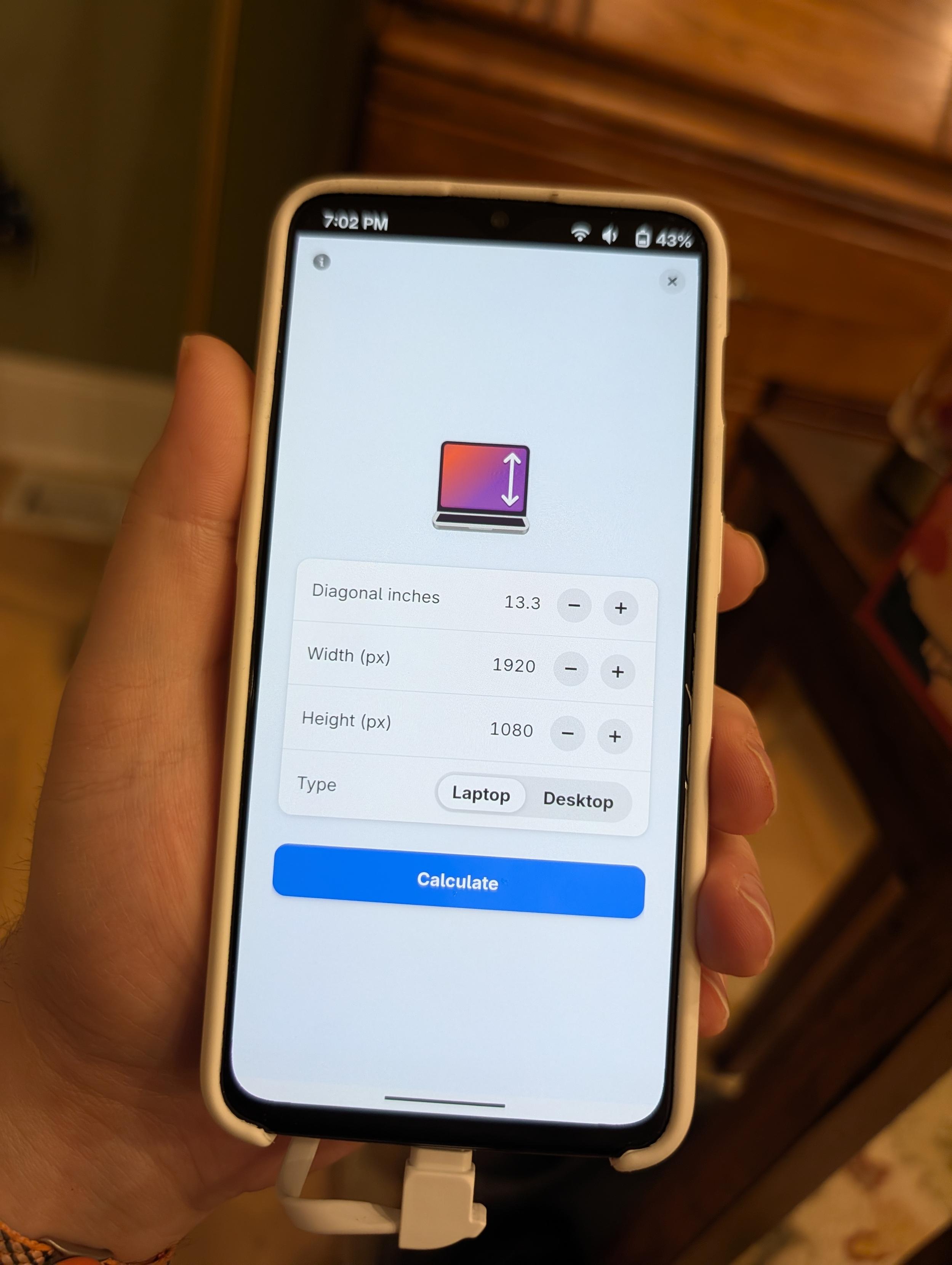
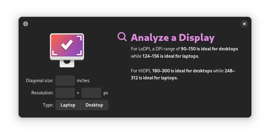
I finally did a little UI rewrite for Dippi 👀

#GNOME #Adwaita #libadwaita #Linux #LinuxMobile #OpenSource

2 media
A phone running Dippi, which is a display DPI/aspect ratio calculator. The screen shows the inputs for a 13.3" diagonal laptop display with a resolution of 1920×1080.
A phone showing the result for the display in the other image. It reads: 

“Potentially Problematic. 
Relatively high resolution, but not quite HiDPI. Text and UI may be too small by default, but forcing HiDPI would make them appear too large. The experience may be slightly improved by increasing the text size.” 

Below, it has the specs (16:9, 165 DPI, 1920×1080) and a prominent button to “share results.”
A phone showing the result for the display in the other image. It reads: “Potentially Problematic. Relatively high resolution, but not quite HiDPI. Text and UI may be too small by default, but forcing HiDPI would make them appear too large. The experience may be slightly improved by increasing the text size.” Below, it has the specs (16:9, 165 DPI, 1920×1080) and a prominent button to “share results.”
  • Copy link
  • Flag this post
  • Block
Anatole Gérard—Chevais
@anatolegc@piaille.fr  ·  activity timestamp 6 days ago

@cassidy Oneplus 6t?

  • Copy link
  • Flag this comment
  • Block
Cassidy James :rr: :gg: :fh:
@cassidy@mastodon.blaede.family  ·  activity timestamp 6 days ago

@anatolegc yep!

  • Copy link
  • Flag this comment
  • Block
Cassidy James :rr: :gg: :fh:
@cassidy@mastodon.blaede.family  ·  activity timestamp 6 days ago

I think it still looks okay on desktop, too! It’s almost the exact same size as before by default, but uses the space better and can of course adapt to nearly any window size (yay tiling!).

Also, I continue to push at the accent color tinting in my apps. I think it’s nice. Here, my computer has a purple accent.

#GNOME #Adwaita #libadwaita #Linux #OpenSource

2 media
Screenshot of Dippi in a dark style on the desktop, where the two screens are side-by-side. There is a subtle purple tint to the app. The left half of the app has inputs for screen size, resolution, and type while the right size reads:

“Analyze a Display.
For LoDPI, a DPI range of 90–150 is ideal for desktops while 124–156 is ideal for laptops. For HiDPI, 180–300 is ideal for desktops while 248–312 is ideal for laptops.”
Screenshot of Dippi in a dark style on the desktop, where the two screens are side-by-side. There is a subtle purple tint to the app. The left half of the app has inputs for screen size, resolution, and type while the right size reads: “Analyze a Display. For LoDPI, a DPI range of 90–150 is ideal for desktops while 124–156 is ideal for laptops. For HiDPI, 180–300 is ideal for desktops while 248–312 is ideal for laptops.”
Screenshot of Dippi on the desktop in a light style. It has a subtle purple tint. The left side is filled out for a 13.3" 1920×1080 laptop display, and the right side reads:

Potentially Problematic
Screenshot of Dippi on the desktop in a light style. It has a subtle purple tint. The left side is filled out for a 13.3" 1920×1080 laptop display, and the right side reads: Potentially Problematic
  • Copy link
  • Flag this comment
  • Block
Siilwyn
Siilwyn
@Siilwyn@mastodon.social  ·  activity timestamp 5 days ago

@cassidy looks great!

  • Copy link
  • Flag this comment
  • Block
Cassidy James :rr: :gg: :fh:
@cassidy@mastodon.blaede.family  ·  activity timestamp 6 days ago

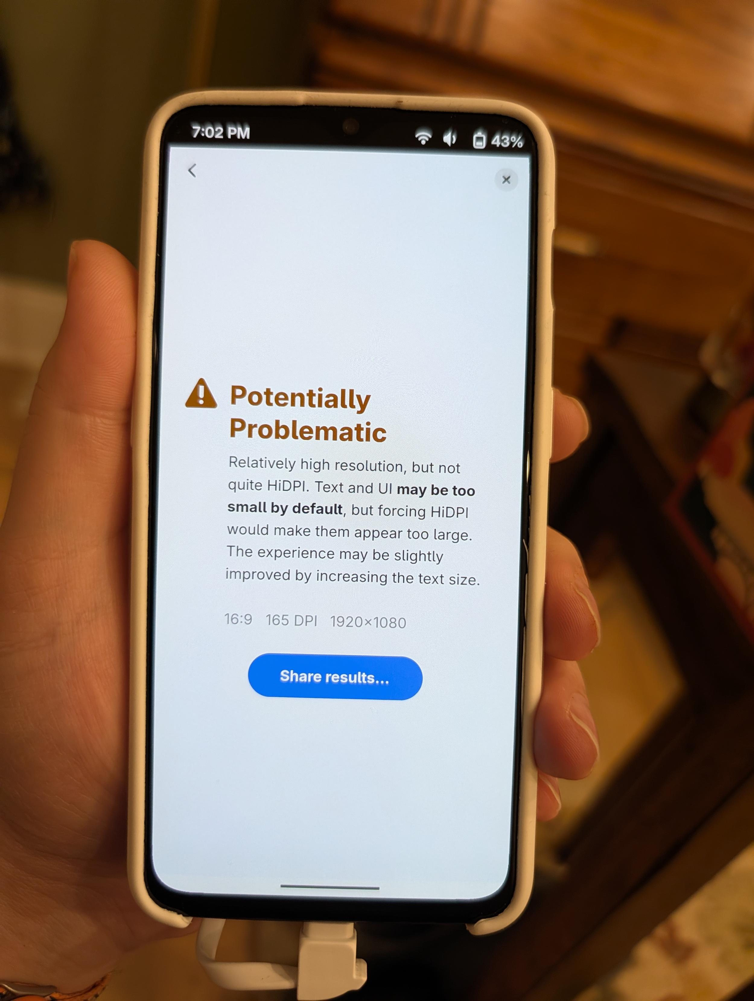
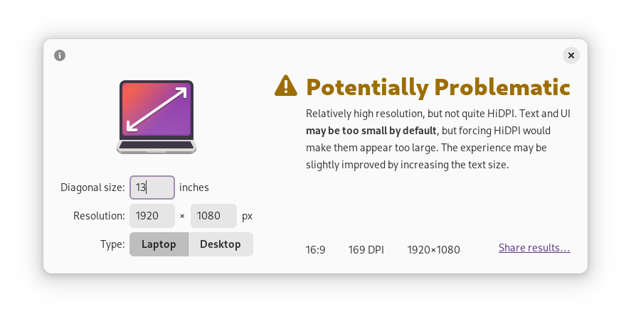
My next phase is probably to rework the results screen; it’s text-heavy which is why I kept the left-alignment for text, but it gets a bit awkward at certain sizes. I’ll probably try out some more Adwaita style widgetry here as well with the icon above and centered text. Maybe reduce the over all text. 🤷

  • Copy link
  • Flag this comment
  • Block
Cassidy James :rr: :gg: :fh:
@cassidy@mastodon.blaede.family  ·  activity timestamp 6 days ago

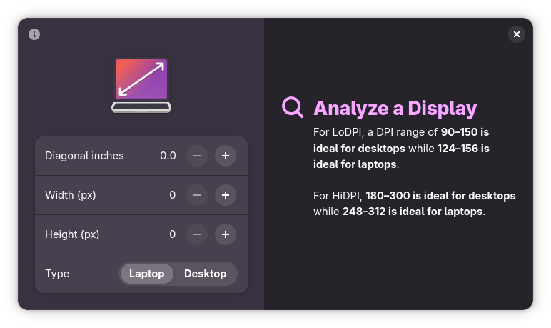
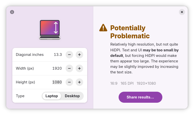
Oh, and… the “before” screenshots for your comparison enjoyment. 🙈

2 media
The same default screenshot as earlier on the thread, but ugly and old looking. It is a very GNOME 2-era design.
The same “potentially problematic” screenshot as earlier on the thread, but ugly and old looking. It is a very GNOME 2-era design.
  • Copy link
  • Flag this comment
  • Block

bonfire.cafe

A space for Bonfire maintainers and contributors to communicate

bonfire.cafe: About · Code of conduct · Privacy · Users · Instances
Bonfire social · 1.0.2-alpha.34 no JS en
Automatic federation enabled
Log in
Instance logo
  • Explore
  • About
  • Members
  • Code of Conduct