Here's my proposal on how to make it easier to understand how logging into servers works in the fediverse. What do you all think?
Post
Replies:
10


@stefan It's hard for me to judge because the current set up was really intuitive to me... but I'm also aware what's intuitive to an autistic person who's spcial interest is computers and has been online since the 90s is not necessarily intuitive to everyone else. That in mind, I don't see any improvement, but more importantly, I don't see that example as worse - so it probably is helpful to users who aren't me.
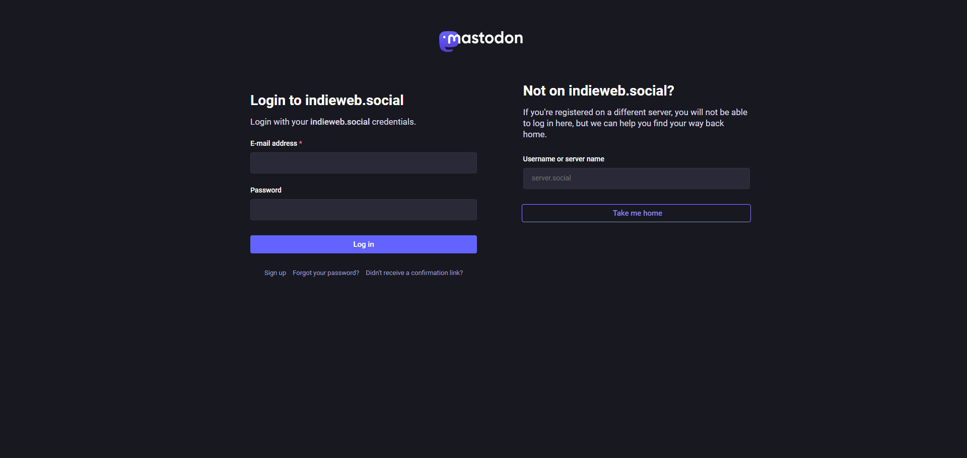
@hellomiakoda Yeah, to me this feels a bit redundant personally, but I do like the idea of making this extra clear, eliminating the chance of anyone getting confused about needing to log in or create another account, as much as possible.
I've seen a few comments about that even relatively recently, outside of the one that I mentioned in the ticket.
@stefan I just don't understand people's persistant avoidance of the fediverse. They leave one big tech platform that went fashy just to go to another, which then gets fashy, and they go to another....
I don't get it. What is the big draw of these big tech platforms? (Not including users who just intend to get monotized - that one's obvious)
@hellomiakoda The bottom line is, people go where there are people. It makes sense to me that most people will either stay on Twitter/X because that's where most of their friends and accounts they follow remained, or move to Bluesky, because that's where everyone in their circles has moved.
We had a fantastic opportunity to attract the early adopters, who would then bring over their followers, but we fumbled it with toxic, gatekeepy, purity-testing, friendly-fire culture.
Sure, people may have complained about the lack of quote posts and missing replies, and those have been (mostly) addressed, but we're not seeing a huge surge of people signing up or logging back here.


@stefan From my experience, that’s too much information to parse. It might be better to add an additional step to present smaller chunks of information and only one action per step.
In this case what you really want is to communicate that there is a choice to make: this server or another one. The login can follow.
I’d do it like this, tweak the UI copy and then run user tests:
Login
====
Please select to proceed:
buttons: [indieweb.social] [Other server]
textlink: What does this mean?
@reimar Adding more information was the goal for me, to force the user to pay more attention and not just assume this is a regular login page without reading the full instructions.
But I do like your idea, maybe the extra button would achieve the same. Would you be interested in leaving a comment on the GitHub issue?
")