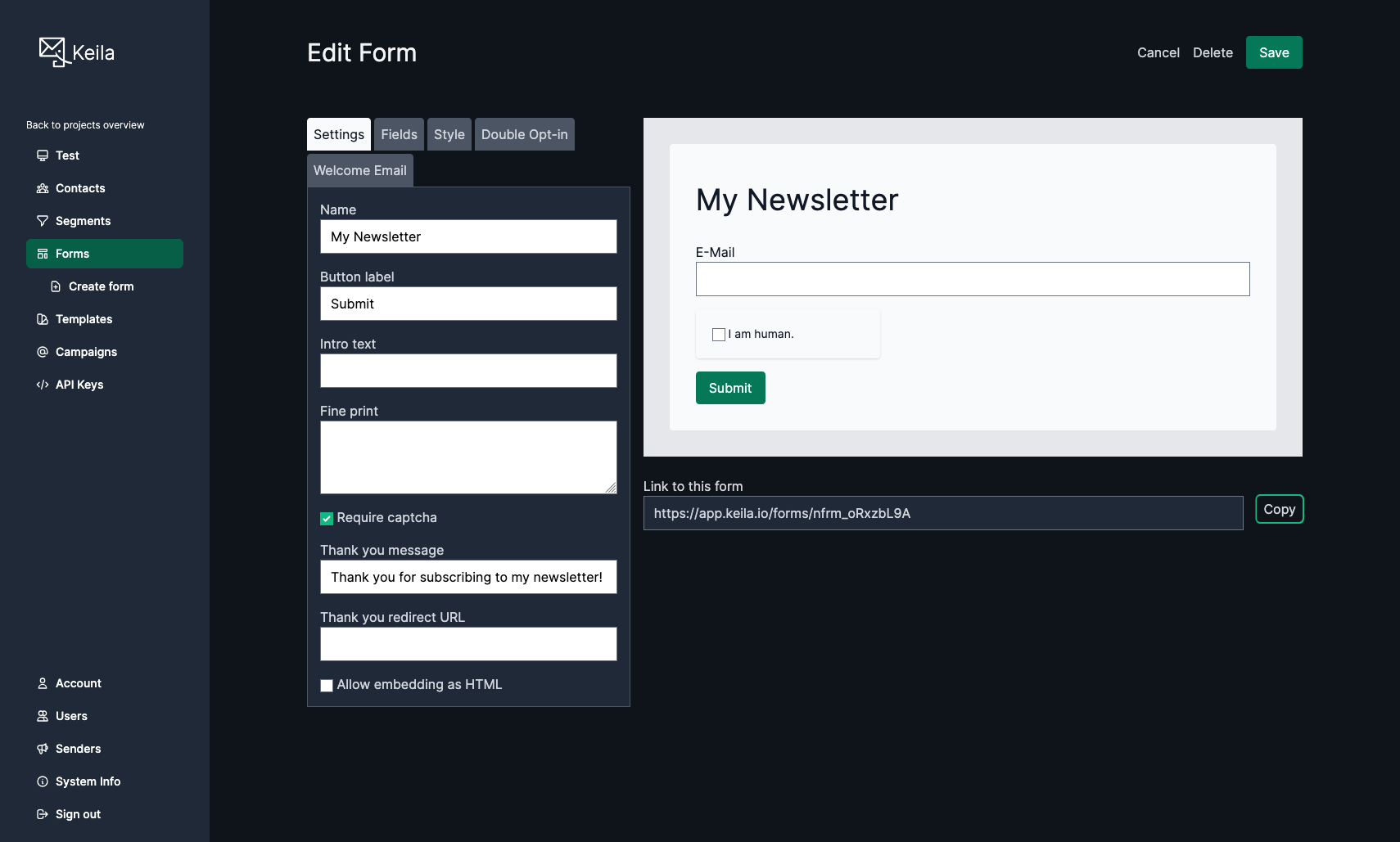
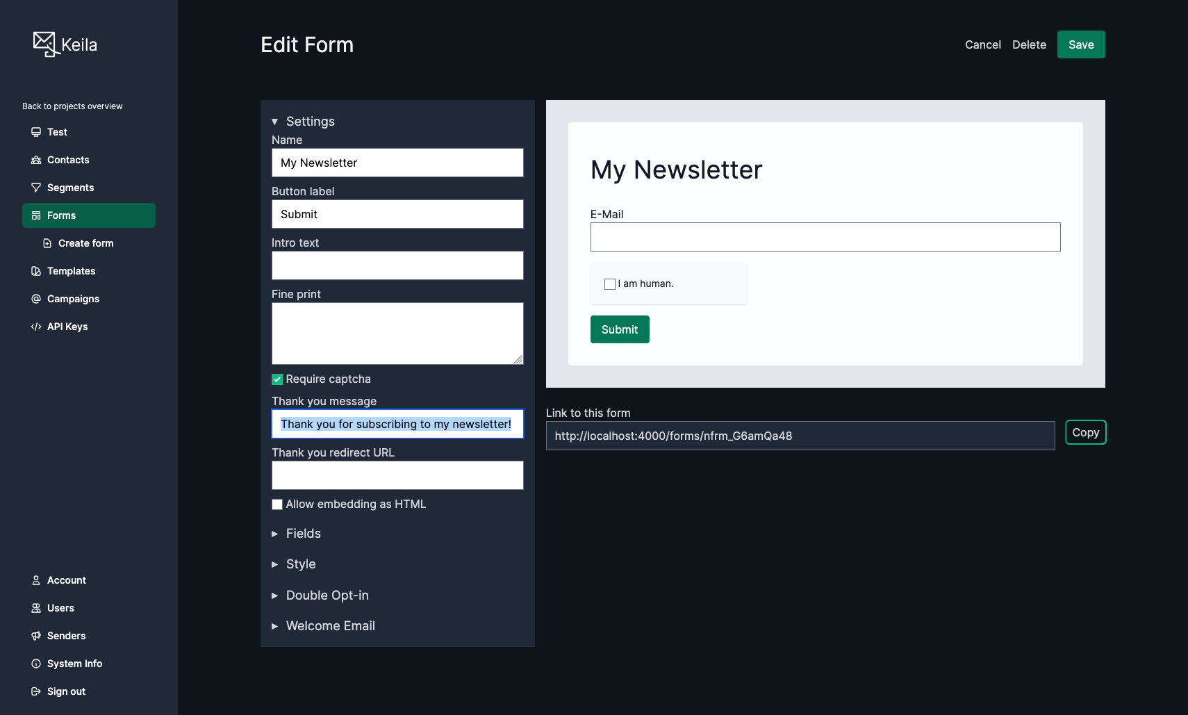
I'm considering replacing the tabs (image 1) with an accordion for the form editor (image 2).
Any opinions?
2 media
Post
I'm considering replacing the tabs (image 1) with an accordion for the form editor (image 2).
Any opinions?
@keila deeper question: which of those are required? Surface only required, hide the rest.
@keila Are these five specific tabs and their contents locked in? Maybe a rework could get you back to 4.
I’m no UX researcher, but accordions always feel like they’re semantically sequential, whereas these each feel like discrete (if still interrelated) parts of setup, so I think an accordion might be the wrong presentation format.
@moshimotsu I want to eventually rework the form editor so that the settings, fields, and style tabs are no longer necessary (i. e. allow inline editing of all that). But that is going to take quite a while so there needs to be a solution until then.
@keila does the user need to switch between tabs/accordions often to get work done? Then keep tabs. It’s much faster to switch. Is the first tab much more important and more used than the others, then maybe accordions?
@solidjellycube Good question. I think they are of similar importance and yes, users might switch back and forth when editing a form. And what I really like about the tabs is that they make the options immediately visible. But I think the current design makes them look a bit cluttered.
@keila I actually like option 2 better — having everything available on one page looks cleaner to me.

Install bonfire.cafe
Get the full app experience