Discussion
Loading...

Post

Log in
  • About
  • Code of conduct
  • Privacy
  • Users
  • Instances
  • About Bonfire
Noam Ross
Noam Ross
@noamross@ecoevo.social  路  activity timestamp 2 days ago

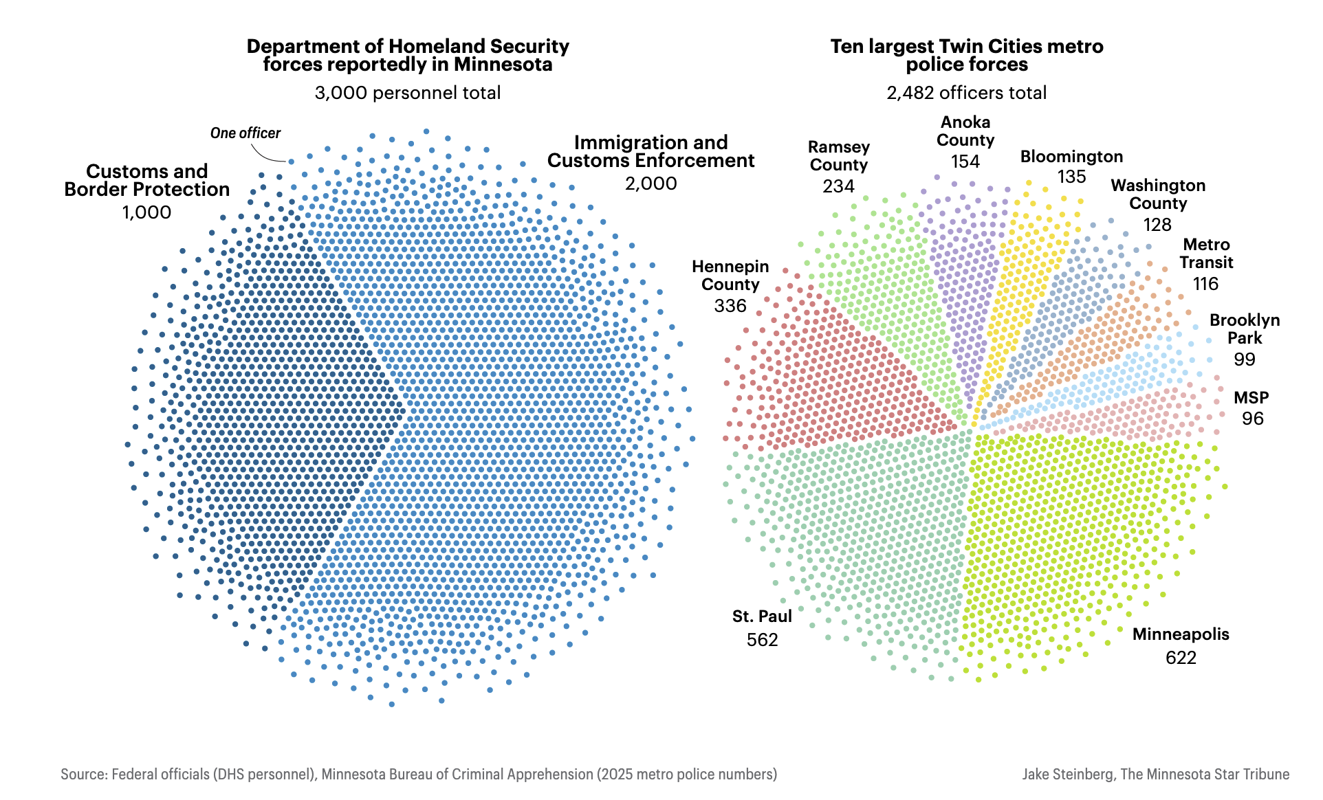
#RStats challenge: How to make a pie-beeswarm like this one from the Minnesota Star Tribune showing the relative sizes of ICE/CBP and local police forces?

https://www.startribune.com/how-ice-numbers-compare-to-twin-cities-largest-police-forces/601562617

(Challenge 2: Try not to argue about pie charts in the replies 馃槈)

A data visualization comparing personnel counts using two large, circular clusters of dots where each point represents a single officer. The left cluster forms a solid blue circle representing DHS forces, while the right cluster is segmented into multicolored wedges like a pie chart to distinguish ten different Twin Cities police forces, combining the granularity of a dot-density plot with the sectional geometry of a pie chart.
  • Copy link
  • Flag this post
  • Block
Elio Campitelli
Elio Campitelli
@eliocamp@mastodon.social replied  路  activity timestamp yesterday

@noamross Sample random points in polar coordinates applying some constrains to ensure semi equal coverage. Then colour them based on their angle, mapping angle ranges to particular variables.

  • Copy link
  • Flag this comment
  • Block
kupac^ESC:wq
kupac^ESC:wq
@kupac@functional.cafe replied  路  activity timestamp yesterday

@noamross
A simple bar chart is far better than this.

#dataviz #datavis #rstats

  • Copy link
  • Flag this comment
  • Block
Tyler Smith
Tyler Smith
@plantarum@ottawa.place replied  路  activity timestamp yesterday

@noamross does that convey more information than a conventional pie chart? Do the dots represent something different than the area of the pie slices?

  • Copy link
  • Flag this comment
  • Block
Noam Ross
Noam Ross
@noamross@ecoevo.social replied  路  activity timestamp yesterday

@plantarum Only in that they represent absolute counts.

  • Copy link
  • Flag this comment
  • Block
Noam Ross
Noam Ross
@noamross@ecoevo.social replied  路  activity timestamp 2 days ago

This is like a quantile dotplot for a dirichlet distribution. @mjskay

  • Copy link
  • Flag this comment
  • Block

bonfire.cafe

A space for Bonfire maintainers and contributors to communicate

bonfire.cafe: About 路 Code of conduct 路 Privacy 路 Users 路 Instances
Bonfire social 路 1.0.1 no JS en
Automatic federation enabled
Log in
  • Explore
  • About
  • Members
  • Code of Conduct