Discussion
Loading...

Post

  • About
  • Code of conduct
  • Privacy
  • Users
  • Instances
  • About Bonfire
Anton van Tetering
@studiohaverstraat@mapstodon.space  ·  activity timestamp last month

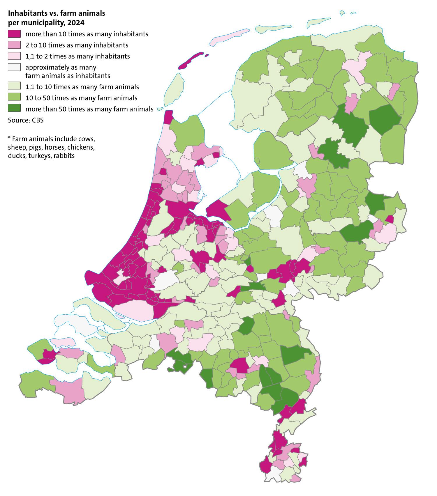
Map of the ratio between the total number of farm animals and the number of inhabitants per municipality in the Netherlands based on data of Statistics Netherlands (CBS).

#30daymapchallenge day 3: polygons #maps #thenetherlands #statistics #cartography

Map of the municipalities of the Netherlands with purple colors for municipalities with a lot of inhabitants compared to the number of farm animals (mainly cities) and green colors for municipalities with a lot of farm animals compared to the number of inhabitants (mainly in the east and southeast).
  • Copy link
  • Flag this post
  • Block
Log in

bonfire.cafe

A space for Bonfire maintainers and contributors to communicate

bonfire.cafe: About · Code of conduct · Privacy · Users · Instances
Bonfire social · 1.0.1-alpha.8 no JS en
Automatic federation enabled
  • Explore
  • About
  • Members
  • Code of Conduct
Home
Login