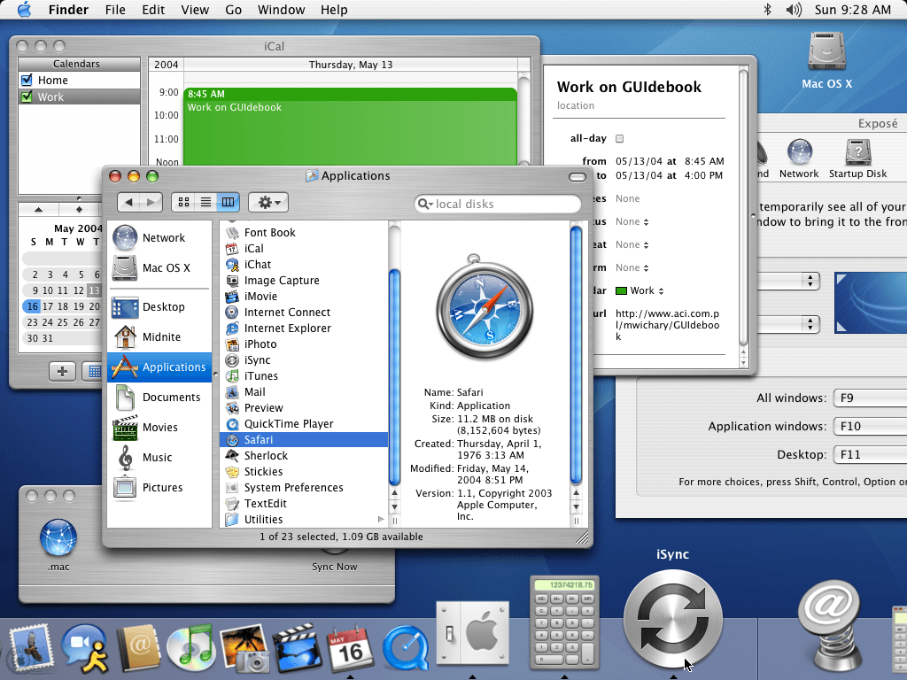
This is #Mac OS Panther, released in 2004. Its UI has many things wrong with it (and is not pretty). But what it does well is a strong and obvious distinction between controls and data. Buttons and borders are clearly defined. Icons are immediately recognizable, even zoomed out and tiny like in this picture. No transparency or blending. Scroll state always obvious through visible bars.
What this adds up to is reduced cognitive load when using the interface. Everything is plain, you can find a thing immediately. This is a stark contrast to #macOSTahoe and the many poor decisions in that UI.