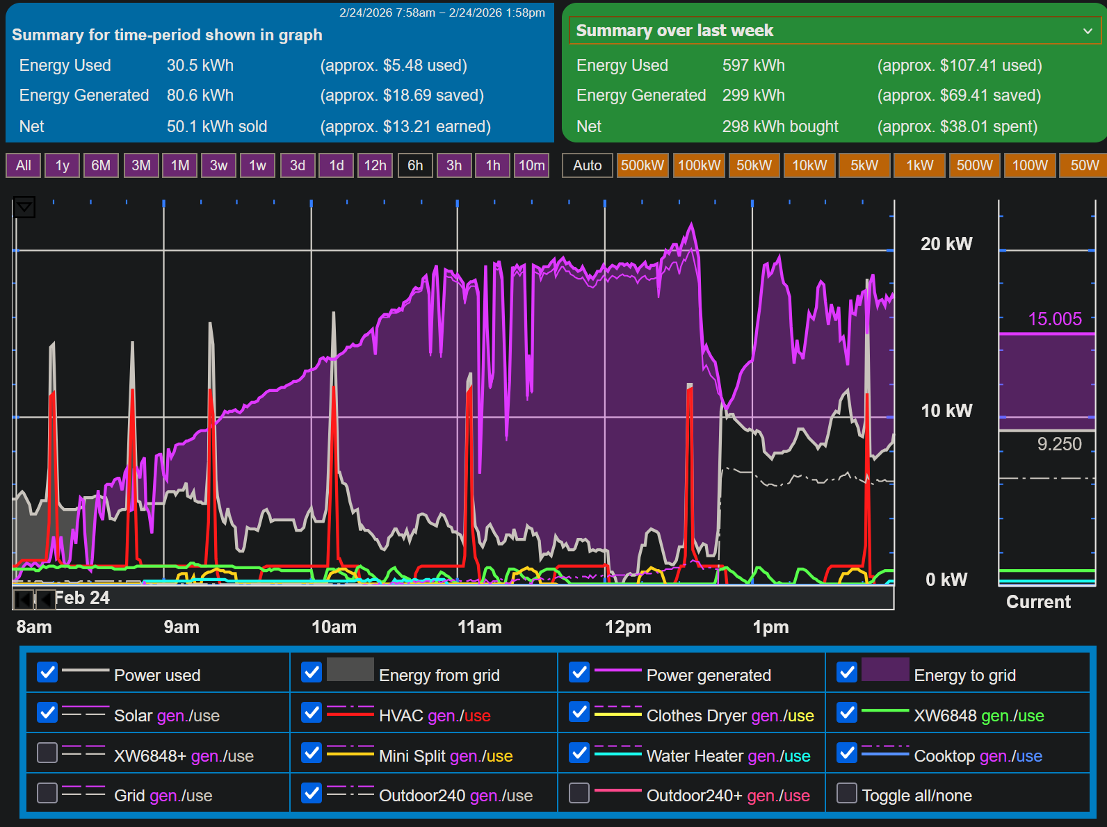
This image presents a complex energy monitoring dashboard for February 24, 2026, showing a six-hour power graph with detailed summaries above and a legend below. A large purple area dominates the center, representing energy being sold back to the grid, which peaked at over 20 kW around noon. Several sharp red vertical spikes indicate the HVAC system turning on, while smaller wavy lines along the bottom track energy use for appliances like the clothes dryer, mini split, and water heater. The top left summary shows that for this six-hour period, 30.5 kWh of energy was used while a significantly higher 80.6 kWh was generated, resulting in a net of 50.1 kWh sold back to the grid for a profit of $13.21. In contrast, the top right summary for the past week shows a net purchase of 298 kWh from the grid, costing $38.01. The legend at the bottom confirms that purple represents power generated and energy sent to the grid, while grey represents power used and energy taken from the grid. A dashed gray line represents EV charging, which never exceeds solar production.