Discussion
Loading...

Post

Log in
  • About
  • Code of conduct
  • Privacy
  • Users
  • Instances
  • About Bonfire
Information Is Beautiful
@infobeautiful@vis.social  ·  activity timestamp 16 hours ago

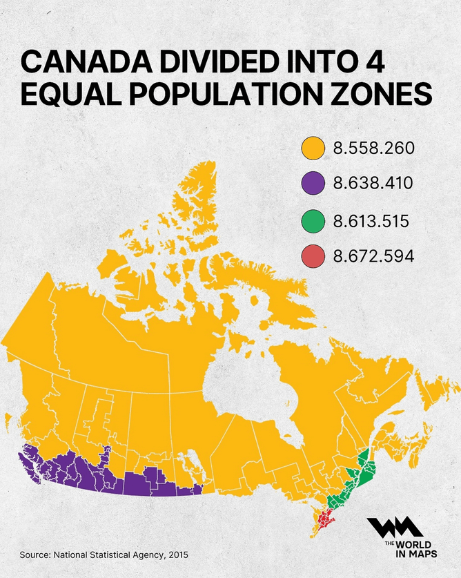
At a glance, Canada looks vast and evenly spread but when you divide the country by population, the picture changes dramatically...

by @the.world.in.maps

This map titled “CANADA DIVIDED INTO 4 EQUAL POPULATION ZONES” visually reconfigures Canada’s geography by grouping its provinces and territories into four distinct regions—each colored differently (yellow, purple, green, red)—so that each zone contains nearly identical populations as of 2015, with the yellow zone accounting for 8,558,260 people, the purple for 8,638,410, the green for 8,613,515, and the red for 8,672,594, revealing how population density skews heavily toward southern urban centers while vast northern and rural areas remain sparsely inhabited; the map uses a textured off-white background and clearly labeled color-coded population figures to emphasize demographic concentration rather than land area, with the source cited as the National Statistical Agency, 2015, and the logo of “The World in Maps” displayed in the lower right corner.
  • Copy link
  • Flag this post
  • Block
Jim Rootham
Jim Rootham
@jrootham@mastodon.acm.org  ·  activity timestamp 7 hours ago

@infobeautiful Many decades ago (circa 1970) the Queen's Printer created an isodemographic map of Canada using ball bearings and flexible steel splines. The result was gorgeous and informative.

  • Copy link
  • Flag this comment
  • Block
JackMex
JackMex
@JackMexa4@mastodon.social  ·  activity timestamp 11 hours ago

@infobeautiful

🥶

  • Copy link
  • Flag this comment
  • Block
Carolyn
Carolyn
@CStamp@mastodon.social  ·  activity timestamp 11 hours ago

@infobeautiful At a glance perhaps by folk who’ve only spent time along the southern corridor. Canadians who’ve spent time outside that are very aware of this. :)

  • Copy link
  • Flag this comment
  • Block
Come On Giant Asteroid!
@VE2UWY@mastodon.radio  ·  activity timestamp 12 hours ago

@infobeautiful

Not exactly a population density map but close enough.

  • Copy link
  • Flag this comment
  • Block
ShadSterling
ShadSterling
@ShadSterling@mastodon.social  ·  activity timestamp 12 hours ago

@infobeautiful is that Toronto in red? I didn’t realize it was so much denser than the other cities

  • Copy link
  • Flag this comment
  • Block
Robin Barton
Robin Barton
@Robo105@mastodon.social  ·  activity timestamp 13 hours ago

@infobeautiful A wonderful way to look at our Country

  • Copy link
  • Flag this comment
  • Block
Arena Cops 🇺🇦✌
Arena Cops 🇺🇦✌
@ArenaCops@infosec.exchange  ·  activity timestamp 13 hours ago

@infobeautiful Canada's still vast — and not for sale & annexation, I'm pretty sure! 😎💪✌🇨🇦🇺🇸

  • Copy link
  • Flag this comment
  • Block
Susan Borda
Susan Borda
@mutanthumb@digipres.club  ·  activity timestamp 15 hours ago

@infobeautiful it is wild that California has a larger population than Canada

  • Copy link
  • Flag this comment
  • Block
Jari Komppa 🇫🇮
Jari Komppa 🇫🇮
@sol_hsa@mastodon.gamedev.place  ·  activity timestamp 15 hours ago

@infobeautiful and the public transit between the population centers is, as I understand, pretty nonexistent.

  • Copy link
  • Flag this comment
  • Block
lyon
lyon
@lyon@mastodon.social  ·  activity timestamp 16 hours ago

@infobeautiful curious to know how heavily weighted the entire yellow section is towards the Atlantic provinces

  • Copy link
  • Flag this comment
  • Block
Flaming Cheeto
Flaming Cheeto
@PizzaDemon@mastodon.online  ·  activity timestamp 16 hours ago

@infobeautiful I like how the purple spike in Alberta is reaching up to grab Edmonton

  • Copy link
  • Flag this comment
  • Block

bonfire.cafe

A space for Bonfire maintainers and contributors to communicate

bonfire.cafe: About · Code of conduct · Privacy · Users · Instances
Bonfire social · 1.0.2-alpha.29 no JS en
Automatic federation enabled
Log in
  • Explore
  • About
  • Members
  • Code of Conduct