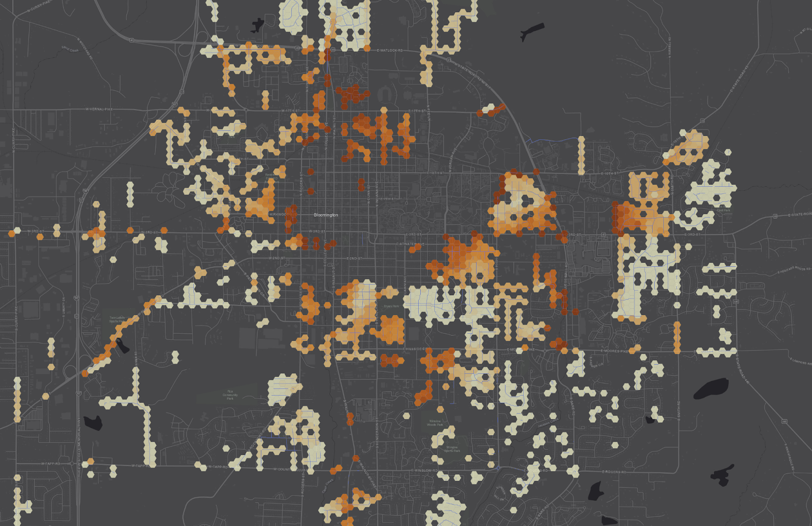
This is my first map visualizing the metric I'm working for "Percent High Comfort Bikeshed". This visualizes in read all the places I'm allowed to bike within 10 minutes of my house, while the routes in white are the ones that can only be accessed using "high comfort" faciliites. It looks about right. There's no way to comfortably access the areas to the north bybike and there's this mall sprawl that makes another chunk inaccessible. 🧵
Another #UrbanPlanning algorithm I plan to pick back up is like "Percent High Comfort BikeShed" (or WalkShed).
The idea is compute the area from a given a location that you bike to within 15 minutes and then the area that bike to *with high comfort*, like protected bike lanes and so forth. Divide them to get the "Percent High Comfort Bikeshed" for that location.