Discussion
Loading...

Post

Log in
  • About
  • Code of conduct
  • Privacy
  • Users
  • Instances
  • About Bonfire
Cartyosh
Cartyosh
@cartyosh@mastodon.social  ·  activity timestamp 2 months ago

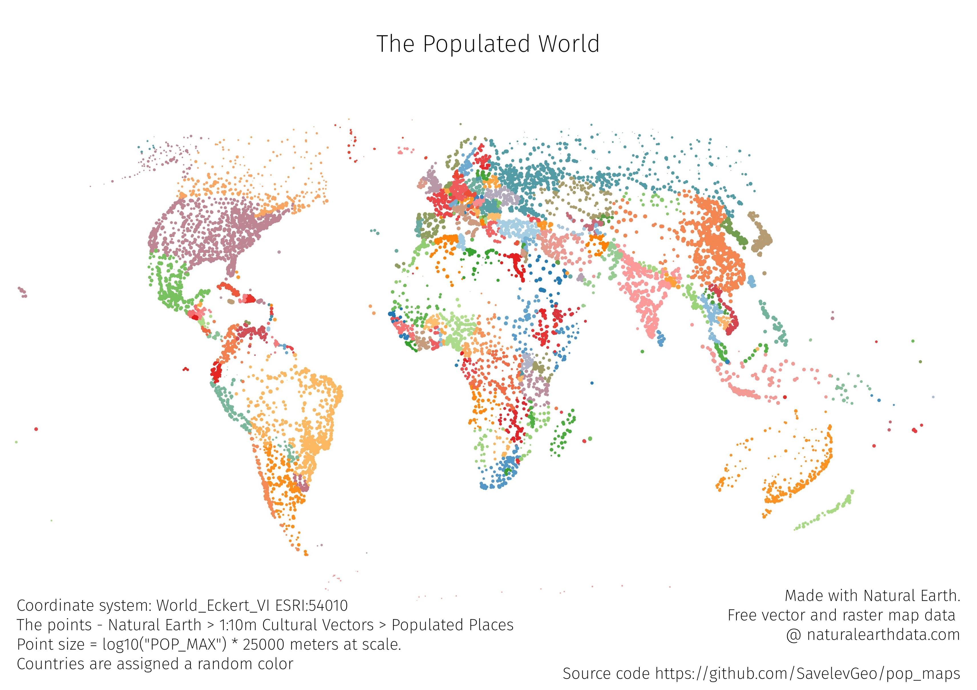
The map of the world drawn only by the points of populated places, colored by the country (color assigned randomly). The size is log10 of the population * 25000
It would be nice to add a sized legend - maybe after the challenge
Tools - QGIS, Data - naturalearthdata
Source code - https://github.com/SavelevGeo/pop_maps

#30DayMapChallenge #Day1

GitHub

GitHub - SavelevGeo/pop_maps

Contribute to SavelevGeo/pop_maps development by creating an account on GitHub.
The world map
The world map
The world map
  • Copy link
  • Flag this post
  • Block

bonfire.cafe

A space for Bonfire maintainers and contributors to communicate

bonfire.cafe: About · Code of conduct · Privacy · Users · Instances
Bonfire social · 1.0.1-alpha.40 no JS en
Automatic federation enabled
Log in
  • Explore
  • About
  • Members
  • Code of Conduct