
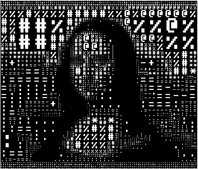
more adaptive #asciiart , this time with a more era-appropriate IBM font
Discussion
Loading...
Post


@rich can I buy a print of this? it is AMAZING
I doubt I'll develop this further. It was an interesting experiment - certainly in terms of human visual perception, but I feel the larger characters "fight against" the fact that they represent "calmer" sections of the image (those with less luminance variation). not to mention if one uses longer ascii mappings, one starts to "read" the mishmash of text as words or part-words - further losing the image.
But cool though.
bonfire.cafe
A space for Bonfire maintainers and contributors to communicate
Automatic federation enabled