
One of my favorite type foundries, @atipo, dropped a new font called Alcyone. It’s absolutely gorgeous.

Joachim
and 2 others
boosted

gorgeous design work and colour choice on this olivetti typewriter ribbon box
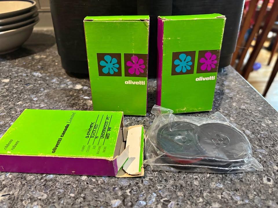
gorgeous design work and colour choice on this olivetti typewriter ribbon box
Matthijs De Smedt
boosted
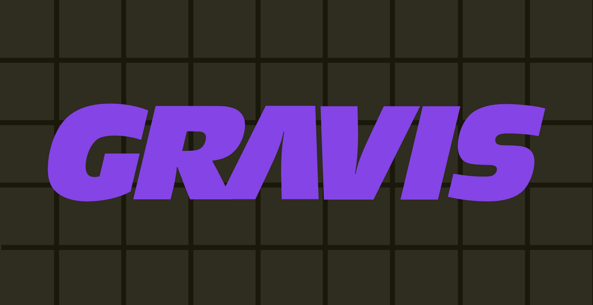
today's digital preservation project:
some might recognize the name Advanced Gravis from its incredible line of UltraSound sound cards, or maybe its classic joysticks and gamepads.
fewer know that this was a canadian company from burnaby, bc. its logo changed a lot over the years until the company's demise. unfortunately, wiki/logopedia/etc all seem to believe that its ugliest logo was its only logo.
so today i replicated the only Advanced Gravis logo that ever mattered: the one that graced my early-90s analog joystick and gamepad.
no one has ever properly researched the typeface for Advanced Gravis' logo. after some font ID magic, it turns out to be Roger Excoffon's (digitized by URW) Antique Olive Standard Compact Italic.
the A is swapped for an inverted V, which gives the logo that perfect sense of proportion and hi-tech slickness
designed in Affinity Designer. enjoy.

Catching up on Page 94, the Private Eye Podcast and episode 99 (22 February 2024) has them briefly discussing custom fonts.
This includes one from the 1960s that the magazine's masthead is set in, but no-one can names its designer. Maybe someone here knows?
From 35:10
https://www.private-eye.co.uk/podcast/99