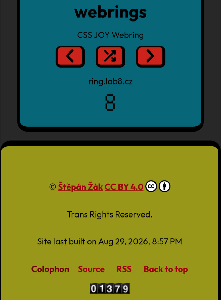

i'm getting #accessibility errors because of low text contrast on my website. it's obviously perfectly legible for me, but i understand that some people need much higher contrast to read comfortably.
my question is, is it enough to add special #css styles for *prefers-contrast: more*?
can i count on most visually impaired users to have that setting enabled? i could redesign my website for everyone, but i like the colors and believe they are fine for most people...