

A couple of table top game designers came together to build an open-source colour identification system that is colorblind friendly. It uses symbols and color theory. For example: the symbol for green is a mix of the one for yellow and blue.
I could totally see those engraved on little wooden tokens for board games for example.
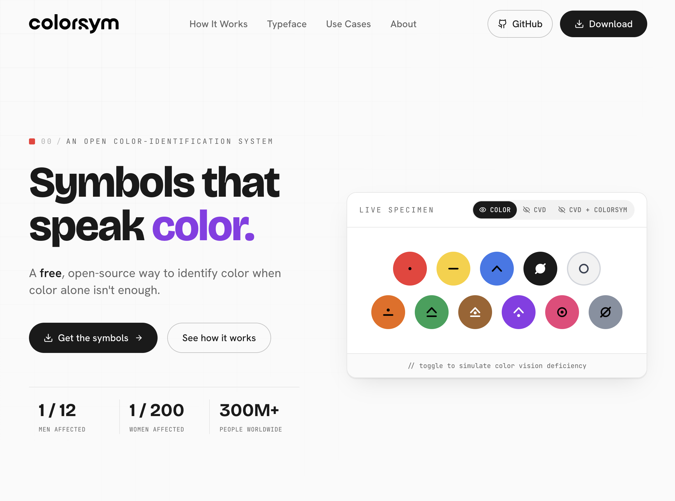

@stephaniewalter Wait there are multiple ways of being colorblind, why do the only have one toggle? how does it function with other forns of colorblindness? do they have a suggested palatte along with their symbols?
(cf. https://www.color-blindness.com/ , found via https://matplotlib.org/stable/users/explain/colors/colormaps.html#color-vision-deficiencies )
EDIT: Wait you literally do UX stuff professionally, you almost certainly know/thought through this already. Okay uh questions are for my "wait, why did they do it like this?" interest; citation is for any third-party reading these comments who sees my question.
You can also read the full explanation of the design decisions behind it: https://boardgamewire.com/index.php/2026/07/06/designer-pair-launch-colorsym-giving-publishers-a-free-tool-for-colourblind-friendly-board-game-creation/
And if you are curious, another system exists as well: ColorADD: https://www.coloradd.net/en/