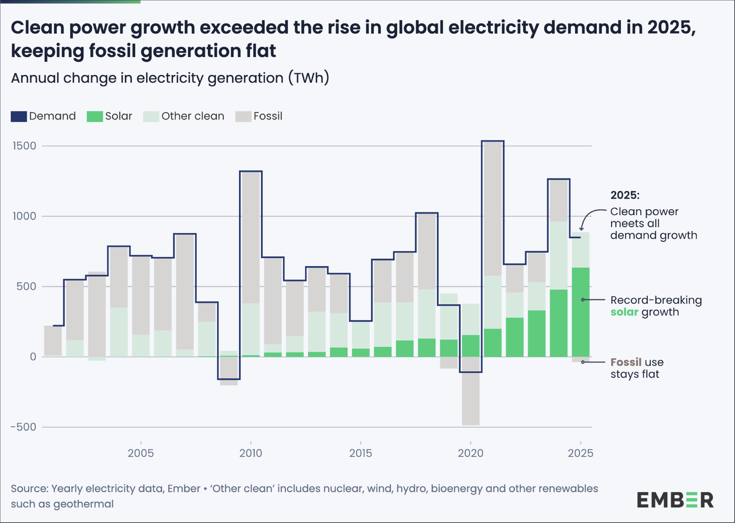
The graph shows the annual change in global electricity generation (in terawatt-hours) from around 2000 to 2025.
A blue line represents the change in electricity demand.
The stacked bars show how this demand is met:
Green: Solar energy
Light green: Other clean energy (e.g., wind, hydro, nuclear)
Gray: fossil fuels
Notably:
In the early years, electricity demand grows moderately and is largely met by fossil fuels.
Starting around 2015, the share of clean energy increases significantly.
Solar energy, in particular, grows strongly and accelerates toward 2025.
Around 2025, clean energy sources cover all demand growth for the first time (“Clean power meets all demand growth”).
Fossil fuel use remains largely constant in the long term (“Fossil use stays flat”).
Overall, the graph illustrates a structural shift: away from fossil fuels toward rapidly growing clean electricity generation, particularly solar energy.