Discussion
Loading...

Post

Log in
  • About
  • Code of conduct
  • Privacy
  • Users
  • Instances
  • About Bonfire
Jan Wildeboer 馃樂:krulorange:
@jwildeboer@social.wildeboer.net  路  activity timestamp 6 hours ago

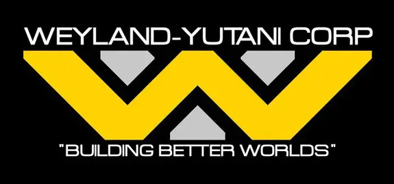
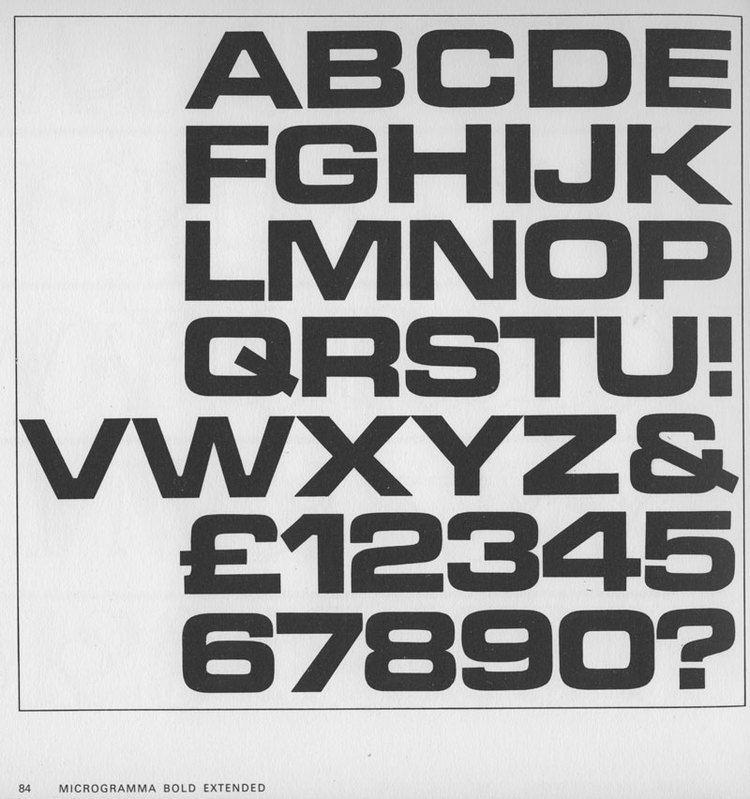
TIL (Today I learned): The typefaces Eurostile/Microgramma and Handel Gothic are not only used by Casio on many watches and calculators from the 1970s to at least the 1990s, these typefaces are also used in many (and I mean MANY) science fiction movies and TV series. From 2001 via Alien to Star Trek and many more. See the wonderful replies at https://social.wildeboer.net/@jwildeboer/116079648938846660 where typography nerds shared interesting knowledge :)

Jan Wildeboer 馃樂:krulorange:
@jwildeboer@social.wildeboer.net  路  activity timestamp 13 hours ago

A long shot. Does anyone know if the font/typeface that Casio used for their calculators back in the days is available as TrueType or SVG anywhere? I am weirdly fascinated by it and would love to use it for some displays.

  • Copy link
  • Flag this post
  • Block
Jan Wildeboer 馃樂:krulorange:
@jwildeboer@social.wildeboer.net  路  activity timestamp 6 hours ago

Yes, the Weyland-Yutani logo is Eurostile (Though in my opinion the kerning was way too narrow ;).

The Weyland Yutani corporate logo from the Alien franchise. A stretched hello W covers a stretched gray Y, at the top WEYLAND YUTANI CORP and at the bottom the slogan "BUILDING BETTER WORLDS" set in the Eurostile font.
  • Copy link
  • Flag this comment
  • Block
Jan Wildeboer 馃樂:krulorange:
@jwildeboer@social.wildeboer.net  路  activity timestamp 6 hours ago

Microgramma was cut in 1952 by Aldo Novarese and Alessandro Butti for the Nebiolo Type Foundry ask an upper case typeface. It was also used by Letraset (yep, the famous rub them off letters). 10 years later Novares reworked the typeface, added lower case and more characters and it was made available as Eurostile and also as Microgramma d. Over the years it was digitised by Linotype. URW, Bitstream. Until today it exemplifies (to me) optimism and progress. I like it a lot :)

Microgramma Bold Extended
  • Copy link
  • Flag this comment
  • Block
Jan Wildeboer 馃樂:krulorange:
@jwildeboer@social.wildeboer.net  路  activity timestamp 5 hours ago

Back in ye olden days of metal letters, the typesetter would grab the capital letters from the Upper Case and, well, you can guess what was in the lower case. Yep. That's where these designations come from ;)

Lineart picture showing the upper and the lower case with metal letters.
  • Copy link
  • Flag this comment
  • Block

bonfire.cafe

A space for Bonfire maintainers and contributors to communicate

bonfire.cafe: About 路 Code of conduct 路 Privacy 路 Users 路 Instances
Bonfire social 路 1.0.2-alpha.29 no JS en
Automatic federation enabled
Log in
  • Explore
  • About
  • Members
  • Code of Conduct