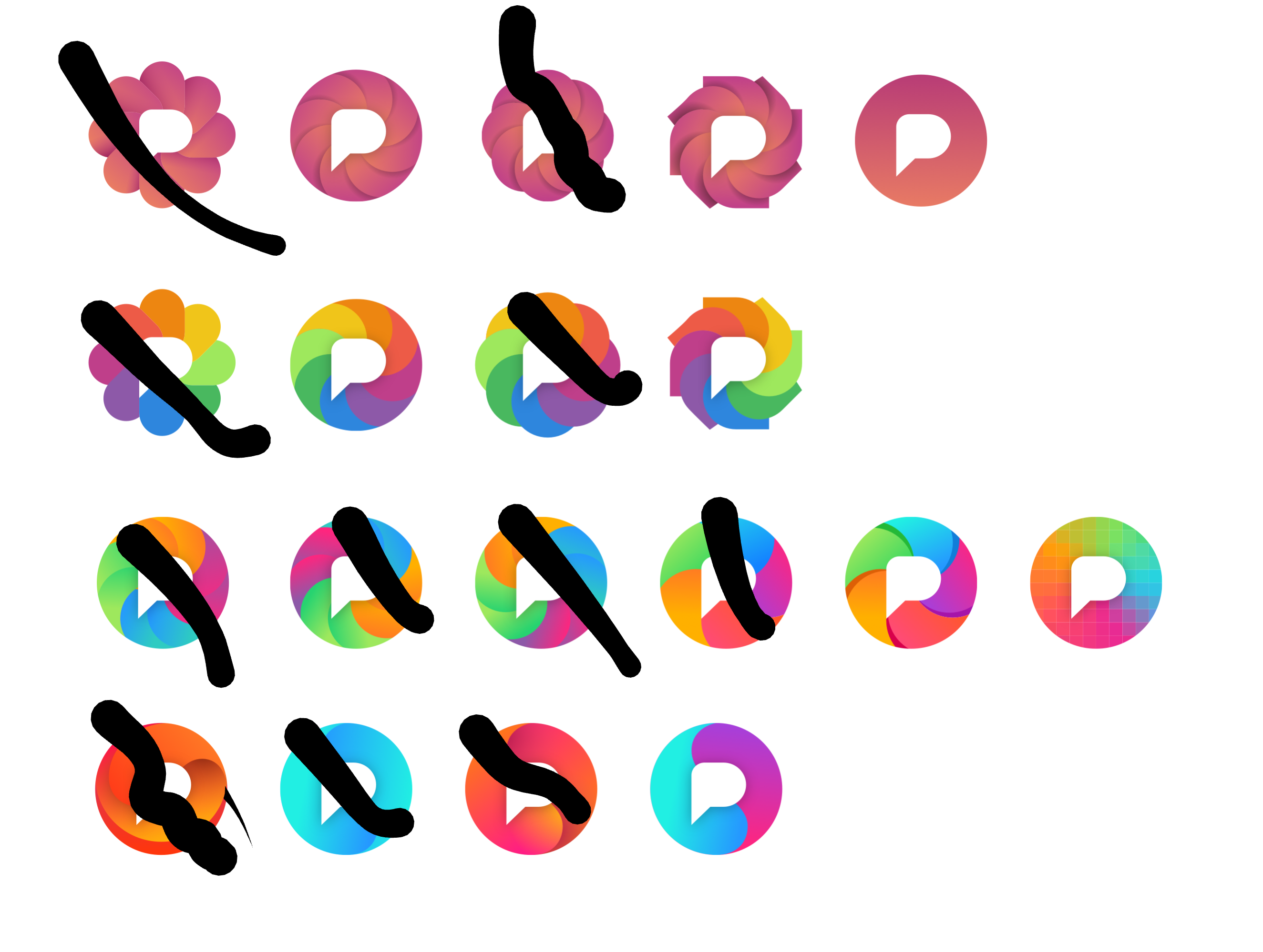
Pixelfed logo variants, one of these will be the new logo ✨
@dansup
1,1 1,2 3,2 6,3 4,4 are great ![]()
@dansup number 14 is the strongest IMO
@dansup
Simple is good so it doesn't get unrecognizable when scaled down in small UI, also needs to look fine on dark/light modes (or have two versions)
Although the current logo is busy, it does stand out when you put it next to other platforms
@dansup The last one on the third row feels great
If you're asking for opinions... Disclaimer, I might not even use Pixelfed (but maybe this is somehow useful still).
1st row: none
2nd row: nice, but none
3rd row: good, I vote for all but especially 5 and 6 (last two from left-to-right)
4th row: none
@dansup
It was easier to explain like this:
I'm personally choosing the 3rd row 4th column so when Dan releases some merch I can buy me some stickers 😁
PS row 2 column 1 and row 2 column 2 somehow remind me of NBC/Peacock and the old Mac spinning wheel respectively. 😄 The former also reminds me of one of the candidates for PF back when 🤷
@dansup my graphic designer girlfriend and I both like third row rightmost the best, and the third row in general significantly more than the other rows.
@dansup 5 colours in a pinwheel has some similarities to the Immich logo.
That said, I'm not suggesting that you avoid that. I like rainbow colours to indicate photos and the camera iris effect enhances that association.
Just think about how they relate or do not relate.
@dansup the pixelated one (at the end of the third row) makes the most sense for sure 💯
I like the 2nd from the right on the third row.
@dansup Somehow top right or bottom right ones stand out to me.


