Discussion
Loading...

Post

Log in
  • About
  • Code of conduct
  • Privacy
  • Users
  • Instances
  • About Bonfire
Information Is Beautiful
@infobeautiful@vis.social  ·  activity timestamp 15 hours ago

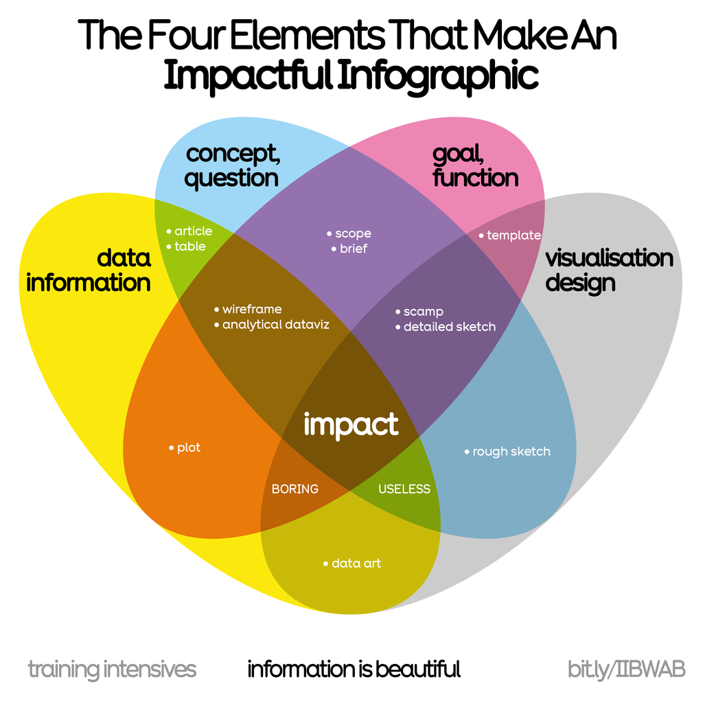
We use this prism in our workshops to help create an impactful, communicable, beautiful #infographic

Learn more in our forthcoming seminars:
2 x virtual half days:
25th & 26th Mar 🇬🇧 UK/EU/AUS
29th & 30th Apr 🇺🇸 USA timezone

Mon 27th Apr 🇬🇧 LDN in-person

https://bit.ly/IIBWAB #iibwab
Reviews: https://geni.us/WABreviews

A Venn diagram titled 'The Four Elements That Make An Impactful Infographic' showing the intersection of four main elements: 'data information' (yellow), 'concept, question' (blue), 'goal, function' (pink), and 'visualisation design' (grey). The overlapping sections contain specific elements like 'wireframe', 'plot', 'template', and 'rough sketch'. The central overlap shows 'impact', while some intersections are labeled as 'BORING' or 'USELESS'. Created by Information is Beautiful for their training intensives
Information is Beautiful

Workshops Feedback — Information is Beautiful

Workshops are Beautiful, but don't just take our word for it...
Information is Beautiful

Data Visualization Training — Information is Beautiful

Learn how to create impactful infographics & data visuals the Information is Beautiful way. Trainings on bringing data-storytelling, design-thinking and better conceptual approaches to your charts, reports and visualisations.
  • Copy link
  • Flag this post
  • Block

bonfire.cafe

A space for Bonfire maintainers and contributors to communicate

bonfire.cafe: About · Code of conduct · Privacy · Users · Instances
Bonfire social · 1.0.2-alpha.23 no JS en
Automatic federation enabled
Log in
  • Explore
  • About
  • Members
  • Code of Conduct