

@scottjenson honestly I didn't even realise that there was a non-advanced 3-column view. I currently use advanced for the separate columns, but my point is I would switch to the simple version if it could do this
Discussion
Loading...


@scottjenson After seeing you suggest narrowing the current view to see how the New Post button would function, I played with that.
The one change I'd suggest would be to make the new post a pop out or otherwise retain visibility of what you are replying to.
Much of the utility of the current sidebar post box is that in replying, you can see the entire thread, move up and down it, load more replies and even change pages before posting, which makes for better conversations.


@scottjenson I use the advanced, so this does not appeal to me. Also the UI is just bad, icons far awar from each going against best practices.


@scottjenson I wouldnt like to open a pop up to write a new post, since sometimes im writing something inspired by the posts im currently looking at on my feed!


@scottjenson I use multi column - so no I wouldn’t use this view.


@mattwilcox I think I made the poll wrong, it should have been "if you're currently using the non-advanced view, would you switch to this? I'm worried too many of the "no" votes are people that use the advanced view.


@scottjenson @mattwilcox Well, you can edit your post, right? 😸
@ElBeeToots @mattwilcox I could, but I worry it would reset the poll count?


Does it have dark mode? Can the text be bigger? Could it be less bland and empty?


I use Mastodon mostly with a desktop browser, but with the Advanced Web Interface (in Slow Mode).
Whatever happens, I wouldn't want to lose that.

@scottjenson so ... just make it twitter?

@scottjenson Is this for tablets only or also on the desktop? On tablets it makes sense to let posts expand as much as possible, but on desktop it would be uncomfortable to read posts if the lines are so wide.


@scottjenson I mean, that’s just Twitter, no?
Personally, I use the multicolumn view, so this doesn’t fit my needs, but it’s fine.
@octothorpe It's nearly every single "list app with nav" on the planet. Yes, Twitter uses this layout too but so do MANY other apps/web pages. The goal is to simplify the view and calm it down.
The critical part of Twitter isn't it's UI: that's hardly 1% of what makes it "Twitter". Similarly, Mastodon using a standard layout doesn't make it Twitter. People massively over index on pixels.

@scottjenson Before making a new Layout it would be nice if the broken scroll of images in "zoom" mode would be fixed.
(Image can be scrolled down but not up unless it is dragged down first)

@scottjenson I like this simplified view better. Plus, having the interaction column on the left is much more logical to me. Currently I am seeing it on the right, which is different from historical social media sites I have used.
I would suggest moving Preferences and About into the More section too, so this gets even simpler.
@randahl very astute comments. This change is the bare minimum (it's just 2 lines of CSS!) and I'm just gauging overall reaction. If we'd go this direciton, it would open up other small changes like you suggest
@scottjenson have you thought about turning the More button into one of those foldout buttons? The type that changes from
▶️ More (not showing items)
To
🔽 More (showing items)
This way, a user can keep the More section open for a while, if they are currently using the more items a lot.

@scottjenson Yeah, probably not, but go for it.
@mrcopilot lol, what client are you using?
@scottjenson If you click that little indicator you get.
Full disclosure a minor contributor...


@scottjenson I could get used to this. But I would prefer the trigger for the New Post modal to be above the feed. Sort of a smaller version of the form that opens a modal.
(I thought I saw a mockup for that on GitHub, but can't seem to be able to find it.)
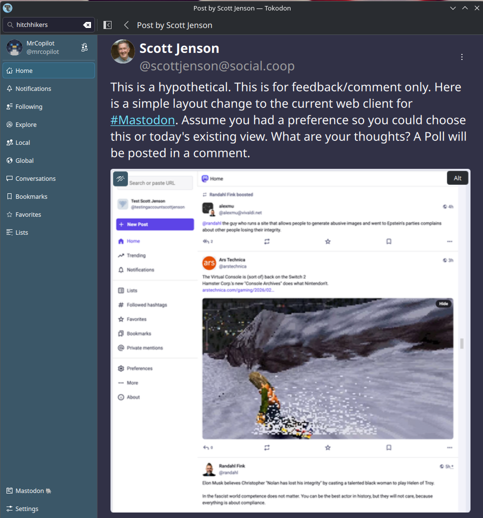
@stefan That's helpful feedback thanks. This is actually nearly shipping today. All you have to do is narrow the width of the web page to trigger the media query (but with the nav on the right) You can play with it a bit more for real (as everything works) and give me additional feedback if you'd like.
@scottjenson Yeah, I think this works pretty well, but I do like what @cheeaun has going on here:
https://mastodon.social/@cheeaun/116021755309837995


@scottjenson overall, it’s pretty good. My only nitpick is that the sidebar might be better off if it retained the post form, instead of hiding that form behind a button.
I can’t prove it, but I feel like the additional click to begin composition would be a really annoying change.
@deadsuperhero You don't find the current layout a bit cramped, for writing new posts?
Also, maybe adding a bit of friction could increase the quality of posts on here 🙃
@deadsuperhero
Besides, we have a rather lot of examples of existing microblogging sites (like nearly all of them!) that put the compose behind a button. They certainly aren't dying under the weight of that "horrible" ux decision ;-)
@stefan
@scottjenson main issue with the simple layout imho is that it doesn't allow viewing notifications and feed at the same time. would use it instead of the advanced view if not for that; we don't need fifty billion feed columns, just the ability to read notifications without losing spot on regular feed
@clarfonthey I'm not sure I follow. With the 3 column view. If you pick "Notifications" it replaces the feed view so I don't understand how you could view both at the same time. That implies 4 columns? I understand the adv view can do that, but I don't see how the non-adv 3 col view can? Please help me understand.
@scottjenson honestly I didn't even realise that there was a non-advanced 3-column view. I currently use advanced for the separate columns, but my point is I would switch to the simple version if it could do this
@clarfonthey great, glad we clarified that. If you would switch could you please vote? I'm trying to gauge interest.


@scottjenson
I don't hate it. But I don't look at the current layout and think “there's clearly something wrong here”. I don't want things to change for no reason.
If this was offered, like the Advanced web interface, as a non-default option, fine. But it definitely, as they say “ain't broke”.
@negative12dollarbill Oh, I'm afraid to tell you that it is actually VERY broke. That's why I'm exploring this. I appreciate it's not broke for you. But we've got lots of user feedback that this is overly complex and off putting to many new users.
But it's also VERY clear that changing this for EVERYONE forcefully would be a big no-no. I'm not suggesting that. I'm just trying to say if this was an OPTION, would people like it?
@scottjenson
I would love to see that feedback in detail then. And only new users?
To me it doesn't look substantially different to Twitter, Threads or Bluesky. I would think users of those systems, or even Facebook, would find it familiar.
@negative12dollarbill and that's a good thing or a bad thing?


@scottjenson
I personally think it's good and may help pulling people over to the Fediverse.
@scottjenson
Strange thing to say. I'm obviously a pro-Mastodon user. I loathe Twitter and Facebook. I'm saying all the world's most successful social media platforms look roughly like this, so I don't know why people would be put off by it unless they were new to social media as a whole.
Where's the research?

@scottjenson would it affect the multi-column mode in any way?
@isagalaev This is all hypothetical, but the assumption is that if you stuck with the original 3-column view, nothing would be different.
@scottjenson I'm asking because the problem with too narrow columns is much more pronounced in the multi-column mode. So I was hoping may be you were working on that too :-)
@isagalaev I'm looking for any feedback this gets! Please explain what you'd like to see.
@scottjenson okay, I started writing a reply about narrow columns, but actually looking at them now I understand that I don't really have a problem with them, they're fine! So nevermind and sorry for the noise :-)


@scottjenson I like it quite a bit! My main complaint with the current UI is that it doesn't use up enough horizontal space, but this at least pushes my minimalism button.