Discussion
Loading...

Post

Log in
  • About
  • Code of conduct
  • Privacy
  • Users
  • Instances
  • About Bonfire
Roni Rolle Laukkarinen
@rolle@mementomori.social  ·  activity timestamp 2 days ago

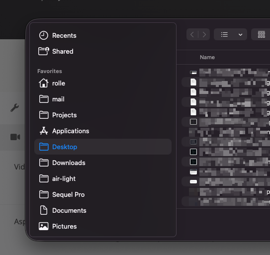
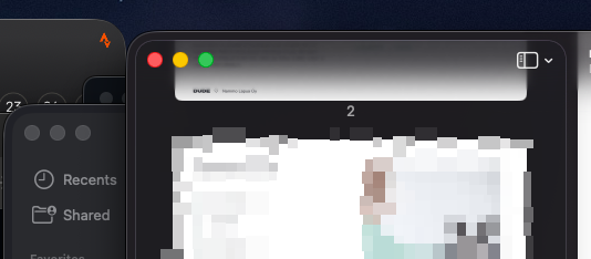
Finally upgraded to Tahoe. Who thought this was a good idea? The UI is terrible. It always looks like there are multiple windows stacked on top of each other. The border-radius inconsistencies are ridiculous. Apple, why did you do this?

And then this: https://wien.rocks/@noheger/115877698373215218

#Apple #MacOS

2 media
Apple inconsistencies in a screenshot
Screenshot of double borders
  • Copy link
  • Flag this post
  • Block
Saaste
Saaste
@saaste@mementomori.social replied  ·  activity timestamp yesterday

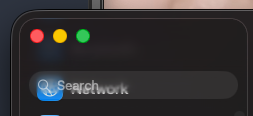
@rolle So clear and easy to read!

Screenshot of Mac OS where the search input overlaps menu item, so that texts of both items create a hard-to-read mess.
  • Copy link
  • Flag this comment
  • Block

bonfire.cafe

A space for Bonfire maintainers and contributors to communicate

bonfire.cafe: About · Code of conduct · Privacy · Users · Instances
Bonfire social · 1.0.1 no JS en
Automatic federation enabled
Log in
  • Explore
  • About
  • Members
  • Code of Conduct