")

neurodivergent-berlin.com shared prepped.to in their community, which resulted in 25 new visitors 🎉
Looking at anonymous session recordings, it became clear that the homepage UX can still be improved.
Now:
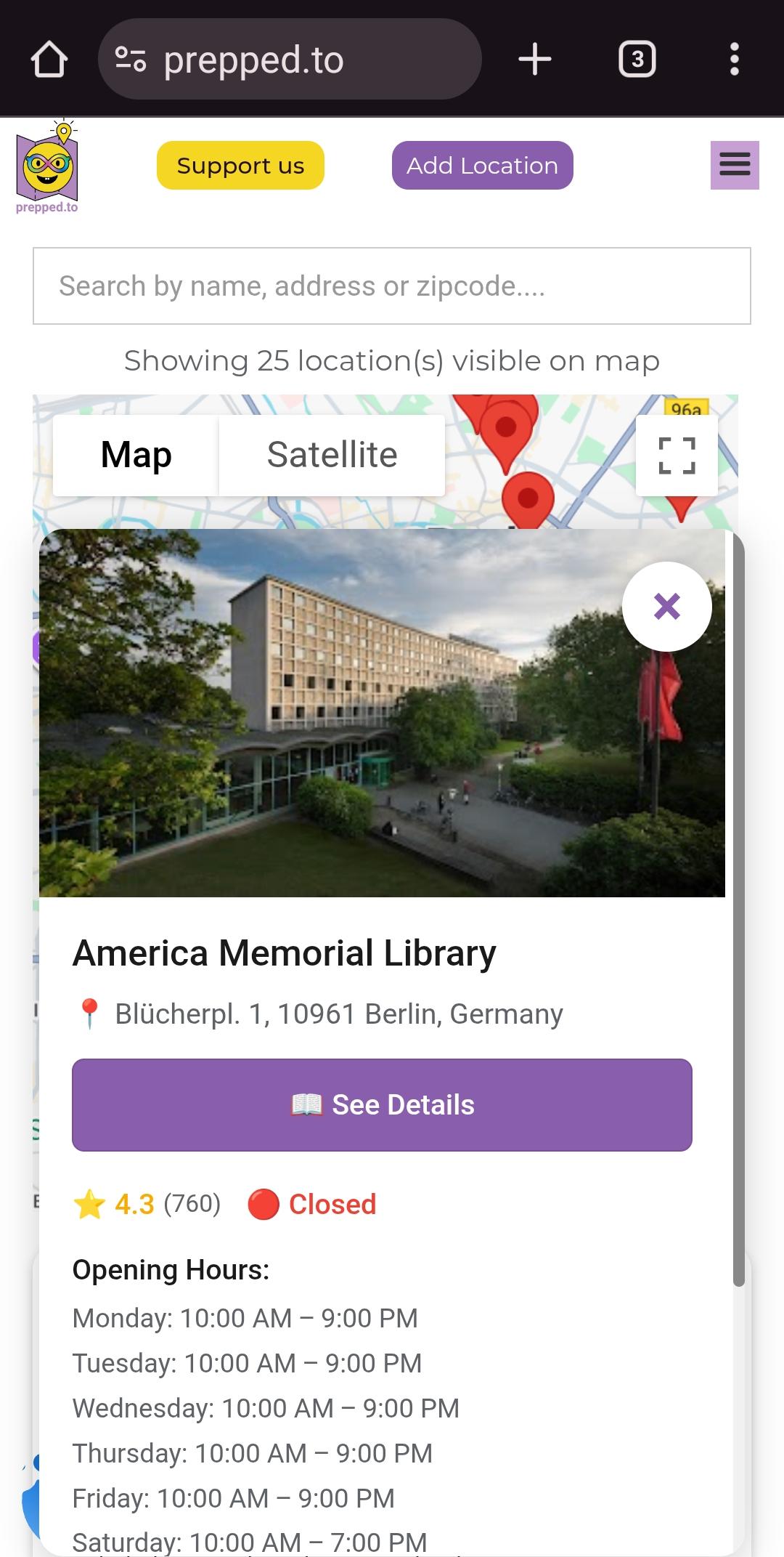
- The entire surface of location cards is now clickable
- The close button of location infoviews on the map is much more obvious
- The See Details button in the location info-view was moved up, so people can easily find and click it
What do you think? Is it easier now?