Discussion
Loading...

Post

  • About
  • Code of conduct
  • Privacy
  • Users
  • Instances
  • About Bonfire
Jeff Allen
@jamaps@mapstodon.space  ·  activity timestamp last week

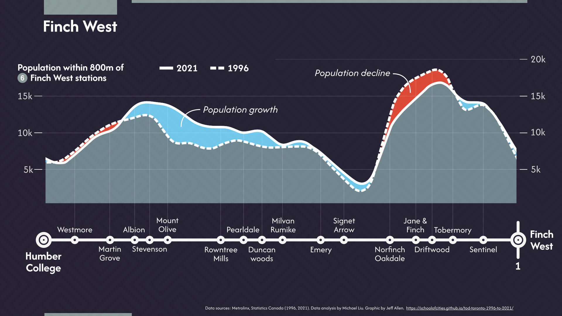
Line 6 Finch West is opening soon - here's a chart of 25 years of population change along the route

adapted from Michael Liu's great work here: https://schoolofcities.github.io/tod-toronto-1996-to-2021/

#transit #dataviz #toronto

Line chart showing population within 800m from Line 6 Finch West LRT stations. There are two lines, one for the population in 1996 and the other population in 2021. The difference between the lines shows where there has been population growth or decline over this 25 year period.
  • Copy link
  • Flag this post
  • Block
Log in

bonfire.cafe

A space for Bonfire maintainers and contributors to communicate

bonfire.cafe: About · Code of conduct · Privacy · Users · Instances
Bonfire social · 1.0.1-alpha.8 no JS en
Automatic federation enabled
  • Explore
  • About
  • Members
  • Code of Conduct
Home
Login