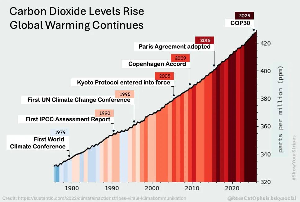
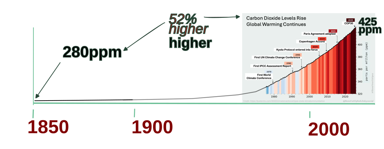
Graphic with headline: climate dioxide levels rise, global warming continues. 

The growth in atmospheric carbon dioxide levels from 1975 to 2025 on the x-axis is plotted on a graph that has parts per million (ppm) on the y-axis. The ppm rises from 320 to 424 across the 50 year period. 

The area underneath the plotted line is filled with climate warming stripes that are light blue for 1975, shifting to a deep red-brown for 2025. 

Along the curve are dots representing and labelled with some of the world’s significant climate change conferences and agreements: 

- first world climate conference in 1979
- first IPCC assessment report in 1990
- first UN climate change conference in 1995
- Kyoto protocol entered into force in 2005
- Copenhagen accord in 2009
- Paris agreement adopted in 2015
- COP30 in 2025.
Graphic with headline: climate dioxide levels rise, global warming continues. The growth in atmospheric carbon dioxide levels from 1975 to 2025 on the x-axis is plotted on a graph that has parts per million (ppm) on the y-axis. The ppm rises from 320 to 424 across the 50 year period. The area underneath the plotted line is filled with climate warming stripes that are light blue for 1975, shifting to a deep red-brown for 2025. Along the curve are dots representing and labelled with some of the world’s significant climate change conferences and agreements: - first world climate conference in 1979 - first IPCC assessment report in 1990 - first UN climate change conference in 1995 - Kyoto protocol entered into force in 2005 - Copenhagen accord in 2009 - Paris agreement adopted in 2015 - COP30 in 2025.