
“In 2015 our projected deadline for reaching 1.5°C was 27 years away. Now, the application estimates the threshold is only 4 years away, suggesting global warming has accelerated quickly in recent years.
It is important to note this is based on a linear extrapolation, which cannot distinguish between acceleration due to increased greenhouse gases and natural climate variability. Nevertheless, this basic projection offers a clear estimate of the rapid pace of warming”
https://climate.copernicus.eu/rapid-approach-15degc-global-warming-threshold-paris-agreement
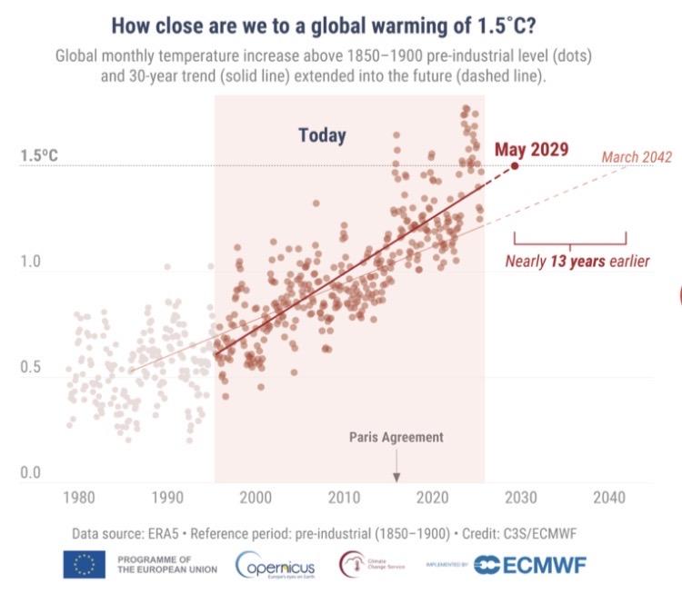
The same basis of mapping to a linear trend, but incorporating data covering the 30-year period from 1995 to 2025, results in an extrapolation that reaches 1.5°C in May 2029, approximately 13 years earlier than the previous image.
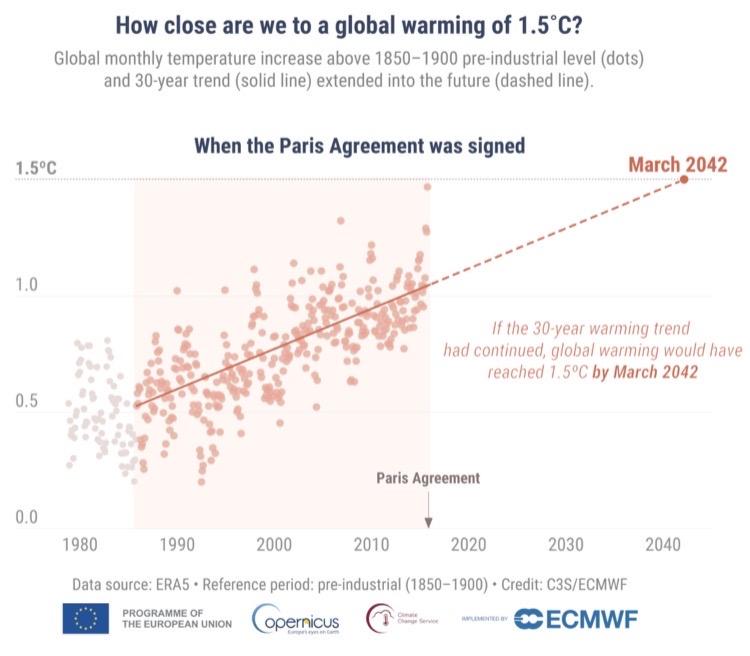
Visualisation addressing “How close are we to a global warming of 1.5°C?” In which there is:
- an x-axis of time and a y-axis of warming
- a plot of dots representing “global monthly temperature increase above 1850 to 1900 pre-industrial level”
- an averaging of those to a linear trend from 1985 up to data available at the Paris agreement in 2015, represented by a solid line
- a linear extrapolation of that line continuing 30-years into the future, represented by a dashed line.
The dashed line reaches 1.5°C in March 2042.
The data source is ERA5 and the chart is credited to C3S/ECMWF, with logos for “A programme of the European Union”, “Copernicus: Europe’s eyes on Earth”, “Climate Change Service” and “Implemented by ECMWF”.