

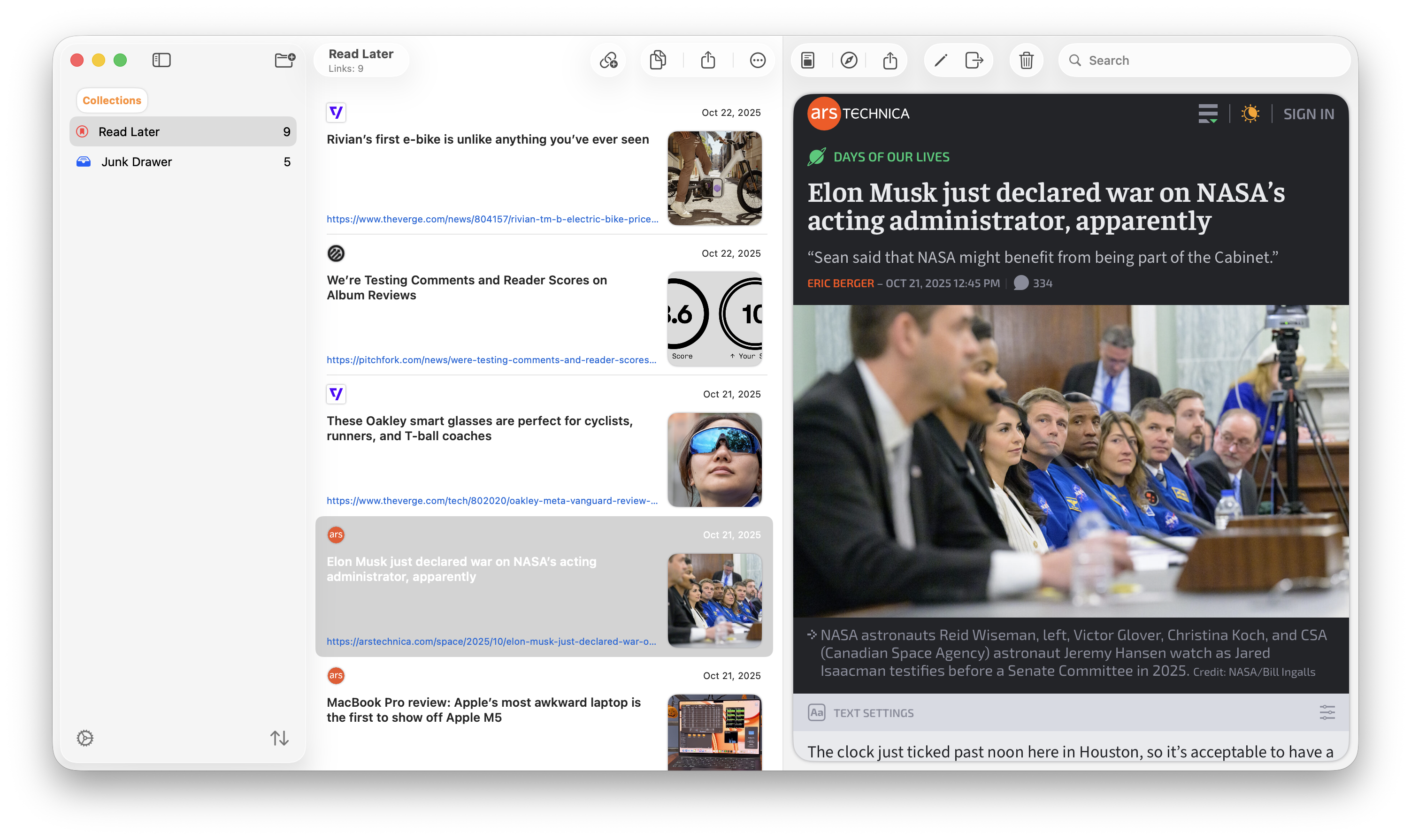
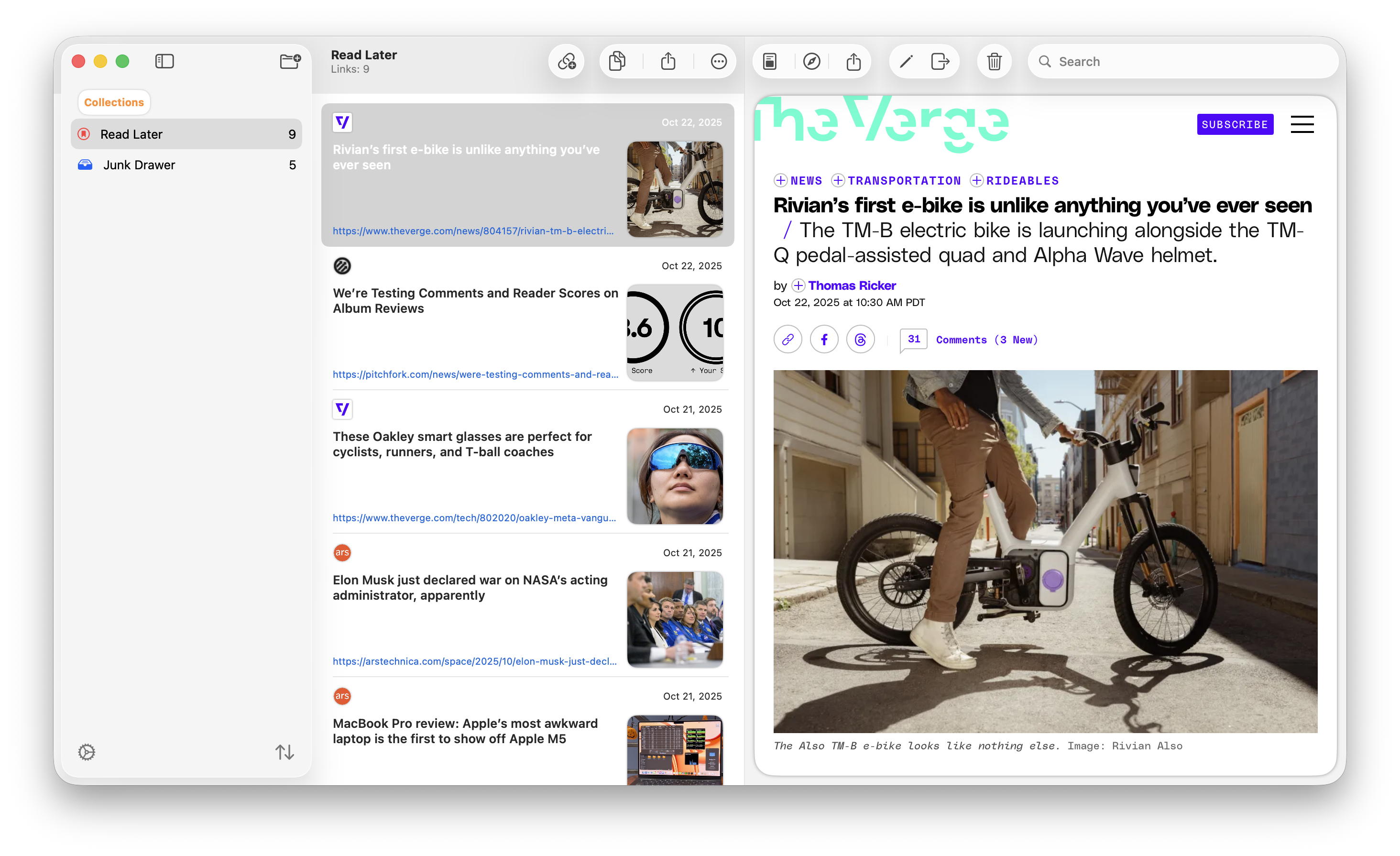
Continuing on updating @bridges. I've been playing around with the toolbar design a bit. Which do you prefer? 🧐
A screenshot of my app Bridges on macOS. It's got the second design of two images in this post. This one shows the app which is a three column app where the toolbar is a clear color in the middle column but hidden in the right column. This design is more like other macOS Tahoe apps.
A screenshot of my app Bridges on macOS. It's got the first design of two images in this post. This one shows the app which is a three column app where the toolbar is a solid color in the middle column but hidden in the right column.