Discussion
Loading...

Post

  • About
  • Code of conduct
  • Privacy
  • Users
  • Instances
  • About Bonfire
Information Is Beautiful
@infobeautiful@vis.social  ·  activity timestamp 2 weeks ago

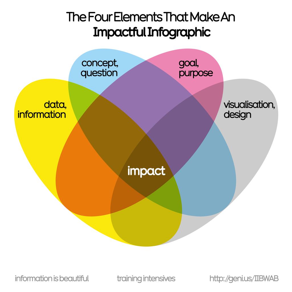
We use this prism in our workshops to help create an impactful, communicable, beautiful #infographic. More detailed prism here
https://informationisbeautiful.net/visualizations/what-makes-a-good-data-visualization/

Learn more in our forthcoming seminars:
2 x virtual half days:
15th & 16th Oct 🇺🇸 USA timezone
11th & 12th Nov 🇬🇧 UK/EU/AUS

In-person Mon 13th Oct London 🇬🇧

https://bit.ly/IIBWAB #iibwab
Reviews: https://geni.us/WABreviews

Information is Beautiful

What Makes A Good Data Visualization? — Information is Beautiful

What are the four elements necessary for a good data visualization? Information is Beautiful founder David McCandless shares his experience.
Information is Beautiful

Workshops Feedback — Information is Beautiful

Workshops are Beautiful, but don't just take our word for it...
Information is Beautiful

Data Visualization Training — Information is Beautiful

Learn how to create impactful infographics & data visuals the Information is Beautiful way. Trainings on bringing data-storytelling, design-thinking and better conceptual approaches to your charts, reports and visualisations.
A Venn diagram titled 'The Four Elements That Make An Impactful Infographic' showing the intersection of four main elements: 'data information' (yellow), 'concept, question' (blue), 'goal, function' (pink), and 'visualisation design' (grey).  Created by Information is Beautiful for their training intensives
A Venn diagram titled 'The Four Elements That Make An Impactful Infographic' showing the intersection of four main elements: 'data information' (yellow), 'concept, question' (blue), 'goal, function' (pink), and 'visualisation design' (grey). Created by Information is Beautiful for their training intensives
  • Copy link
  • Flag this post
  • Block
Log in

bonfire.cafe

A space for Bonfire maintainers and contributors to communicate

bonfire.cafe: About · Code of conduct · Privacy · Users · Instances
Bonfire social · 1.0.0-rc.3.13 no JS en
Automatic federation enabled
  • Explore
  • About
  • Members
  • Code of Conduct
Home
Login