Discussion
Loading...

Post

  • About
  • Code of conduct
  • Privacy
  • Users
  • Instances
  • About Bonfire
Roni Rolle Laukkarinen
@rolle@mementomori.social  ·  activity timestamp 4 days ago

Best part of iOS 26.

#Design #Icons #Apple #iOS #iOS26

After 12 major updates since iOS 7, skeuomorphism returns in iOS 26, showing how design trends often cycle back, like in this example camera app icon actually looks like a camera lens in close up and boy just a flat grey box.
  • Copy link
  • Flag this post
  • Block
Jukka 'Shrike' Kolehmainen
@Shrike@mementomori.social replied  ·  activity timestamp 3 days ago
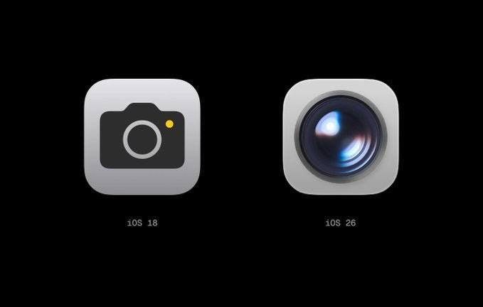
@span rolle I've realised I do not like realistic iconography.
I like clear and thought out semiotics that really represent the thing or idea it's supposed to represent.
Style over function is not for me at all.

Also. Pod bay doors will not open *shiver*

  • Copy link
  • Flag this comment
  • Block
Baron Henrik von Pömpöösi
@henrik@eliitin-some.fi replied  ·  activity timestamp 4 days ago
@span rolle That icon somehow reminds me how much I miss Apple Aperture.
  • Copy link
  • Flag this comment
  • Block
Log in

bonfire.cafe

A space for Bonfire maintainers and contributors to communicate

bonfire.cafe: About · Code of conduct · Privacy · Users · Instances
Bonfire social · 1.0.0-rc.2.21 no JS en
Automatic federation enabled
  • Explore
  • About
  • Members
  • Code of Conduct
Home
Login