
The final Liquid Glass is super cringe. Here some of the worst moments. It is tech-broey, immature and an accessibility dumpster fire.
The lack of understanding the difference between design and decoration is incredible.
Read alt text for individual descriptions.
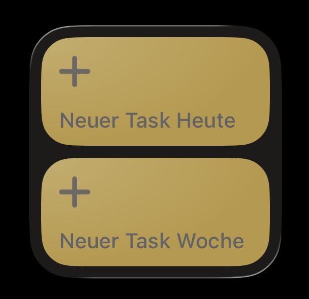
Screenshot of iOS 26 shortcut widget. The button text and icons are of poor contrast compared to the background.
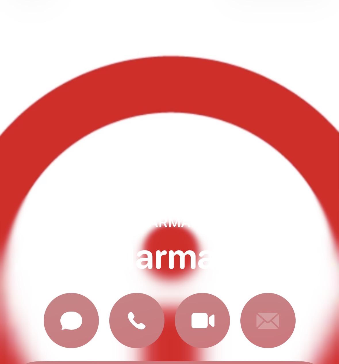
Screenshot of iOS 26 contact. The avatar is a red logo with white background. iOS thinks it is a good idea to make the text white on white background.
Screenshot of iOS 26 Safari browser. The URL bar is way too transparent and makes it difficult to read the text and distinguish it from the background.
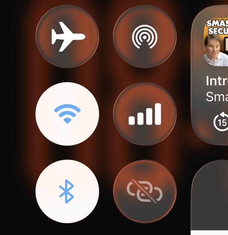
Screenshot of iOS 26 control center. The contrast of UI items and their icons is poor and indecisive.