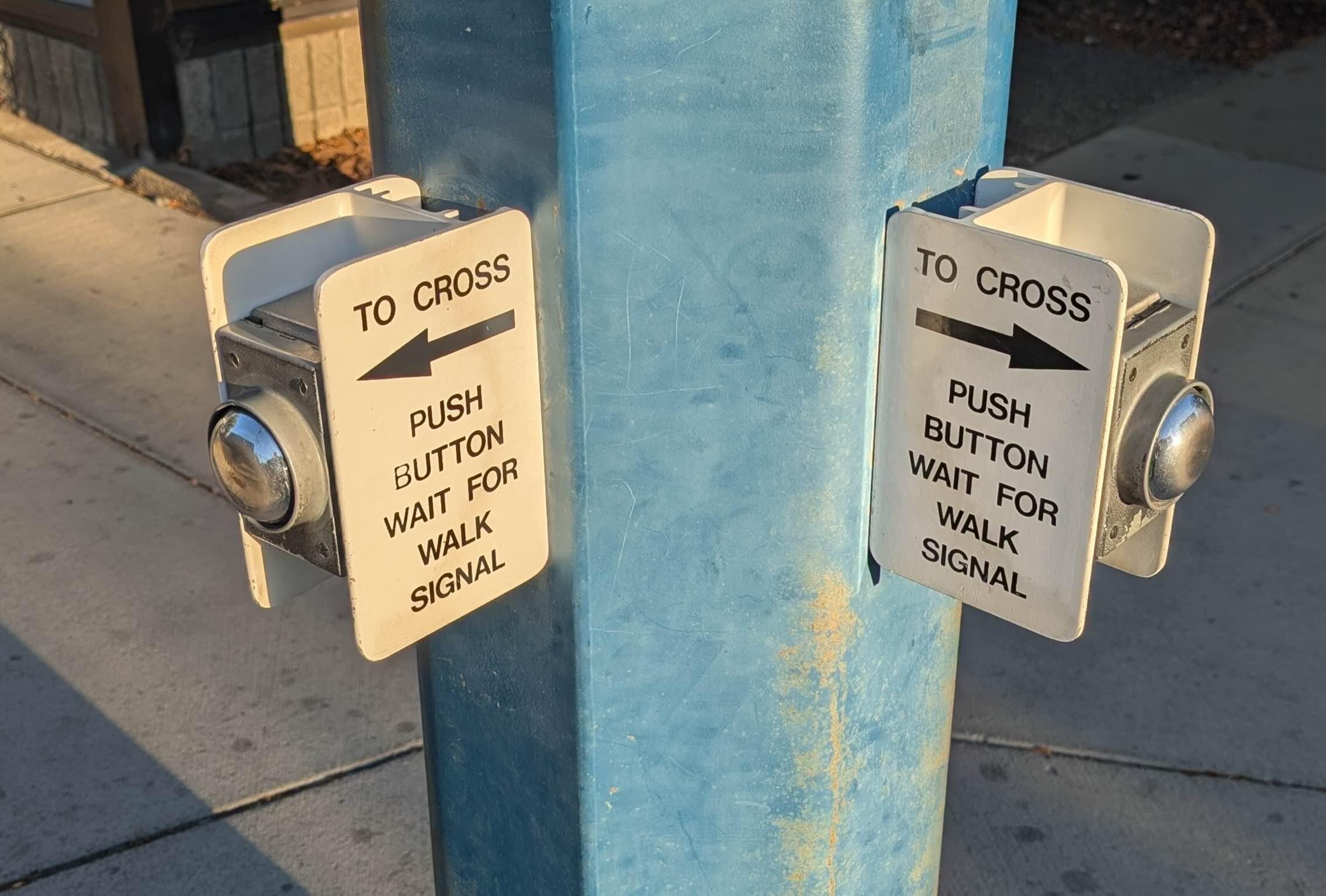
I see this type of #UX mistake all the time. People use a control in the wrong location and have to create high energy signs to 'fix it'.

The first image has the button effectively behind you vs the normal placement of having it next to you. This one physical layout difference makes the signage so much simpler and intuitive.
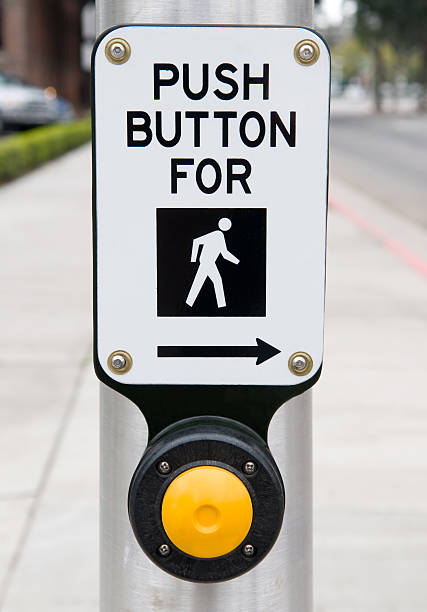
@scottjenson I agree that the first image is all kinds of stupid. But the second isn’t much better. I think both don’t really consider how people *use* crosswalks. Most commonly, people approach the crossing wanting to continue in their direction of travel. Therefore having a button for crossing left or right is confusing. It should be a button on the opposite side of the pole for the crossing it controls. Actually, I’m pretty sure that’s how these were when I was a kid in Canada.
@scottjenson
We just got back from England, confused by the pedestrian lights, which are at waist level on your side of the road, often hidden by other pedestrian's butts.

(TIL "puffin crossing" & "pelican crossing", and that this is considered an improvement???)

https://en.wikipedia.org/wiki/Puffin_crossing

https://en.wikipedia.org/wiki/Pelican_crossing