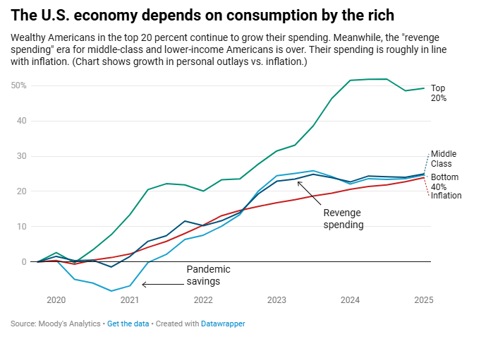
This is a line chart titled "The U.S. economy depends on consumption by the rich."
The chart plots the percentage growth in personal outlays versus inflation from 2020 to mid-2025.
There are four lines on the chart:
Top 20% (Green line): This line shows the spending growth of the wealthiest Americans. It starts flat in 2020, drops slightly below zero, and then rises sharply from late 2020, peaking at over 50% growth in early 2024. It ends slightly below that peak, at around 48% growth, in 2025.
Middle Class (Blue line): This line represents the spending growth of the middle class. It starts near zero, dips sharply into negative territory in 2020-2021, a period labeled "Pandemic savings." It then rises steadily, crossing the inflation line in mid-2022 and peaking at about 25% growth in late 2023. It ends in 2025 at a growth rate similar to inflation. A label points to the period of its rapid increase as "Revenge spending."
Bottom 40% (Dark Blue line): This line shows spending growth for the lowest-income Americans. It follows a similar path to the middle-class line, with a sharp dip in 2020-2021, a rapid rise, and a peak around 25% in late 2023. It also ends in 2025 at a growth rate similar to inflation.
Inflation (Red line): This line represents the inflation rate. It starts near zero in 2020, rises steadily, and ends in 2025 at a growth rate of about 25%.