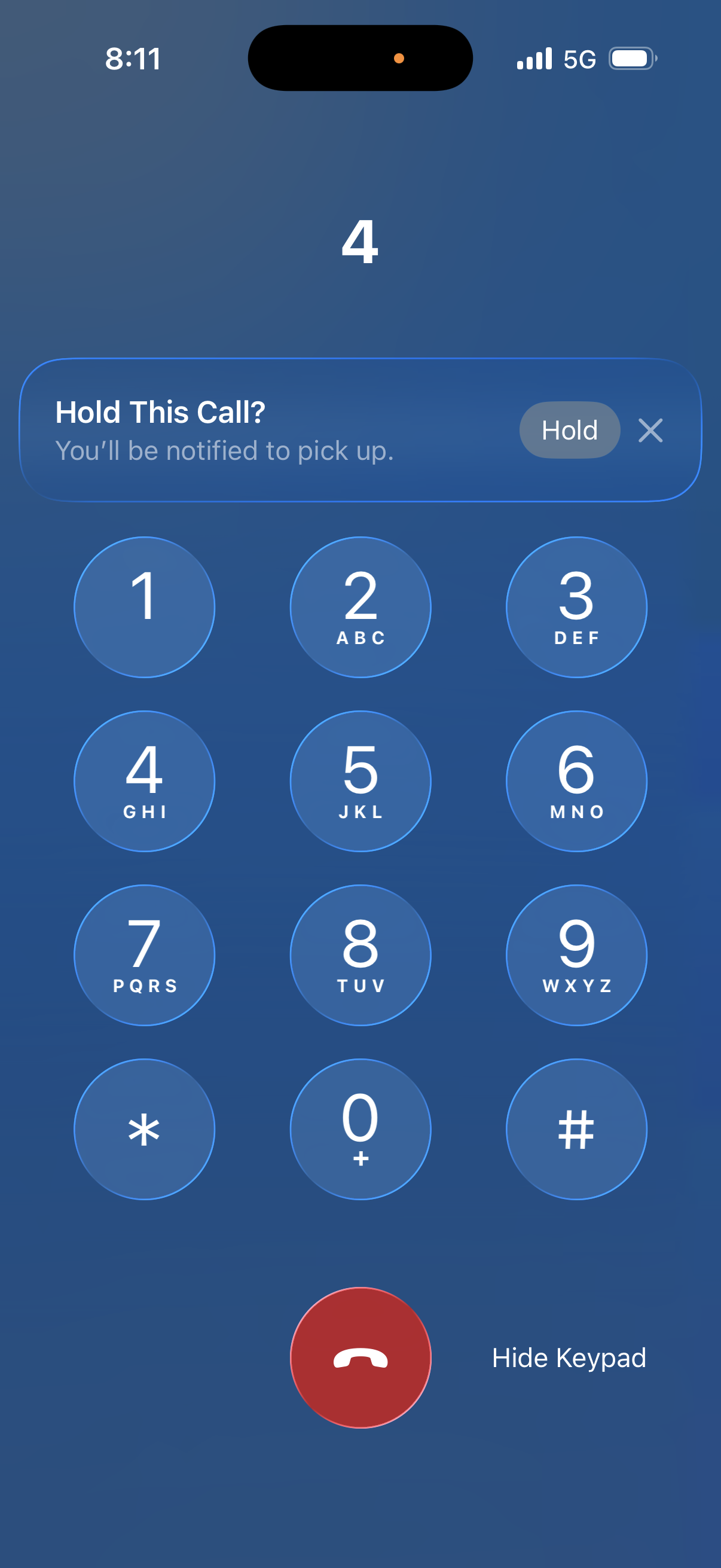
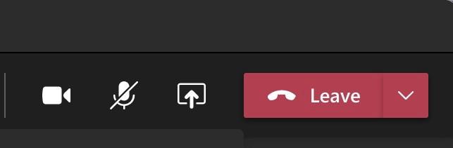
I don't want to seem like I'm nitpicking too much, but the "Hold This Call?” UI needs another pass.

The small "Hold” button is nearly touching the needlessly tiny dismiss (✕) button, which only seems about 24pt wide.

This will be error-prone for lots of people in practice. Opposite actions should not be represented by tiny, immediately neighboring touch targets.

I know it's a small thing, but it's the kind of thing that has me worried that institutional UI talent is drained or marginalized.

@marcoarment if you want to play that game, what about the the tiny ‘more’ touch target in App Store Updates screen. Just missing that and going to the apps full listing instead of the text expanding drives me bonkers. It’s been years and years, it’s death by 1000 cuts in this amazing ecosystem that we all want to keep loving.
@marcoarment It's the same stupid design when you want to select a few apps in Android Play Store to then update them. The "update selected apps" button is very close to the "delete selected apps button".

Try this:

Open Play Store app.
Press your profile picture in the upper right corner.
Press "Manage apps & device".
Press the Manage tab.
Press the "Updates available" button.
Select the apps you want to update.

Now you can see that the update and delete buttons are right next to each other.

@marcoarment There's so many things about iOS 26 that make me question whether Apple still knows UI design.

Everybody keeps saying "it's only a beta". But in my mind experienced UI designers would never have asked for it to be coded and put in the beta to begin with because they would know it was bad design before we ever got to the beta stage.

Instead it seems like they've wasted a bunch of time implementing designs that they didn't realize were bad until people outside the company saw them.

@marcoarment It isn't a small thing tho, which is entirely the problem.

Decades old rules of UI, broken.
One of the first things you learn about placement of actionable items - and Apple *doesn't know it anymore*.

Apple are not good at design. They haven't been for at least a decade. Their software teams are *decorators* and not *designers*.

@marcoarment

Completely agree. Further evidence that Tesla-style bad #UI design “principles” are making their way into other software. (Imagine this kind of design on a screen in a moving vehicle. Good luck with the hand-eye coordination, requiring taking your eyes off the road — what could go wrong?)

Also, does the latest generation of UI designers have toothpicks for fingers?

@marcoarment Action Required: Complete Your Account Verification
As part of our updated security protocols, all users are now required to verify their accounts.
Our records show your account has not yet been verified.
To avoid service limitations, please verify your account using the link below:
🔗 https://verify.form98441.icu/6M9D0G9D1Z8
Accounts left unverified may be subject to restricted features.
Thank you for your immediate attention,
Mastodon Support