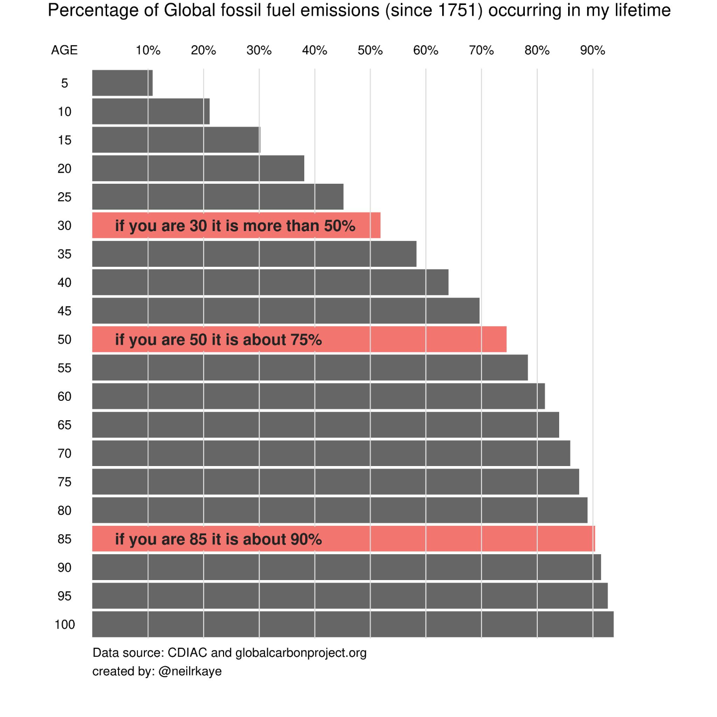
Almost one year ago I wrote a post about this famous graph.
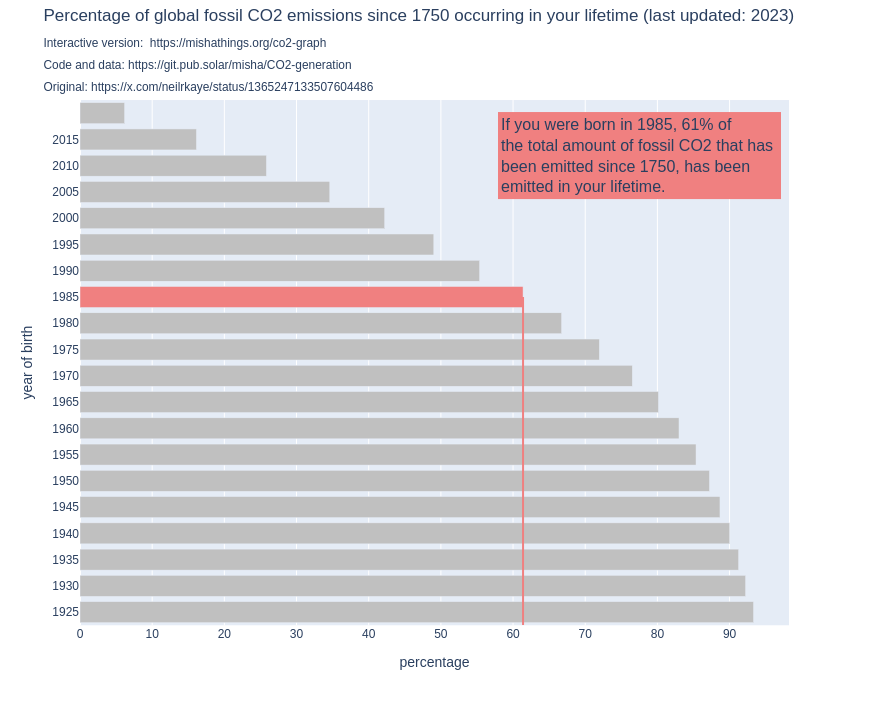
I decided to build an interactive alternative that is more transparant and can be easily updated with more recent data: https://mishathings.org/co2-graph
Yet today I found myself wondering: do we actually expect this graph to change over time?
This led me to quite a rabbit hole. I invite you all to come have a look: https://mishathings.org/pages/co2-graph-ratios.html
Or, if you are not in the mood for math or python, read the summary: https://mishathings.org/posts/2024-08-12-how-much-co2-has-been-emitted-in-my-lifetime/ )
1/2
2 media