Discussion
Loading...

Post

Log in
  • About
  • Code of conduct
  • Privacy
  • Users
  • Instances
  • About Bonfire
Mina
@mina@berlin.social  ·  activity timestamp 3 weeks ago

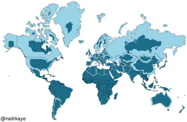
We all know, how crappy the common #Mercator projection for world #maps represents areas, inflating them with distance from the equator.

What many people don't know, is why this projection is still so popular:

The shortest path between two points on the globe, is a straight line on the map.

I reckon, this is useful.

In all other projections, the shortest paths are curves.

In #Maths, we say, the Mercator projection preserves angles, not areas.

A world map. Countries are drawn in light blue according to the Mercator projection. Inside, in darker blue the actual sizes of the countries. 

Especially in the cases of Alaska, Canada, Greenland and Russia, the real area is only a small fraction of the apparent sizes.
A world map. Countries are drawn in light blue according to the Mercator projection. Inside, in darker blue the actual sizes of the countries. Especially in the cases of Alaska, Canada, Greenland and Russia, the real area is only a small fraction of the apparent sizes.
  • Copy link
  • Flag this post
  • Block
Log in

bonfire.cafe

A space for Bonfire maintainers and contributors to communicate

bonfire.cafe: About · Code of conduct · Privacy · Users · Instances
Bonfire social · 1.0.0-rc.2.3 no JS en
Automatic federation enabled
  • Explore
  • About
  • Members
  • Code of Conduct