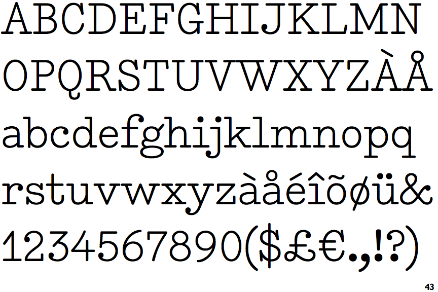
There are surprisingly few fonts based on, or used by, actual typewriters. In the interests of finding out the right answers by posting wrong ones:

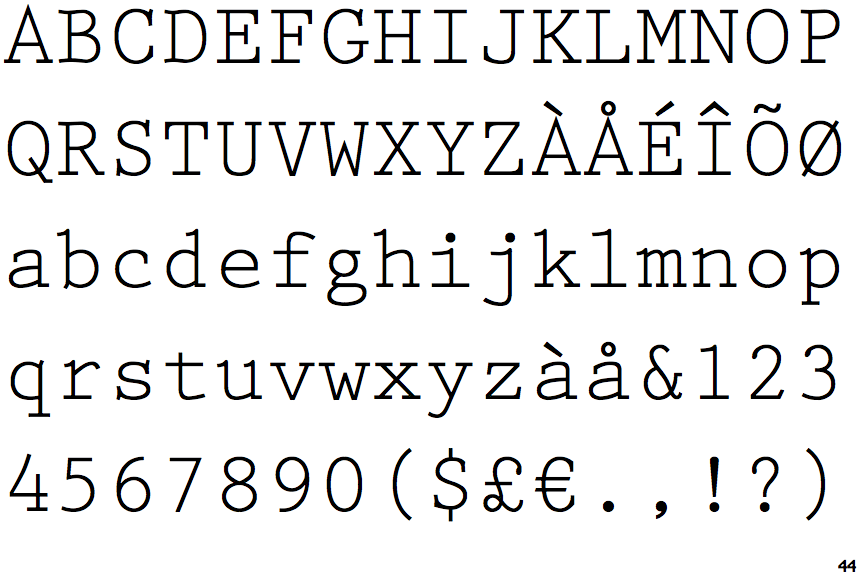
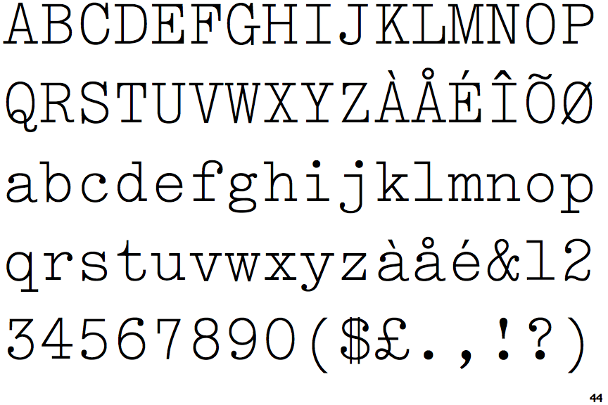
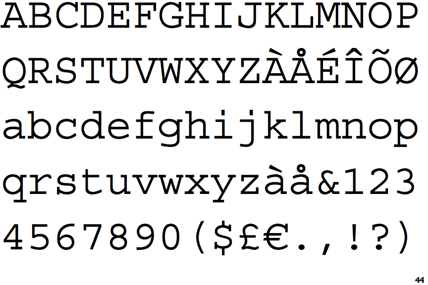
Prestige Elite, Typewriter Elite (balls and fillets), Courier (no balls, slab serifs), LTC Remington Typewriter (wavy seven).

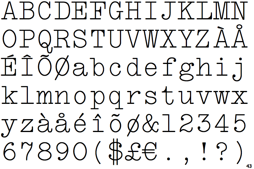
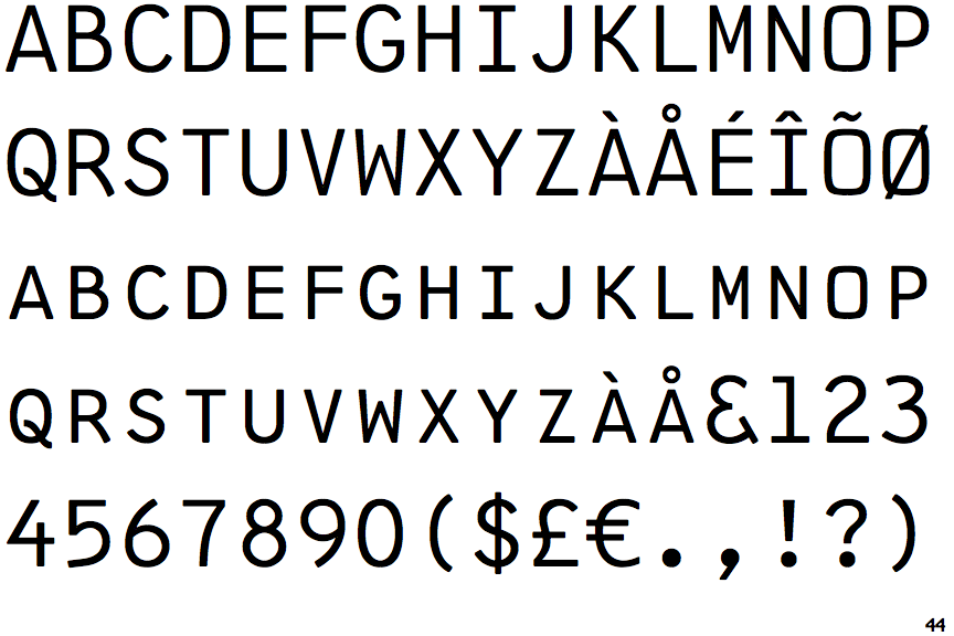
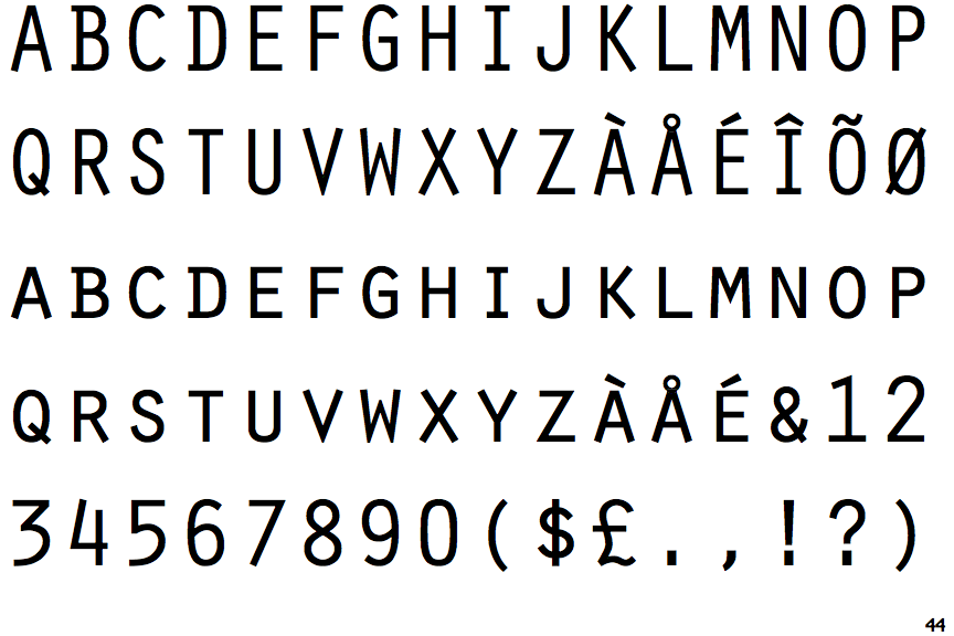
A2 Typewriter, 1403 Vintage Mono, and Orator feature in the next post.

Please boost (to increase the rage replies).

(samples from identifont)

1/

#TypewriterFont #font#Typewriter#Monospace

A sample of LTC Remington Typewriter. It is similar to Typewriter Elite, with balls and fillets; there is a little more "spring" in the /h /m /n /r (the arch has a lower junction on the left, and the top of the arch is further to the right). The /two has a wavy bottm, the /three has a flat top, the /four is close, the seven has a top-left hook (or beak) and has a wavy top and an ogee diagonal.
A sample of Courier. Very monostroke, no ball terminals, no fillets. Serifs and entry-and-exit strokes are largely rectilinear slabs. The /Q has a distinctive wavy tail. The /g is single story (schoolbook). The /two is flat-bottomed, the /three is rounded top and bottom, the /four is closed, the /seven has a hook at top-left and a straight diaonal.
A sample of Typewriter Elite. Like many of these fonts, it is largely monostroke. This sample has significant ball terminals /a /c /f /j /r and many fillets /E /F /T /t. The /two has a wavy bottom, the /three is flat-topped, the /four is closed, the /seven has a top-left hook and a curving diagonal.
sample of Prestige Elite. Quite a clean monostroke design with curved entry and exit strokes on many letters (the /b /d /h /k /l /m /m /p). Compare to other sample, there are no ball terminals, and no fillets except perhaps small ones in the beak of /C /S /T.
The /two is straight bottomed, the /three is round at top and bottom, the /four is open, and the /seven is straight with no hook.
sample of Prestige Elite. Quite a clean monostroke design with curved entry and exit strokes on many letters (the /b /d /h /k /l /m /m /p). Compare to other sample, there are no ball terminals, and no fillets except perhaps small ones in the beak of /C /S /T. The /two is straight bottomed, the /three is round at top and bottom, the /four is open, and the /seven is straight with no hook.

Continuing with fonts based on Typewriters

A2 Typewriter, based on an Olivetti Letterer 22; 1403 Vintage Mono, based on an IBM 1403 band printer; Orator.

The last two are somewhat oddballs. They both have smallcaps in the lowercase, and i'm pretty sure the 1403 i used had regular lowercase letters (an option on later models, apparently). Orator is a Selectric face that use smallcaps for clarity (fontsinuse).

All other typewriter fonts are either based on these or more generic versions. haha.

Sample of Orator.
Essentially sans-serif with the lowercase being a smallcaps version of the uppercase. Small flag/serifs on the /B /D. The /two is flat-bottomed, the /three is flat-topped, the /four is open, the /seven has no hook and a straight diagonal.
Sample of Orator. Essentially sans-serif with the lowercase being a smallcaps version of the uppercase. Small flag/serifs on the /B /D. The /two is flat-bottomed, the /three is flat-topped, the /four is open, the /seven has no hook and a straight diagonal.
Sample of 1403 Vintage Mono.
The /O and /D have a somewhat squarish shape. Mostly sans serif and monostroke. There are no ball terminals, nor fillets. The lower case is a small-caps version of the uppercase capitals. The /two is flat bottomed, the /three is round top and bottom, the /four is open with no feet on its lower stroke, the /seven has no hook and a curving diagonal.
Sample of 1403 Vintage Mono. The /O and /D have a somewhat squarish shape. Mostly sans serif and monostroke. There are no ball terminals, nor fillets. The lower case is a small-caps version of the uppercase capitals. The /two is flat bottomed, the /three is round top and bottom, the /four is open with no feet on its lower stroke, the /seven has no hook and a curving diagonal.
Sample of A2 Typewriter.

Ball terminals and slab serifs. Fillets only where there are beaks: /C /G /S. The /Q has an idiosyncratic simple hook-shaped tail positioned to the right. The /g has an idiosyncratic straight ear pointing up and to the right. The /two is straight bottomed, the /three is straight topped, the /four is open, the /seven has a hook at top-left and a gently curving diagonal.
Sample of A2 Typewriter. Ball terminals and slab serifs. Fillets only where there are beaks: /C /G /S. The /Q has an idiosyncratic simple hook-shaped tail positioned to the right. The /g has an idiosyncratic straight ear pointing up and to the right. The /two is straight bottomed, the /three is straight topped, the /four is open, the /seven has a hook at top-left and a gently curving diagonal.