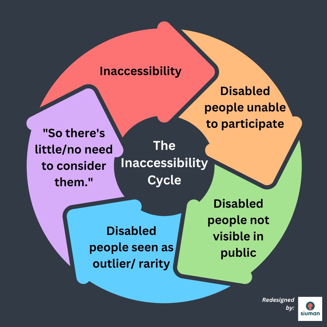
An infographic showing The Inaccessibility Cycle. There is a circle of arrows, showing a cycle as follows:
> Inaccessibility
> Disabled people unable to participate
> Disabled people not visible in public > Disabled people seen as outlier/rarity
> "So there's little/no need to consider them."
The last arrow points back to "Inaccessibility", completing the cycle.
The original infographic is by Pacing Pixie, redesigned by Siuman.