Greg Lloyd
boosted

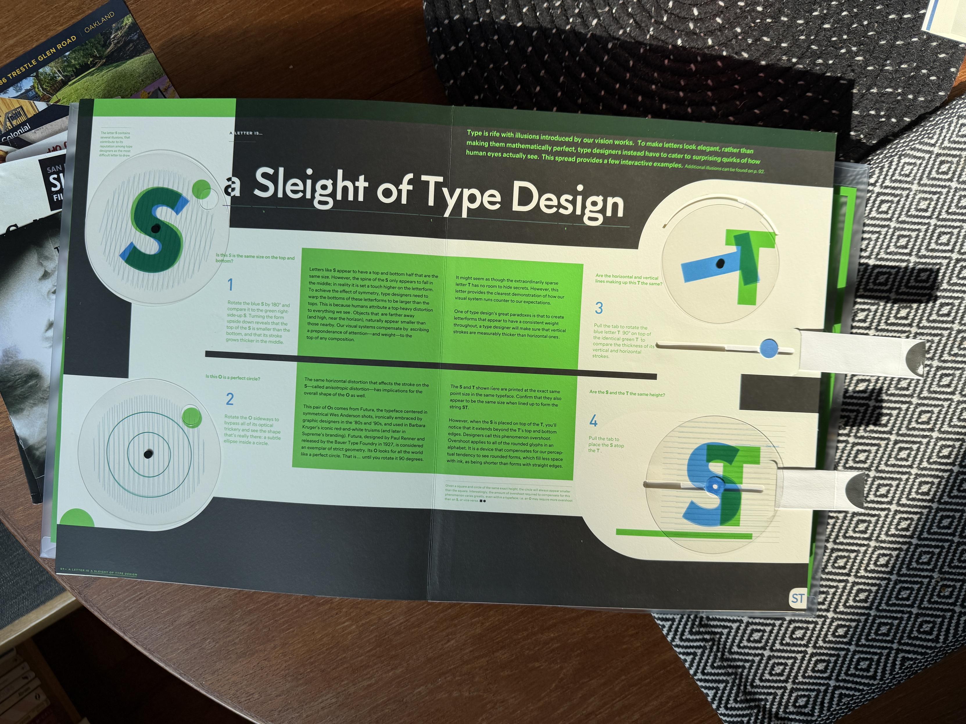
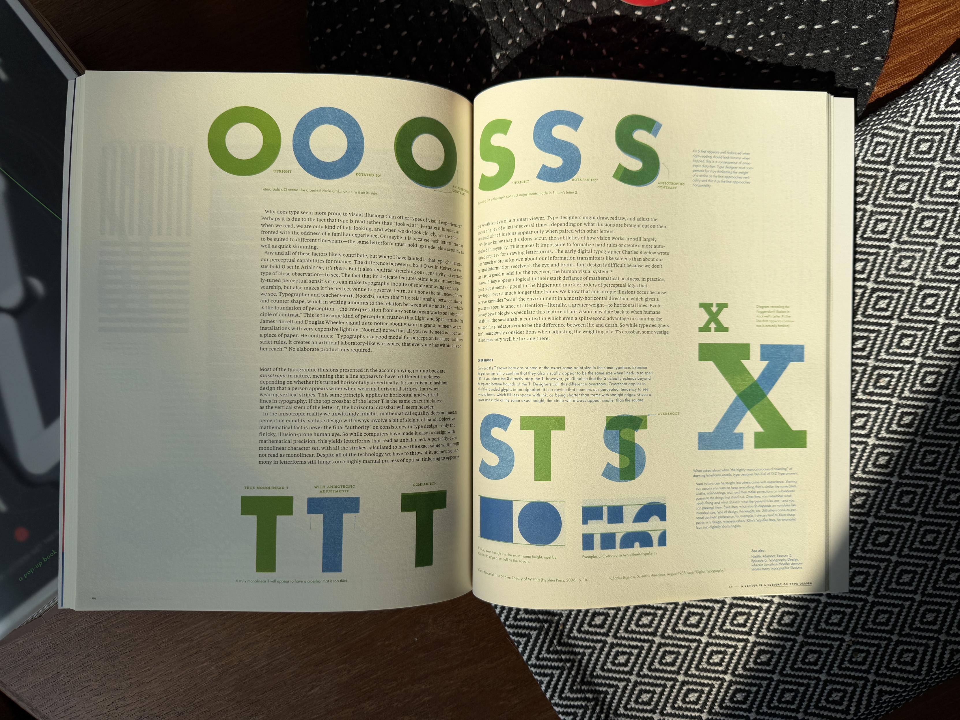
A deep bow to @kellianderson for the astonishing ambition of Alphabet in Motion. My favorite pop-up mechanisms are those that clearly explain principles of type design that are difficult to show in static images: the asymmetry of S and O; the optical correction devices of overshoot and horizontal/vertical stroke weights; the concept of variable axes. It’s not only beautiful and fun, it’s a godsend for educators! #KelliAnderson #PopupBooks #TypeDesign #Lettering
2 media