Discussion
Loading...

#Tag

  • About
  • Code of conduct
  • Privacy
  • Users
  • Instances
  • About Bonfire
Joel Michael boosted
Sticker the Planet
@Stickerum@infosec.exchange  ·  activity timestamp 6 days ago

After #CyberMonday comes #PatchTuesday, naturally.

—> https://stickerthepla.net/#018 <—

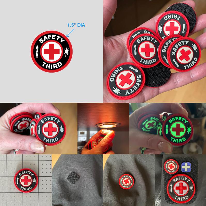
Dark times call for glow-in-the-dark #SafetyThird patches with velcro backing. Incredible deals when you bundle up several: THREE for $29, or TEN for $69 USD.

Order today for bonus gifts for your sleigh. MOAR stocking-stuffers: https://stickerthepla.net
#PatchAllTheThings
#EPluribusStickerum

glowy safety third patch is velcro backed too
  • Copy link
  • Flag this post
  • Block
Matt "msw" Wilson
@msw@mstdn.social  ·  activity timestamp 3 months ago

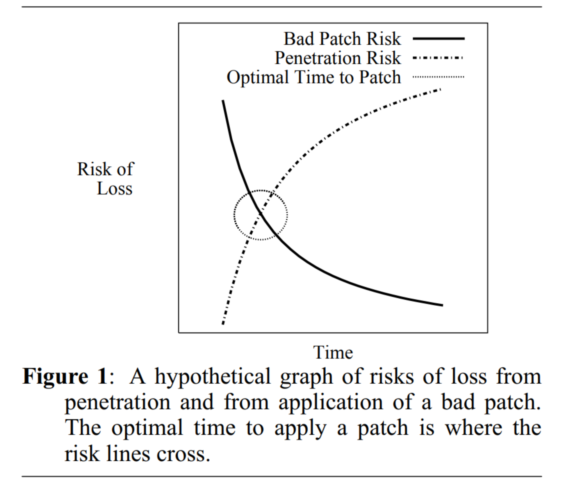
I definitely recommend folks read the paper linked in the first post. Here's a TL;DR summary in the form of Figure 1: " "A hypothetical graph of risks of loss from penetration and from application of a bad patch. The optimal time to apply a patch is where the risk lines cross."

#CVE#OSS #FOSS #FLOSS #OpenSource #FreeSoftware #InfoSec

@smb @adamshostack

A graph showing Time along the X axis and Risk of Loss along the Y axis. Two curves are on the graph, one is the "bad patch risk" which decreases over time, and the other is "penetration risk" which increases over time. Where the two lines cross, a circle is drawn representing "Optimal Time to Patch".

Caption: "Figure 1: A hypothetical graph of risks of loss from penetration and from application of a bad patch. The optimal time to apply a patch is where the risk lines cross."
A graph showing Time along the X axis and Risk of Loss along the Y axis. Two curves are on the graph, one is the "bad patch risk" which decreases over time, and the other is "penetration risk" which increases over time. Where the two lines cross, a circle is drawn representing "Optimal Time to Patch". Caption: "Figure 1: A hypothetical graph of risks of loss from penetration and from application of a bad patch. The optimal time to apply a patch is where the risk lines cross."
Matt "msw" Wilson
@msw@mstdn.social replied  ·  activity timestamp 3 months ago
@smb @adamshostack

Folks who like that paper may light this one as well.

It studies Microsoft "Patch Tuesday" updates in particular, which are much different (in my opinion) than your typical open source software updates that are labeled with a CVE.

#CVE#PatchTuesday #InfoSec

https://arxiv.org/abs/2307.03609

  • Copy link
  • Flag this comment
  • Block
Log in

bonfire.cafe

A space for Bonfire maintainers and contributors to communicate

bonfire.cafe: About · Code of conduct · Privacy · Users · Instances
Bonfire social · 1.0.1-alpha.8 no JS en
Automatic federation enabled
  • Explore
  • About
  • Members
  • Code of Conduct
Home
Login