Roni Rolle Laukkarinen
boosted
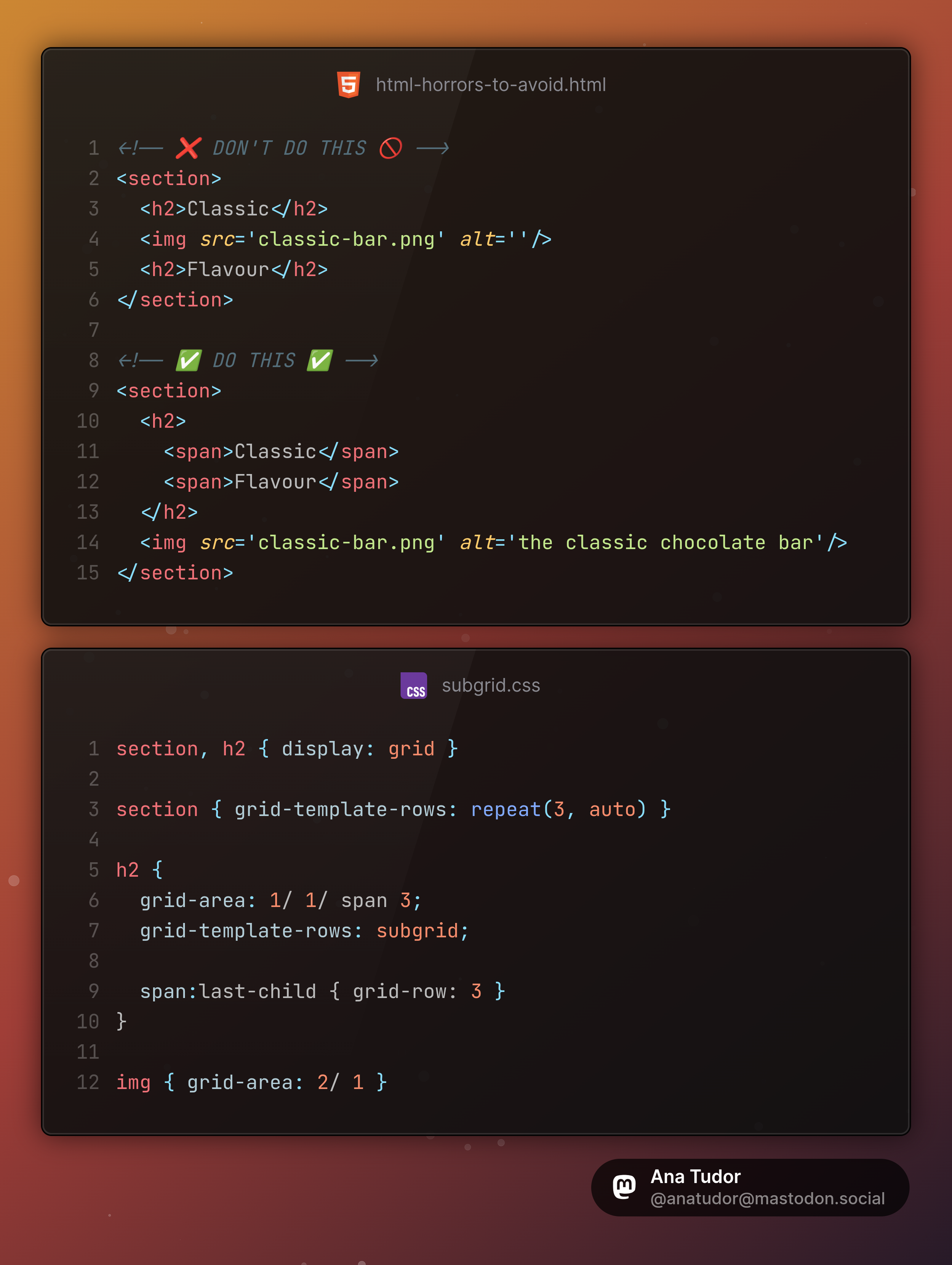
I am begging you, please don't split your heading into two separate `h2` elements with an `img` in between just to have the image in between your heading words.
This is what subgrid was made for!
#CSS #layout #cssLayout #code #coding #web #dev #webDev #webDevelopment