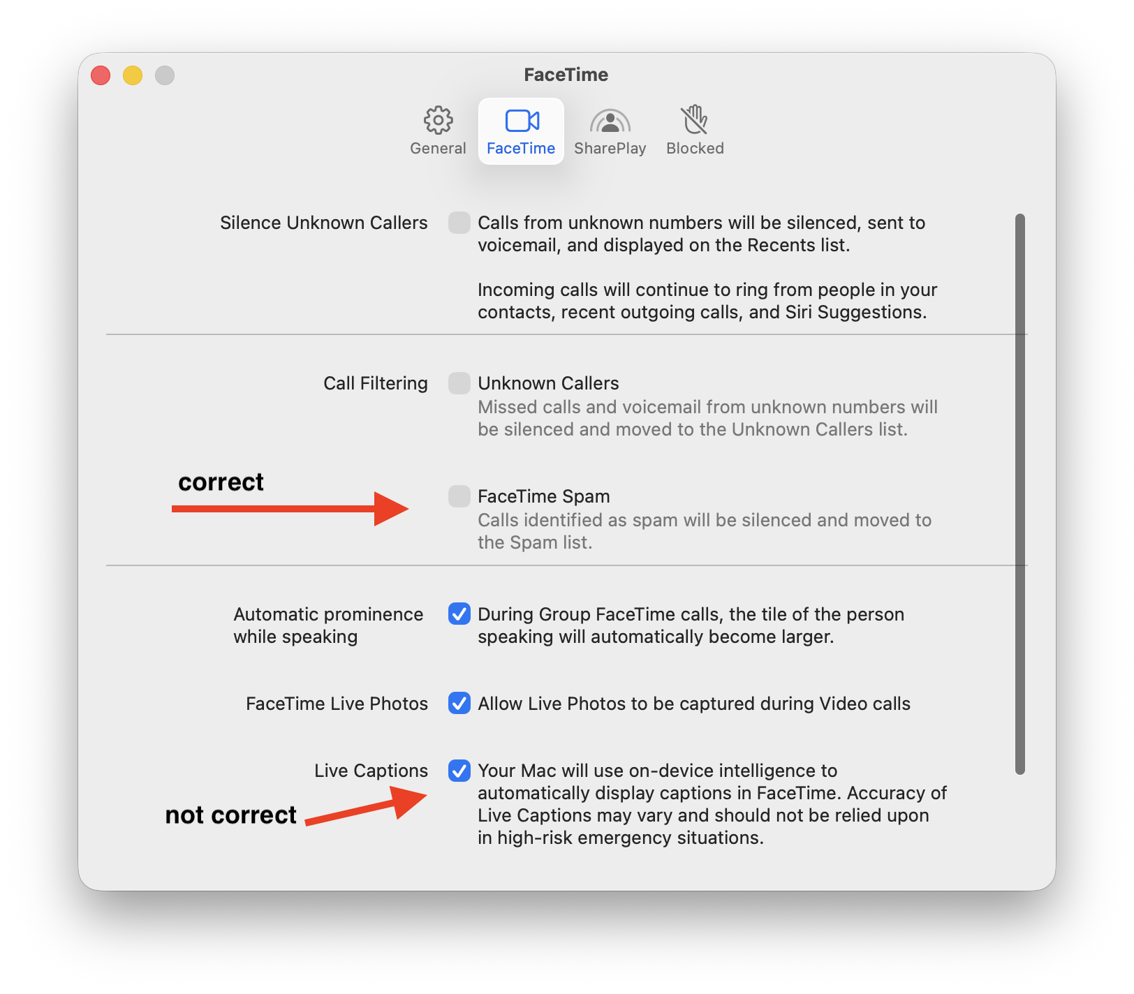
This makes me so sad; this is why you need a proper HIG.
Checkbox labels should succinct (short, to the point). If you need a description, it goes as a secondary label under it and aligned with the checkbox's title.
What you DO NOT DO is put the checkbox title to the left of the checkbox and the whole ass description to the right.
Trying to figure out how they got some right and some just super wrong in the FaceTime app Settings window... The left side is for section titles only.