Discussion
Loading...

Post

  • About
  • Code of conduct
  • Privacy
  • Users
  • Instances
  • About Bonfire
Mario Alberto Guzmán
@marioguzman@mastodon.social  ·  activity timestamp last month

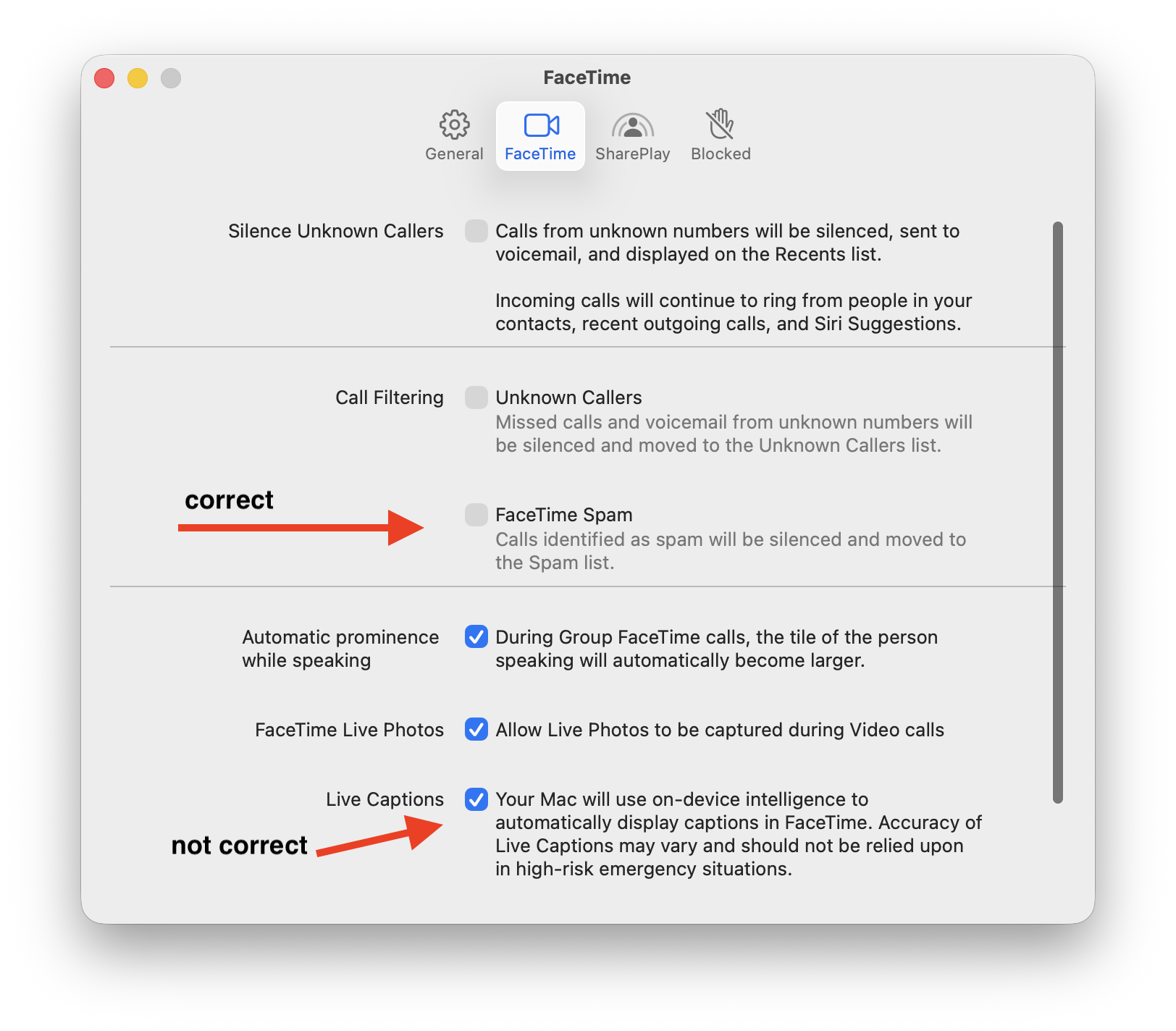
This makes me so sad; this is why you need a proper HIG.

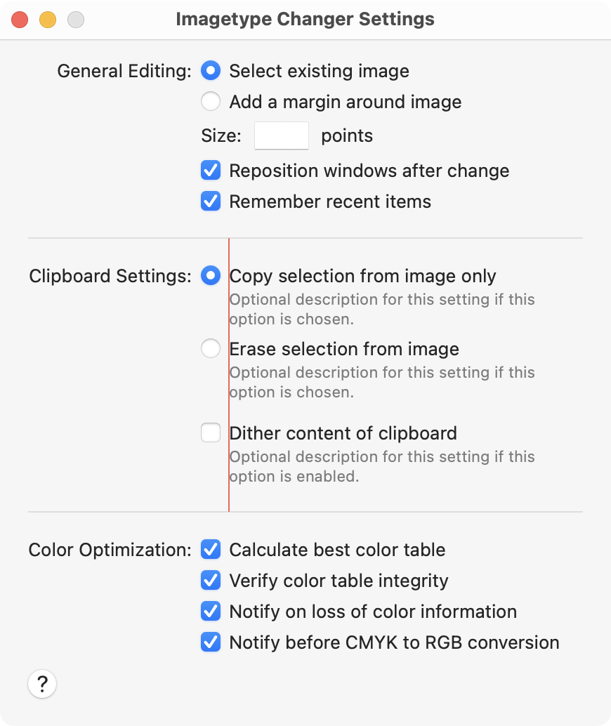
Checkbox labels should succinct (short, to the point). If you need a description, it goes as a secondary label under it and aligned with the checkbox's title.

What you DO NOT DO is put the checkbox title to the left of the checkbox and the whole ass description to the right.

Trying to figure out how they got some right and some just super wrong in the FaceTime app Settings window... The left side is for section titles only.
#macOSTahoe

Sorry, no caption provided by author
  • Copy link
  • Flag this post
  • Block
Mario Alberto Guzmán
@marioguzman@mastodon.social replied  ·  activity timestamp last month

Here's a window I created for my own HIG that explains how to do this properly from a layout perspective... but you get the point.

https://marioaguzman.github.io/design/layoutguidelines/

#macOSTahoe

Sorry, no caption provided by author
  • Copy link
  • Flag this comment
  • Block
Log in

bonfire.cafe

A space for Bonfire maintainers and contributors to communicate

bonfire.cafe: About · Code of conduct · Privacy · Users · Instances
Bonfire social · 1.0.0-rc.3.13 no JS en
Automatic federation enabled
  • Explore
  • About
  • Members
  • Code of Conduct
Home
Login